-
I want to thank all the members that have upgraded your accounts. I truly appreciate your support of the site monetarily. Supporting the site keeps this site up and running as a lot of work daily goes on behind the scenes. Click to Support Signs101 ...
You are using an out of date browser. It may not display this or other websites correctly.
You should upgrade or use an alternative browser.
You should upgrade or use an alternative browser.
Thoughts on this
- Thread starter Doyle
- Start date
J Hill Designs
New Member
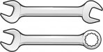
kinda reads like a 'c'
jayhawksigns
New Member
You could make it a combination wrench, the outline feels heavy too, but like it overall.
weaselboogie
New Member
Circleville Signs
New Member
I personally like the thicker outline, but I tend toward that style of design. Agree that you should go with a closed end combo wrench.
Otherwise, great work!
Gary
Otherwise, great work!
Gary
Doyle
New Member
I probably wouldn't have gone as thick on the outline and the wrench looks a bit skewed on the left end. I just did some cards for a mechanic and made this wrench for the card.... You're welcome to use it. I'll email it to ya!
It was my sorry attempt at giving dimension to the wrench, kinda like it is closer in the front at the nut end.... just ended up looking skewed/distorted. I appreciate you letting me use your wrench! Looks a lot better than mine, which I tried to draw from a photo.

Circleville Signs
New Member
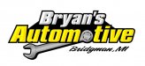
The new one is better - I think that the all caps idea would REALLY overpower the logo. Maybe try flipping the yellow and chrome. make "Bryan's" chrome and "Automotive" yellow.
Also, the script font for the city isnt' working for me...Ugh.
Gary
Also, the script font for the city isnt' working for me...Ugh.
Gary
J Hill Designs
New Member
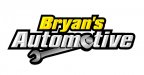
yeah I think a different color for automotive will let you see the o/wrench better
HaroldDesign
New Member
It seems Bryan's and Automotive need some breathing room. The negative space left with them touching is puzzle-like.

Circleville Signs
New Member
I actually like the yellow. How about blocking out the black all-together - making your lettering outline into an outline that gives a solid black background?
Personally, I like the wrench alot.
Gary
Personally, I like the wrench alot.
Gary
Just Me
New Member
thats a nice looking wrench weaselI probably wouldn't have gone as thick on the outline and the wrench looks a bit skewed on the left end. I just did some cards for a mechanic and made this wrench for the card.... You're welcome to use it. I'll email it to ya!

Doyle
New Member
I actually like the yellow. How about blocking out the black all-together - making your lettering outline into an outline that gives a solid black background?
Personally, I like the wrench alot.
Gary
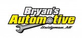
Like this?