• I want to thank all the members that have upgraded your accounts. I truly appreciate your support of the site monetarily. Supporting the site keeps this site up and running as a lot of work daily goes on behind the scenes. Click to Support Signs101 ...

Thoughts/Opinions on BBQ Sign

Doyle

New Member
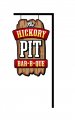
This customer came to me and basically told me to go nuts with a design for their sign, total freedom on this thing. Size cannot exceed 32"w x 48"h. One idea they had and really would love to see is moving flames on the sign. I do not see a practical way to do this, so here is what I have come up with. I am pretty disappointed in myself as I am always complaining when customers give me no freedom, and when they do, I have so much trouble coming up with anything....

Anyway, my proposed idea here would be a solid chunk of wood as wood plank, possibly hand carved. I want it to look weathered, and also want it to be about 2" thick. Each of the other (red) panels would be separate pieces attached to the plank, and the word "pit" a separate piece as well. I would like to use paint wherever possible, only vinyl if absolutely necessary.

The sign will be located in a downtown area of a tourist town, speed limit approx 25mph with lots of foot traffic. The business is ONLY allowed ONE sign, period, so it has to be perfect. Surrounding businesses all have sandblasted or dimensional signage, a very up-scale area here.

I am open to any and all critique and/or ideas of what I could do with this sign. I am also open to completely starting from scratch with a whole new approach. The pole pictured is existing, and I have tossed around the idea of wrapping it with a faux log structure to complete the look I am going for here.

Thanks in advance!
 

Attachments

  • signs101.jpg
    signs101.jpg
    32.1 KB · Views: 134

jiarby

New Member
I initially see "THE PIT"

Maybe the most important thing should be "Bar-B-Que" since that identifies the genre??
Try to keep Hickory & Pit together as one element?

Just my initial impressions.... original is good.
 

Doyle

New Member
I initially see "THE PIT"

Maybe the most important thing should be "Bar-B-Que" since that identifies the genre??
Try to keep Hickory & Pit together as one element?

Just my initial impressions.... original is good.

Agreed.... actually this customer was originally going to call the business "The Pit" but evidently the name was already registered, so they had to change it.
 

Marlene

New Member
what I am seeing is a disconnect between each line of copy as you have each in it's own space. maybe pull it all together so it doesn't look like a list of words. the wood and the layers is a pretty good idea. you might want to work with HDU as you can do some other textures as well as wood.
 

SignManiac

New Member
I fooled around with it, I'm kinda bored today.

It's not the same rustic feel that yours has but it's another possible design direction you could go in... This would be another good candidate for the classroom exercise forum.
 

Attachments

  • Hickory Pit.jpg
    Hickory Pit.jpg
    41.5 KB · Views: 101

Jillbeans

New Member
Definitely beef up BBQ (or is that pork?)
I mainly see PIT which tells me nothing.
Love.....Jill
 

Attachments

  • Graphic1.jpg
    Graphic1.jpg
    248.3 KB · Views: 126
Last edited:

k.a.s.

New Member
I love the idea of doing the weathered wood as the backround, that is the kind of project I would love to take on. So for sure keep that.

I understand what people are saying about the "pit", looking at the thumbnail that is what you see. But since you said it is a slow traffic area and has a lot of foot traffic I think it is OK. Maybe make the bottom panel a little taller and just have it say BBQ, then what they do would be more readable. I would also add a little black around letters on the red panels.

Overall looks good though.

Kevin
 

Marlene

New Member
nice job Jill. the copy is pulled together while being on panels. if you just do something like that on your wooden background, that would make it look so much better.
 

signmeup

New Member
Pit is too big. Turn the sign sideways and run "Hickory Pit" in one line.
If the post really looks like that....change it. :biggrin:
 

Doyle

New Member
can't turn it sideways, pole configuration cannot be altered, so I am stuck with the vertical layout unfortunately.

Thanks for the ideas, I am going to work on it a little more....
 

Marlene

New Member
can't turn it sideways, pole configuration cannot be altered, so I am stuck with the vertical layout unfortunately.

Thanks for the ideas, I am going to work on it a little more....

I would keep your original wood background but do it with HDU and would go more for a stacking on ribbons and bands like Jill did to pull it all together and it should look really nice. with HDU, you can v-groove some of the copy in the ribbons and have it rasied on the wood grain background. textures and multi dimensions would look great on this sign.
 

Wes Phifer

New Member
Here is a background for it. It is cedar. Looks like what you are after.
 

Attachments

  • MVC-822F.JPG
    MVC-822F.JPG
    92.6 KB · Views: 114

Jon Aston

New Member
Moving flames...

Just thinking out loud - don't know how practical this would be.

My first thought was orange sequins. There used to be a billboard-sized sign in downtown Toronto (was it a Pizza-Pizza sign) that was made of sequins. It shimmered in any breeze (was conspicuous and unique) and was around for a long time.

You might also want to look into "lenticular"... check out "Sakar" about 20 seconds into this video. Bet you could do something like this with lenticular...and if you could, they would probably want to pay more for it. :)
 

OldPaint

New Member
3 letters.....which are UNIVERSALLY RECOGNIZED....
BBQ...................or the words BAR B QUE..........name is secondary TEXT.
 
Top