-
I want to thank all the members that have upgraded your accounts. I truly appreciate your support of the site monetarily. Supporting the site keeps this site up and running as a lot of work daily goes on behind the scenes. Click to Support Signs101 ...
You are using an out of date browser. It may not display this or other websites correctly.
You should upgrade or use an alternative browser.
You should upgrade or use an alternative browser.
Totaly stumped and have only bad ideas any sugestions??
- Thread starter racershawn
- Start date
"Deposit Please"
New Member
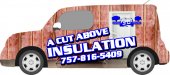
What if you put a big roll of insulation on back half of vehicle w/ some of it rolled out running along the bottom of doors. There, you can put the company name & ph#. I would keep all info straight, not slanted like you have it & center align everything. Toss the black shadow, increase the white stroke & give it a hard edge. keep it clean & simple.
speedmedia
New Member
I'm getting over wraps. I'll be happy when we go back to vehicles with SIGNS on them that we can READ.
Well, it depends on who is doing them. There are very few people out there who can properly pull off a vehicle wrap as a useful piece of advertising.
Sometimes the hardest part is trying to keep the client under control. Everyone wants to throw the kitchen sink at a wrap when it just is not the right way to go.
I think if you take Stephen's suggestions and make your cutouts look a bit more natural, start over on the text and work on your color contact you will have something to work with.
Thanks,
Kurt
laserman70
New Member
I would show your customer one with the direction you are going, and create something from scratch that you think would give them the look they need.
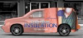
The background picture being used with the insulation wall is blah. Get another image to use that creates a better look.
The blue will be ok i believe. You need to make the blue pop off the graphic. Get rid of the drop shadow, put a bold outline around it. Create the contrast of the font and the graphic in the background.
Instead of just grabbing pictures, create something on your own. Then you can show him the boring wrap he says he wants, and the great creation you have come up with that gives him what he needs.
Just my .02
jfiscus
Rap Master
I am also thinking that your source images may be the main source of problems in this wrap. Also, it is a Cube; which also looks like a PITA to make look nice anyways....
If you're using a room photograph for the background you should try to make the "insulation revealed" area transition photorealistic. There are many PS brushes you can mask with that will give a "cut/broken" effect with a shadow onto the revealed insulation area. See if you can find better source images, the darkness of the rooms does not look "welcoming or friendly" imho.
The greens & blues don't say "warm insulation" to me either, it looks more like a HVAC company's colors. Possibly a white (even a reflective white?) logo text with a blue stroke/glow around it; might also make it easier to read. If they like blue/white, you could try starting with a blue background layer in PS and fading the scene into it?
Attached is possibly the worst PS I've ever seen. It certainly wasn't made by me!")
If you're using a room photograph for the background you should try to make the "insulation revealed" area transition photorealistic. There are many PS brushes you can mask with that will give a "cut/broken" effect with a shadow onto the revealed insulation area. See if you can find better source images, the darkness of the rooms does not look "welcoming or friendly" imho.
The greens & blues don't say "warm insulation" to me either, it looks more like a HVAC company's colors. Possibly a white (even a reflective white?) logo text with a blue stroke/glow around it; might also make it easier to read. If they like blue/white, you could try starting with a blue background layer in PS and fading the scene into it?
Attached is possibly the worst PS I've ever seen. It certainly wasn't made by me!
Attachments
Last edited:
Seven Sin Design
New Member
Don't make me bust out a design on this guys. If I wasn't so busy today I would
Somehow I have found time to be on this forum though....
Somehow I have found time to be on this forum though....
Brandon708
New Member
^ I think they are making you bust one.
jfiscus
Rap Master
^ I think they are making you bust one.
Rule is you only have 20 minutes start to finish.
Seven Sin Design
New Member
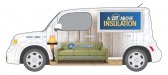
Okay, I had a chance to throw something together. Not quite in 20 minutes, but close! I still think it's a little busy looking, but it gets my visual across. The idea would be better realized on a box truck than the Cube because with such little room to work with, it's hard to make the insulation the focus. Please ignore the 30 second logo.
Good luck with it. Hope this helps.
Good luck with it. Hope this helps.
Attachments
SignManiac
New Member
Now that looks good!
racershawn
New Member
See I think the cube is the biggest problem ... thanks guys for all the input ... I think we are all going down about the same road ( a very bumpy, ugly one at that) but all with the same thoughts in mind.... thank you all!!! I will let you know how it turns out....Shawn
signmeup
New Member
Jill.... love your "ugly house logo". I too admired the lamp.
I think the concept in the second photo of the first post is the best idea so far. Just don't use such ugly insulation, change the nasty blue text and don't cover quite so much of the vehicle with the insulation effect.
(actually, the Pink Panther blowing insulation into an attic is the best concept so far)
Brandon708
New Member
The "Major Award" in there is a nice touch.
Seven Sin Design
New Member
I thought you guys would like the leg lamp, lol.