• I want to thank all the members that have upgraded your accounts. I truly appreciate your support of the site monetarily. Supporting the site keeps this site up and running as a lot of work daily goes on behind the scenes. Click to Support Signs101 ...

Totaly stumped and have only bad ideas any sugestions??

racershawn

New Member
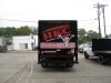
I have a customer that is insisting on using a pic of home insulation with the studs as some sort of background for his wrap. it is all he dose so he wants it on the wrap... My mind has not been working very well lately and I just cant seem to get kick started on this one.... adamantly they are all ugly.... The house in the window is in all his other stuff and he wants to keep it and he wants blue lettering .... anyone wana share any ideas??? thanks for the advise!!! and before you say you hate these... I already know that!!!...LOL its been a bad cpl weeks.................
 

Attachments

  • a cut above 6.jpg
    a cut above 6.jpg
    61.5 KB · Views: 83
  • a cut above 7.jpg
    a cut above 7.jpg
    60.5 KB · Views: 75

SignManiac

New Member
The problem is not the insulation background. It's the blue lettering. Contrast isnt there. either fade out the background or go white on the lettering with a thin dark outline. Just look at your example of the logo in the window. The white jumps off because of the contrast.
 

iSign

New Member
vehicle is white?
maybe big roll of insulation at back, like it's laid out on floor for cutting... fuzzy side up (no need to advertize for the insulation brand) and have it roll out at an angle, kind of a side view, in proportion... so it's like an underline... then his name is blue on white... on that angle maybe (or not)... and his dumb house... on the door, like a typical auto mag size (in fact, sell him on a mag, so he can remove it when he figures out it sucks...

Obviously this would be more of a partial wrap idea, but they are often enough, even better... and cost less for less time and material...
 

firesignz

Celebrating 10 Years in business
Not Mine - but might help to inspire

While this is not a job I did, it is one that I have seen around on a few different vehicles in their fleet.

Looks pretty nice and definitely gets the point across as to what they do without the over busy background that takes away from the lettering and message.

Whoever did make this for them definitely did a very nice job IMHO!

Good luck!

(From their website)
 

Attachments

  • IMG_0852.jpg
    IMG_0852.jpg
    76 KB · Views: 68

os101king

New Member
even though he said he wants blue lettering... like maniac said try white lettering with a blue stroke. (ADDED* careful of the white stroke... at a distance all the eye sees is the contrasting stroke, NOT the letter... when using a stroke I stick to a color closer to the background...) I'm sure if he's at all reasonable and you show him the comparison between the two that the white letter/blue stroke will win out. for my .02, the same size/font for the casual part of the name doesn't really make "INSULATION" punch. you might consider at least a size difference.. maybe an italic if he wants to stick to the same fonts. INSULATION in a nice big serif block like that will punch out big if you did the "a cut above" in something a little more casual. after all, that's what he does..

.. good luck!
 

iSign

New Member
another thought, on the topic of not advertising any brand of insulation... you could go with your full wrap concept of wall framing, and just photoshop yourself a nice custom bulging paper insulation backing that better serves your needs... one that is white-ish overall (similar to photo above, but not spray-in) ,,, AND, where some logo branding belongs... photoshop some slightly wrinkled, believable, realistic "Cut Above house logo" ...maybe even print one on paper... wrap a pillow with it & take a photo...
 

racershawn

New Member
some very good thoughts.... thanks so much guys ... I will be on it this afternoon and let yall know... and please keep them coming..............
 

HulkSmash

New Member
While this is not a job I did, it is one that I have seen around on a few different vehicles in their fleet.

Looks pretty nice and definitely gets the point across as to what they do without the over busy background that takes away from the lettering and message.

Whoever did make this for them definitely did a very nice job IMHO!

Good luck!

(From their website)

besides the logo being stretched to all hell. It's good.
 

firesignz

Celebrating 10 Years in business
besides the logo being stretched to all hell. It's good.


True - the regular size trailer looks MUCH better but this was the only picture I could find. The original design was for a 14' cube van and then apparently they have just stretched it to fit everything else as needed.
 

Steve C.

New Member
Insulation is ugly. Hard to make it look attractive. Maybe a nice illustration of
a house with sun beating down??? or covered in snow? Just a thought.
 

Jillbeans

New Member
In my opinion, the use of blue implies cold because blue is a cool color.
If I was an insulation company I wouldn't want people to think of being cold.
The background to me looks like shredded money, another negative image in my opinion.
I think Isign's idea has merit, and would make it really custom.
I'd also think about a pictorial with a house wrapped snuggly in insulation like a blanket.
Cartoonical of course.
Love....Jill
 

jfiscus

Rap Master
Around here I think most insulation is pink (Owen's Corning has the market covered?) or at least that's what every kind I've ever got all itchy from was. Is the insulation mfg paying a portion of the wrap? If not, get them off of there (draw some studs/insulation in Pshotoshop if ya have to make it better; how hard could that be?)

I did a box truck for an insulation company, image shared below. The mfg of this insulation DOES pay a portion of their wrap fees based upon their annual sales volume as long as the wrap meets certain requirements.

I can't read any of this, blue over green/gray looks bad (gray/green is dull) This needs some fades/gradients/glows/etc to spice it up some & draw attention. I LOVE how they used the "house" charactor from wingdings for a "logo", I have another customer who uses it also, lol.
 

Attachments

  • IMG_2240.jpg
    IMG_2240.jpg
    87.5 KB · Views: 75
  • IMG_2242.jpg
    IMG_2242.jpg
    61.7 KB · Views: 65
  • IMG_2247.jpg
    IMG_2247.jpg
    89.6 KB · Views: 58
  • QHM Van Pix 003.jpg
    QHM Van Pix 003.jpg
    65 KB · Views: 73

Seven Sin Design

New Member
Here's an idea. I'll try to paint the picture in your head, though it might be hard to get a mental picture.

Pretend the entire vehicle is a finished wall. Put a picture frame hanging on the wall (or maybe an exterior window showing the sky) where the back window is. Maybe some foreground elements like a lamp, end table, etc. Along the bottom of the wall, (say from wheel-well to wheel-well) show the drywall cut, revealing the studs and insulation. Then have a hint of finshed floor along the rocker panel.

The point of this is to break up the busyness of that background image. You just CAN'T use it like you have there. The above idea would give you a cleaner canvas with which to put in your logo and contact info, but still creating a realistic scene using their product.

Worth giving a try anyways...
 

racershawn

New Member
Seven.... That is just what i did in the very first atempt... just what you said!!! I will find it and put it up
 

racershawn

New Member
this is the wall cutouts
 

Attachments

  • a cut above 6s.jpg
    a cut above 6s.jpg
    54.9 KB · Views: 77
  • a cut above 7s.jpg
    a cut above 7s.jpg
    52 KB · Views: 72
  • a cut above 8s.jpg
    a cut above 8s.jpg
    51.8 KB · Views: 67

4R Graphics

New Member
Racershawn,
I believe everyone has given you some great ideas. I feel that you need to work on the contrast of the lettering as everyone else has stated. I also think mybe you should try a real picture of the inside of a house then remove the drywall in an area or half the wall to reveal the insulation (should be pretty easy in photoshop). Perhaps give the picture/backgrouond a little fade to it so its not so bold. You really need to get rid of the insulation manufacturer (unless there paying part of the bill). As some others have stated the insulation color is ugly try the pink stuff should be easy to contrast with that.

Keep working on it youll get it.

Also I know your client said this is what I want but often I find that I am the advertising company and usually know better so I will design what I feel is best for the client. Most of the time the client goes for my design. Which is no shock since this is what I do.

I wouldnt tell the insulation guy how to insulate my house. I would ask him to give me the best insulating job and materials he could for the budget I have.

Dont be affraid to design something completely different than what he asked for if you think its a better product for him. Just dont spend to much time going against his idea incase he just wont budge.

Good Luck.
 
Top