• I want to thank all the members that have upgraded your accounts. I truly appreciate your support of the site monetarily. Supporting the site keeps this site up and running as a lot of work daily goes on behind the scenes. Click to Support Signs101 ...

Trailer I designed and applied

Flubber

New Member
Would like to get some feed back!
 

Attachments

  • 100_0009.jpg
    100_0009.jpg
    89.2 KB · Views: 102
  • 100_0011.jpg
    100_0011.jpg
    74.8 KB · Views: 79
  • 100_0012.jpg
    100_0012.jpg
    63.9 KB · Views: 78

Jillbeans

New Member
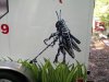
First the nice part. I love the little bugs.
Next the critique.
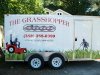
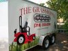
Is it "The Grasshopper 1000?"
Because those look like two completely different elements.
The top font choice is very weak, and very crammed to the edges.
A thicker letter style, perhaps in caps and lower case, with no arch may have been a better idea.
I try to avoid parenthesis on an area code, and also try to avoid using italics.
And the grass would have looked better on a smaller scale and overtop the lawn tractor, as it looks to be hovering.
Not trying to be mean, just trying to help.
Love....Jill
 

Flubber

New Member
after the customer approved it i went back on my own time and changed the grass to where it was solid on the bottom and the strands where on top but boss said it was to late to change so i had to stick with it also on the type it wouldve looked better with a shadow or another affect bc yes it was too plain but my boss wanted to use 651 vinyl on that also the 1000 had to be put on for copyright reasons
 
Top