-
I want to thank all the members that have upgraded your accounts. I truly appreciate your support of the site monetarily. Supporting the site keeps this site up and running as a lot of work daily goes on behind the scenes. Click to Support Signs101 ...
You are using an out of date browser. It may not display this or other websites correctly.
You should upgrade or use an alternative browser.
You should upgrade or use an alternative browser.
VW show logo
- Thread starter aandrews19
- Start date

SignManiac
New Member
Yep Jill is right. Needs further tweaking.
aandrews19
New Member
Yep Jill is right. Needs further tweaking.
yup...exactly why I posted here

Thanks guys, I'll play with it some more.
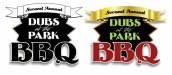
Jill - the fire in 'bbq' is the result of me just playing around with gradient layers. Normally when I need some kind of special effect I'll search the internet for a tutorial for the desired effect. This time I just went for it myself and I'm happy with the result. I'll admit the banner at the top is a stock image
 .
.Flame
New Member
#1 suggestion. Design in black and white first. If you would've on this, it would come out totally different. Now you may ask "why black and white"? Because, it forces you to design differently. You're not relying on effects, you're relying on proper shapes. And it shows you where to put lights on darks, darks on lights etc.
For example, attached image. Just a quicky but you can design something like this, that becomes your base design, then you build off of that adding in all your foo fooey cool bling a ling and when you're done, you should end up with a much better product.
As it is now, your design is pretty weak and with the effects taken off, is a disaster. So... just my $0.02, best of luck and show us how it comes together!
Attachments

aandrews19
New Member
Yeah, I get what you're saying about starting with black and white. I'll admit... It is something I'm tend to overlook. When I get an idea i have a bad habit of trying to get to the end result too quick. Probably why I sometimes struggle with layout.
Well... I changed a few things around... For some reason the red banner at the top all of a sudden reminds me of Campbell's Soup, so I moved it lower, which kind of helped solve that for me.
Well... I changed a few things around... For some reason the red banner at the top all of a sudden reminds me of Campbell's Soup, so I moved it lower, which kind of helped solve that for me.
Attachments


SignManiac
New Member
Jillbeans
New Member
I was being kind of mean about the special effects.
I meant that no matter how nice your effects are, they can't save a flawed design.
Here's my not-so-hot idea. Just quick-n-dirty.
I thought you could do a pig with a VW bug shape.
Sorta.
I can't draw cars.
I meant that no matter how nice your effects are, they can't save a flawed design.
Here's my not-so-hot idea. Just quick-n-dirty.
I thought you could do a pig with a VW bug shape.
Sorta.
I can't draw cars.
Attachments

aandrews19
New Member
haha...well then....lol
I actually love the idea you have going there Jill. Maybe I did get out of hand with the effects.
I actually love the idea you have going there Jill. Maybe I did get out of hand with the effects.
aandrews19
New Member
Is this an aircooled BBQ, mixed, or water pumpers?
No specifics, other than VW, Audi, BMW, etc.
aandrews19
New Member
I spoke with the guy running the show (he really had no ideas to add earlier). He mentioned that he is interested in giving it a retro feel, so that helped actually give me some direction.
I liked what SignManiac had going as far as layout, as well as what Jill had with the pig on wheels... and this is where it brought me. I like the idea that this would translate well to cut vinyl (thanks Flame for encouraging to start black and white), because I will actually have a booth at the show. I will be cutting decals and heat pressing tshirts.
I wasn't sure if I liked it with the black for the tires and the eye of the pig, since black is not used anywhere else in the design. I attached a versions with that changed as well.
Like it? Hate it?
Attachments


aandrews19
New Member
That's getting better! Don't distort italicized text though.
I need to find a font to replace it with. My font collection isn't exactly vast. If anyone has any suggestions for a similar font that is not italicized, please let me know.
aandrews19
New Member
There you go.
Try the BBQ font for the top line.
I think you can get away with the script in the ribbon.
Much nicer and more effective than what you had.
")
Thanks for the help!
