• I want to thank all the members that have upgraded your accounts. I truly appreciate your support of the site monetarily. Supporting the site keeps this site up and running as a lot of work daily goes on behind the scenes. Click to Support Signs101 ...

wall wrap

wildside

New Member
i usually don't post up things like this, but am stumped, or have designers block or something

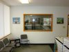
we are in the process of testing some phototex and with good results so far are going to wrap one interior wall of the office, i also posted the pic of the wall now, i plan to use window vision on the glass to see out of my office still

i have been researching all kinds of photos etc, did this up the other day but not sure i like it all together, and even after sitting on the design for a few days, i am still in different about it

any suggestions? maybe my creative juices will start flowing again
 

Attachments

  • DSC04132.JPG
    DSC04132.JPG
    102.3 KB · Views: 97
  • wall wrap 2012.jpg
    wall wrap 2012.jpg
    83.9 KB · Views: 59
Last edited:

sar bossier

New Member
Why not a jungle type theme (or good stock photo)? When I see your avi, I immediately think of Jungle Book or Lion King ...

just a thought
 

jfiscus

Rap Master
Stop stealing my ideas! This is a wall in our office (picture was during installation 2 months ago). Needs more colors in it, kinda monotone with the yellow.
The fluorescent lighting after dark doesn't help photographs well...
 

Attachments

  • wall in progress.jpg
    wall in progress.jpg
    78 KB · Views: 77
  • Digi Wall lowres.jpg
    Digi Wall lowres.jpg
    75 KB · Views: 74

sar bossier

New Member
Stop stealing my ideas! This is a wall in our office (picture was during installation 2 months ago). Needs more colors in it, kinda monotone with the yellow.
The fluorescent lighting after dark doesn't help photographs well...

:Big Laugh urban jungle, cool
 
Last edited:

wildside

New Member
wow, just noticed the color looks way off, i just double checked the jpg, and it turns bright bright green on 101, but not on the jpg, funky:rock-n-roll:
 

Attachments

  • wall wrap 2012.jpg
    wall wrap 2012.jpg
    59.2 KB · Views: 65

signswi

New Member
I'm with Colorado, I like everything but the gears. Looks a bit stock vector to me and I'd rather see it in a counter-punch color like your blue.

Also be aware that putting that much color on the walls can tint the tone of light in the office. That can be an issue if it's anywhere near your printers when it comes to visually checking color. Don't let that stop you, I think all shops should cover their walls in branded graphics, but keep it in mind.
 

Jillbeans

New Member
So are you saying that what we see as yellow gears should be green? Because color is the problem that I see with this layout.
I don't care for the maroon frame around the logo, (even though it's a window) I'd lose that.
Not around the door, either.
I think you need blues and greens, maybe less gears and more tribal/indigenous.
Love....Jill
 

wildside

New Member
the maroon is actually wood frame work just to show where it falls really

i don't know about it anymore, the idea i had over the weekend was to do a scene of town from the early 20's or so, i have tons of these pictures, and then using my window as like a billboard in the middle of it all

the other idea i had was something in the background with the window being anchored with chains hanging from the ceiling making it look more 3 dimensional, but not very refined idea for sure

i haven;t had much time to spend on it like i want for sure
 

signswi

New Member
Honestly I'd rather see some crazy jungle theme or even better, a cityscape silhouette and in the streets wandering giraffes, lions, monkeys, etc...maybe even the city burned out/destroyed with giant chimps swinging from the crumbling skyscrapers...

Then in the negative space of the sky your awesome logo with an intense yellow and red sunburst (like you have now, only more intense) drawing focus to it. So like the foreground is the crazy city jungle silhouette scene with your logo as the sun casting the intense glowy red yellow backlighting.

Put on some dubstep and get it done, son! Such a great brand mark, get a little nuts with it.
 

wildside

New Member
here is the second round of this idea, am i making progress or just starting to shine the clean end of a turd?
 

Attachments

  • wall-wrap-2012-2.jpg
    wall-wrap-2012-2.jpg
    80.3 KB · Views: 69

4R Graphics

New Member
I like post 13 as well but I also think Jill was on to something with some tribal type stuff not really feeling the gears but the rest is looking good and the colors are nice.
 

phototec

New Member
here is the second round of this idea, am i making progress or just starting to shine the clean end of a turd?

Wildside, what do gears have to do with being WILD?

As mentioned above, the gears look like stock vector art, also it looks to MECHANICAL to be considered WILD.

You have been give several good ideas, think out of the box, go WILD!

:popcorn:
 

Jillbeans

New Member
I love Josh's suggestion.
But #13 does look better than the initial attempt.
Still not digging the gears, although the colors are a lot better.
 

wildside

New Member
i am not sold on the gears either, the initial idea was the "inner workings" that without the parts all working together it just isn't working, in my head it makes total sense lol

the evolution thing would be cool, a baboon not an orangutan, at this point i think i am over thinking it all and need to start from scratch

so i think i may step away from this for a few more days and see if anything else comes to mind, as i do feel i am trying to polish a turd at this point
 

JoshLoring

New Member
Wildside,
Isn't designing you own stuff the WORST!!

I highly overanalyze, over think and redo our own personal media. I have a brochure that's 5 months in the making.. It's ok.. It's part of being a designer. Your not having a block- you just care about your image.
 
Top