SellersSign&Design
New Member
Change at least one line to Comic Sans. Possibly make another Brush Script. Then you'll have a nice banner!!!
Why would that be obvious ??
Why would that be obvious ??

signguy 55;1242543[SIZE=1 said:]You know what's scary about all this? There are a few members who actually believe this an actual job design. What started as a joke on a Friday afternoon is now an actual critique of a make believe job[/SIZE]. Are there really some members here who believed this was an actual job in the works? Unless you've been on Uranus for 5 years you know all about the "Feed the children" 500 banner order. Just when you think you've seen it all something like this comes along and shows how bad off our trade is.
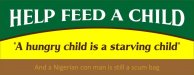
I made many of the changes that everyone suggested but the client decided to stay with the first version. I think it looks contemporary like a lot of the designs I see around these days. Who really wants boring block letters anyway. The key is to stand out among a sea of blah...
I made many of the changes that everyone suggested but the client decided to stay with the first version. I think it looks contemporary like a lot of the designs I see around these days. Who really wants boring block letters anyway. The key is to stand out among a sea of blah...
")
I made many of the changes that everyone suggested but the client decided to stay with the first version. I think it looks contemporary like a lot of the designs I see around these days. Who really wants boring block letters anyway. The key is to stand out among a sea of blah...
So I edited the design from all the suggestions and this is what Reverend Scamilton shot down.

So I edited the design from all the suggestions and this is what Reverend Scamilton shot down.