-
I want to thank all the members that have upgraded your accounts. I truly appreciate your support of the site monetarily. Supporting the site keeps this site up and running as a lot of work daily goes on behind the scenes. Click to Support Signs101 ...
You are using an out of date browser. It may not display this or other websites correctly.
You should upgrade or use an alternative browser.
You should upgrade or use an alternative browser.
What does everyone else think?
- Thread starter eahicks
- Start date
skyhigh
New Member
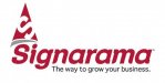
My first impression was a hunk of pizza floating around.
i thought it was a piece of pizza floating above the name...
You guys forget to pack your lunch today???
http://www.youtube.com/watch?v=0DxlOWVVQWE
"You're not you when you're hungry"
DougWestwood
New Member
Wow..someone at SAR **** you off? Sorry you have a bad opinion of them...they are all not the same however. I will say with my 21 years experience and the owner's 13 years, we are not like whatever misconception you seem to have.
NOT a misconception. Have dealt with almost all the SaRs in the Vancouver area. One clown wanted to hire me, but since they were a "family business", they did not pay overtime. I said not my "family". Worked at another shop where we had this IDIOT helper, whom we fired after he continually screwed up work and lied about it. Guess where he found a job? SIGN-A-RAMA!!
Yours might be different, but you are swimming against the current of other SaR shops who do nothing to enhance the brand.
Craig Sjoquist
New Member
The old one was more readable,
The new one just does not give a good professional business image, reminds me of Colorado's logo.
A sign shops logo should be way better unique or way professional image, old one was at least readable but plain this one is nether but modern.
The new one just does not give a good professional business image, reminds me of Colorado's logo.
A sign shops logo should be way better unique or way professional image, old one was at least readable but plain this one is nether but modern.
d fleming
New Member
Wow..someone at SAR **** you off? Sorry you have a bad opinion of them...they are all not the same however. I will say with my 21 years experience and the owner's 13 years, we are not like whatever misconception you seem to have.
You asked what I thought, I told you. Over thirty years in the biz, MY name over the door.
TammieH
New Member
TammieH
New Member
I wish they had some sort of design contest where actual designers threw in their ideas
But that would have stepped all over some poor little sensitive designers toes!
Yeah I'm in agreement with most everyone. I don't like it...but what does it matter.
I wish they had some sort of design contest where actual designers threw in their ideas and then drew from that. Instead they had someone at corporate design it. I heard there were a few options in the design process that were even worse. Oh well....
Not sure where you were when this all went down, but this design WAS part of a contest. AND it was from a store level designer. I believe the guy is out in AUS.
As far as the design, I like the wordmark. But the icon not so much. I see pizza. Looks like the logo from Z Pizza when they first opened. I also see party hat.
SignManiac
New Member

TammieH
New Member
Im hungry!
What? No cheese?
shoresigns
New Member
Compared with the old logo, it's refreshing. It certainly looks a lot less dated. The Superman cape looks alright but I don't know if it's an appropriate theme for a sign company. On the other hand, one of the biggest realtor duos in our city uses the Batman Forever font on their logo and it seems to work for them.