-
I want to thank all the members that have upgraded your accounts. I truly appreciate your support of the site monetarily. Supporting the site keeps this site up and running as a lot of work daily goes on behind the scenes. Click to Support Signs101 ...
You are using an out of date browser. It may not display this or other websites correctly.
You should upgrade or use an alternative browser.
You should upgrade or use an alternative browser.
Need Help What font did GM used for Chevrolet (Camaro) door labels 1997?
- Thread starter aaberg
- Start date
oldgoatroper
Roper of Goats. Old ones.
Nearly all automotive badging is custom drawn by in-house designers.
In the cases where fonts exist like "Nissan" or "Porsche", these fonts were built after the fact by font designers who are fans of the badge style.
In the cases where fonts exist like "Nissan" or "Porsche", these fonts were built after the fact by font designers who are fans of the badge style.
S'N'S
New Member
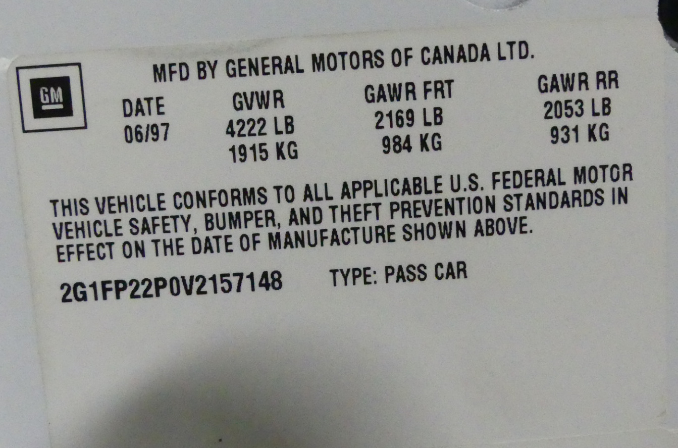
I'm restoring a Camaro 1997 and need to make new labels for the driver door side. What font did GM use?
Try here..... Search | Brands of the World™
oldgoatroper
Roper of Goats. Old ones.
Well, I'must not interested of their logos. I need to know the font used on labels, like door labels showing tire pressure, VIN label etc. Label font on short side of driver door. Those labels are used in all GM cars and are more common text.
Well, then post a picture of the labels in question, the best quality you can, and likely someone will be able to tell you what font they are...
GAC05
Quit buggin' me
Not sure what font that is.
There are photos of the other door logos here:
1997 Chevrolet Camaro Z28 SS SLP Anniversary Stock # 157148 for sale near Columbus, OH | OH Chevrolet Dealer

There are photos of the other door logos here:
1997 Chevrolet Camaro Z28 SS SLP Anniversary Stock # 157148 for sale near Columbus, OH | OH Chevrolet Dealer
Replacement VIN Sticker, VIN Labels, Tire Pressure Label | Auto Data
I have used this Co. A few times and have had great results.
I have used this Co. A few times and have had great results.
shoresigns
New Member
Adobe or Linotype would work fine. Either classic Helvetica or Helvetica Neue would also be fine. The differences between them are too miniscule to identify on a label that small.Thank you! You have made my day!
Perhaps you also know what brand of the Helvetica Bold Condensed?
You could also rasterize the text at a low resolution without anti-aliasing for a more authentic look.
shoresigns
New Member
I'm doing the label in InDesign. Can you explain more about rasterize effect?
I'm referring to the "staircase" effect where you can see the square pixels around the edge of the letters.
Once you're done in InDesign, export to TIFF at 300 ppi, then import into Photoshop
- Shrink the image down so the text is around 28-36 pixels in height
- Add a threshold layer and tinker around with the setting (default is 128) to adjust the weight of the letters.
- Image Resize > UNTICK "Resample" > Change width/height back to the original print size. Your resolution will be low - that's what you want.
- Export to TIFF for printing
shoresigns
New Member
No it doesn't. Gaussian blur and threshold are two completely different effects that look nothing alike.I used Gaussian blur in Photoshop, guess that gives same effect?
I have tried to do as you suggested, but don't really get this correct. can you explain more detailed how you do? Thank you!No it doesn't. Gaussian blur and threshold are two completely different effects that look nothing alike.
eahicks
Magna Cum Laude - School of Hard Knocks
Well, then post a picture of the labels in question, the best quality you can, and likely someone will be able to tell you what font they are...
What? Aren't we all mind readers?
shoresigns
New Member
I posted detailed instructions earlier in the thread. Which part are you having trouble with?I have tried to do as you suggested, but don't really get this correct. can you explain more detailed how you do? Thank you!
Another easier way to do it would be to simply set the text in Photoshop and turn off antialiasing. It's the dropdown box right next to the point size - change it from "Sharp" to "None".
