-
I want to thank all the members that have upgraded your accounts. I truly appreciate your support of the site monetarily. Supporting the site keeps this site up and running as a lot of work daily goes on behind the scenes. Click to Support Signs101 ...
You are using an out of date browser. It may not display this or other websites correctly.
You should upgrade or use an alternative browser.
You should upgrade or use an alternative browser.
What kind of Fonts would you like to see more of?
- Thread starter Steve C.
- Start date
Shovelhead
New Member
You may choose more that one.
Also, Would having a Chisel version make you more likely to purchase a
font? I know a lot of people here don't care for chisels, but I noticed quite
a few in the recient design contest.
I voted for a bold headline typeface Steve.
Mark me down for one vote against a beveled version.

SignosaurusRex
Active Member
I voted for a bold headline typeface Steve.
Mark me down for one vote against a beveled version.
X2
mountainmang
New Member
marquee is my favorite bold font but i find myself using it too often because, well, just because :Big Laugh
Pat Whatley
New Member
I can make this more difficult for you....I'd love to see more font families. I'm quickly replacing most of my old standby fonts in favor of more selections with different weights and options. I bought the entire Bodega Serif family a while back and have used the snot out of it. I'm buying the Bodega Sans as soon as budget allows. I know, it's a lot to ask of a small foundry...just answering the question.
A little less grocery store window banner...
I understand. It probably wont supprise you that those are among the
best sellers....Puff Daddy, Roadhouse, Cricket, and California Plug. And
as one who's background is mostly ShoCard, Window Splash, Grocery
Banner....they are much easier.
I can make this more difficult for you....I'd love to see more font families. I'm quickly replacing most of my old standby fonts in favor of more selections with different weights and options. I bought the entire Bodega Serif family a while back and have used the snot out of it. I'm buying the Bodega Sans as soon as budget allows. I know, it's a lot to ask of a small foundry...just answering the question.
Yes...more difficult
 I noticed that in some of your work, I think
the Early Bird Special Signs....incredable! I've thought of doing that with some
fonts, but usually by the time one is finished, I'm so sick of it that a bold, lite,
condensed or italic version is out of the question. Thanks for the suggestion.
Signguyno1
New Member
Old school, sharp serif, bold and thick & thin sign writers display fonts.
bob
It's better to have two hands than one glove.
I understand. It probably wont supprise you that those are among the
best sellers....Puff Daddy, Roadhouse, Cricket, and California Plug. And
as one who's background is mostly ShoCard, Window Splash, Grocery
Banner....they are much easier.
I'm sure that you sell the hell out of those. To me they and their brothers represent sign writer schlock, a hand you use when you don't have time to do it properly.
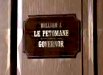
If you want to do an interesting face, watch the movie Blazing Saddles. In one scene in the governor's office there's just a glimpse of a door lettered 'Attorney General' in a rather narrow high waisted face with a double stroke for the top of the 'A' and an interesting treatment on the curves of the 'O' and, I assume, all other characters with rounds. It's a quite nice hand, very late 19th century. If you do it, you simply have to name it 'Hedley'
Jillbeans
New Member
That would be a hilarious name, bob. I love your sometimes droll suggestions.
Steve, I think you need a slab serif. hahaha
Actually, I voted for retro. My second choice would be bold headline.
While I love a good period font, some of them are used as much as Flamey uses Cricket.
Thanks for asking!
Love....Jill
Steve, I think you need a slab serif. hahaha
Actually, I voted for retro. My second choice would be bold headline.
While I love a good period font, some of them are used as much as Flamey uses Cricket.
Thanks for asking!
Love....Jill
Shovelhead
New Member
I'm always looking for interesting ideas, I'll get Blazing Saddles. Not a big
fan of Mel Brooks humor, but I guess I don't have to watch the whole thing.
Thanks for the suggestions.
DOOR
Attachments
Pat Whatley
New Member
but usually by the time one is finished, I'm so sick of it that a bold, lite,
condensed or italic version is out of the question.
If you're scared say you're scared.