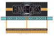
Think that he is going in the right direction with the first design. He is taking it up a notch from just typing an old signpainter font and putting some art he stole off google with it. And I buy food at the carnival by the quality and taste, not by the layout of the trailer. He could have the best looking
signs but the toothless carni spinning the cotton candy with magenta old sugar from last month around the edges is not getting my business.
This is a very interesting concept or approach.
You say you will buy something to eat based upon it's taste and quality..... not the wrapper or advertisement. I would imagine that same theory would cross over into the kind of automobile you buy or the clothes you wear. I believe many of us think this way, but really only think..... and don't practice what they preach.
I'm not pointing the finger at you John, but what about all the many, many threads and posts here... where everything is based on price, availability and what the general consensuses is ??
How many people on this forum alone, ask for opinions on particular printers or inks or even substrates to use without any personal preference whatsoever ??
I too, buy based upon my personal preferences as you claim you do, but I, along with you and some others, think I'm in the vast minority in that department.
If I was at a carnival and the lines were very long at any given stand and the air just smelled amazing, I would go there. Now, don't get me wrong..... I also experiment and try new things, but I'm usually very cautious when going that route. However,
again like you..... the outside colorings don't really intrigue me, cause I know it's all based on what the mind's eye sees and the average person can be fooled.... even if someone is trying to look upscale and hip. Now, if when I get up to the head of the line and the person is oozing from sores all over her/his arms and hands, I'll probably just turnaround and walk away. I'm weird like that. I'll stick to what I know is good, however the tooth count doesn't bother me.... as long as they didn't take a bite out of my funnel cake when I wasn't looking.
Nope, one can be easily fooled by the cover and if it's too clever, I just figure they had some smart
sign person on the other end filling their heads with all kinds of mumbo-jumbo about some effect they can get in Photoshop or something.
Ya mean you wouldn't buy cotton candy from this sweetheart. Look at that lovely smile.........

 Screen Shot 2013-01-22 at 8.15.36 AM.jpg68.3 KB · Views: 193
 Screen Shot 2013-01-22 at 8.15.10 AM.png80.3 KB · Views: 140
 Screen Shot 2013-01-22 at 8.13.55 AM.jpg26.4 KB · Views: 134
 Screen Shot 2013-01-22 at 8.13.29 AM.jpg39.5 KB · Views: 149
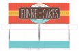 Screen Shot 2013-01-21 at 12.58.27 PM.jpg48.7 KB · Views: 150

")
