jfiscus
Rap Master
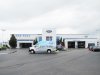
We had a customer call up and ask if we could wrap an armadillo for them... a Ford Armadillo that is.
For the vehicle: It's the new competition for the Sprinter. It's a lot cheaper initially and parts are cheaper to buy also (Ford vs Mercedes), so expect to run across a few in the future as people cut costs on new purchases. It was nice to see something new, but it's not as polished as the sprinter is yet.
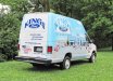
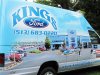
For the wrap: To me it was just as hard (tall/large) as a sprinter, except no window recesses! The body lines are deep, but I wrapped into them as they are horizontal only.
Took a lot of material and time, but the end product was nice. Got a little tricky around the doors, but overall not too bad.
Took the photos myself with my Canon Powershot SX20IS and stitched them into a panorama.
For the vehicle: It's the new competition for the Sprinter. It's a lot cheaper initially and parts are cheaper to buy also (Ford vs Mercedes), so expect to run across a few in the future as people cut costs on new purchases. It was nice to see something new, but it's not as polished as the sprinter is yet.
For the wrap: To me it was just as hard (tall/large) as a sprinter, except no window recesses!
The body lines are deep, but I wrapped into them as they are horizontal only. Took a lot of material and time, but the end product was nice. Got a little tricky around the doors, but overall not too bad.
Took the photos myself with my Canon Powershot SX20IS and stitched them into a panorama.