been in the industry for a long time....something i learned is that you ONLY have to please the customer! The customer made adjustments on the design and he got what he wanted-thats all that matters.
I posted some of our work to share with the community, not brag. You only do this work if you love it and thats why i joined the site. If its not your cup of tea....no biggie! but i can care less bout negative opinions because we produce quality work backed with years of integrity.
So.....in conclusion-thank you for welcoming us and we hope to share more work with all of you in the near future!
")
 Some of our recent work !
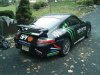 Monster Porsche Nov. (5).jpg42.6 KB · Views: 200
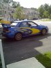 WRC complete.jpg45.9 KB · Views: 163
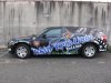 Skin Kreations wrap , RCS, ghost pinstripe 002 (2).jpg83.6 KB · Views: 150
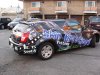 Skin Kreations wrap , RCS, ghost pinstripe 001 (2).jpg99.5 KB · Views: 154
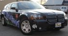 Skin Kreations wrap , RCS, ghost pinstripe 005 (2).jpg48.5 KB · Views: 149
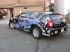 Skin Kreations wrap , RCS, ghost pinstripe 011 (2).jpg89.2 KB · Views: 158
 Bushkill Falls and LSI install 016 (2).jpg73.1 KB · Views: 164
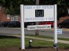 LSI.jpg79.5 KB · Views: 165
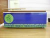 OCT pics and work 2 003.jpg43.6 KB · Views: 167