• I want to thank all the members that have upgraded your accounts. I truly appreciate your support of the site monetarily. Supporting the site keeps this site up and running as a lot of work daily goes on behind the scenes. Click to Support Signs101 ...

Wrecker service truck lettering

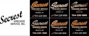
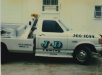
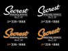
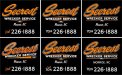
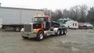
This design is for a heavy wrecker service. They have black trucks with orange fenders and roofs, and want the lettering to match. They basically want Harley-Davidson logo colors (black, orange, white, silver). The black logo off to the side in the picture is how the trucks have been lettered for years. The only thing I was told to keep is the "Secrest" in a slanted script because it has always been done that way. The combination of that slanted script and the requested color scheme on a black truck has been a nightmare for me as far as coming up with something I am happy with. I am looking for feedback on the 6 options I have drawn up, which aspects work and which ones don't? Does the basic layout look good or should I scrap it and start over? The ones with silver leaf would be hand laid and turned, not printed.
attachment.php
 

Attachments

  • secrest.jpg
    secrest.jpg
    55.2 KB · Views: 566

sardocs

New Member
Middle bottom would be my choice, but the up-slant on the script creates a space that seems awkward. Perhaps an other line or a little swash would fill it. Or the t could descend to give it support.
 
Middle bottom would be my choice, but the up-slant on the script creates a space that seems awkward. Perhaps an other line or a little swash would fill it. Or the t could descend to give it support.

That space bothers me too! I will see what I can do with a swash or something.
 

Craig Sjoquist

New Member
Middle bottom .. extending the T at bottom would help that space yes

All the others have to many defects to be well readable except middle bottom which seems just right
 

Craig Sjoquist

New Member
On another note I have never been a fan of the words dial, call, phone even same weight & size area code then the other 7 numbers

The 7 numbers of a phone are the most important & that is what you want to remember, the words dial, call, phone, are meaningless & the area code is a reference to something ya already know & even if from out of town still just a reference.
 

Bretbyron

New Member
I like the word Dial in front of the PH# it's old school. I like the chrome one but I bet it could be hard to read sometimes, you could swap the chrome and orange. Maybe the bottom right one with the word Dial and a chrome pinstripe/outline around the name.


Or, the top middle one, Change the brushed metal to orange and chrome the drop shadow.


I like them all, but If I had to choose now as they sit, it's bottom right.

Send them all to the customer and make them decide your next path.
 
On another note I have never been a fan of the words dial, call, phone even same weight & size area code then the other 7 numbers

The 7 numbers of a phone are the most important & that is what you want to remember, the words dial, call, phone, are meaningless & the area code is a reference to something ya already know & even if from out of town still just a reference.

I agree with all of this. The only reason I threw in the words in front of the numbers is for the "old school" look. I will do some examples without the words and a smaller area code to see how it looks.
 
I like the word Dial in front of the PH# it's old school. I like the chrome one but I bet it could be hard to read sometimes, you could swap the chrome and orange. Maybe the bottom right one with the word Dial and a chrome pinstripe/outline around the name.


Or, the top middle one, Change the brushed metal to orange and chrome the drop shadow.


I like them all, but If I had to choose now as they sit, it's bottom right.

Send them all to the customer and make them decide your next path.


I am definitely a fan of the "old school" look. I normally try to replicate the hand-painted style if the customer will allow me to.
 
Ok, here are two revisions:

attachment.php


It may be hard to see but the first one has a silver drop shadow. I left the "Dial" in that one just in case that is what the customer is looking for.
 

Attachments

  • secrest 2.jpg
    secrest 2.jpg
    52.9 KB · Views: 407

Rick

Certified Enneadecagon Designer
I say it's almost there but...
On the last samples.. on the left, there are 6 separate typefaces/fonts - on the right, 5

That's too many. To me it's kind of a mess

The City/State strokes need to be consistent.
The phone numbers kerning... on the 1888 needs adjustment.
I think if "INC" was the same typeface as "WRECKING SERVICE"
and all the script were the same, it might look better...
That would be 3 typefaces...

The other thing it the silver may still make it hard to read, a dark silver may be more legible.
The highlghts on the orange script may work better if it was a lighter orange instead of white.
 

2B

Active Member
Left of the revisions with area code added and the leg of the "t" extended further down (almost to the same level as the "S")
 

OldPaint

New Member
i have done a ton of WRECKERS/TOW TRUCKS...............
AND not many of em with a SCRIPT!!!!
i did 10-15 for this guy had 8 other tow truck companies..........and iam the guy that caused them to outlaw magnetics for tow trucks............i had one guy had 3 tow companies, with truck lettered for one........he would stick magnetics over the name so he could get more rotations.........heheheheheehehe
look here:
https://www.google.com/search?q=jer...e=univ&ei=z7ryVIiQLsrToAS2rICoDw&ved=0CB4QsAQ
 

Attachments

  • jd2.jpg
    jd2.jpg
    38.7 KB · Views: 162

Rick

Certified Enneadecagon Designer
I just noticed that drop down "T"... looks a little awkward and
the name loses the slant... I say slant it some more and don't
worry about the space. Treat it like a logo, the concept is a car/truck
being lifted or when the arm is raised, the logo will slant.

I saw the truck, it's pinstriped so those embellishments may not go
well with that, if the other trucks get lettered, and they are all wildly
different, how will this layout work on the other trucks? I think it should
have the least amount of graphic fill so it can go with any vehicle on their
fleet.

Old Paint mentions the jersey style, and that lends well to applying it to
different vehicles too, though it's not all that old school and may not fit
your clients style.

I did a quickie layout showing 3 typefaces, with the slant idea... and one
that might go on the tow arm. Maybe a pinstriper could hit the spot under the logo
 

Attachments

  • secrest.jpg
    secrest.jpg
    64.3 KB · Views: 169

Craig Sjoquist

New Member
I like the 2 last changes

Yes retro ads using the words dial, phone, call is normal since phones was fairly new then & the left one has a retro look indeed.
The right one using a small area code really brings out the 7 numbers.
I also like the slant on Monroe NC which helps the main name flow.
Using so many fonts or putting in INC are personal preferences of customer or designer same as to shade or outline the main name.

Kerning issues can be correct & anything else as customer sees examples of the 2 or 3 choices no more & all should be different as possible because they may like a part of this one & part of that one & the total look of number 3.

Design guides lines of advertising should be based as if on a billboard 1st, no more than 7 areas for the eye to go to, kerned so it all can be readable at 60 mph, normally no more than 3 fonts max of 5 fonts, but different fonts add interest, so still this is only guide lines of advertising does not mean this way only. Logic of this is, if it will work on a billboard it will work on anything smaller better.

Good going & glad ya made some good improvements over the design after showing, ya just gotta step back from the PC & look at it even upside down & ya can pick at it bit by bit till perfect, any customer would be proud of where ya going with ya work indeed.
 

OldPaint

New Member
the one thing most are not addressing is ........
MOST TOW VEHICLE LETTERING.......
has to conform to STATE REQUIREMENTS.......
that is where you need to start. most states have enforceable rules about size, and visibility.
and the tow truck people KNOW THIS...they should provide you with some guidelines to go by.
this is why most i lettered was old school, large and readable. except the REPO man, now he was required to have numbers on the truck a set size....but the law didnt state the keller))))) so you got a red tow truck, with a shade different red lettering)))) its there......but you gota look for it))))
 

bob

It's better to have two hands than one glove.
Five lines in five type faces? This is a typographical mid-air collision.

Try one specimen face for 'Secrest' and everything else in one family.

Make 'Wrecker Service' larger and have it overlap a bit with 'Secrest'. See what it looks like with one or the other on top. Do something to tie it all together, right now it's five independent lines floating around in the same area.
 
I appreciate all of the help with this. I like a mix of old school hand painted style and Jersey style. I can picture what I am trying to do in my head, but getting the fundamentals right and finding that perfect balance is what is the hardest for me, but you all have been very helpful with pointing me in the right direction to fine tune it! It is just difficult for me to break away from the gold leaf with a black drop shadow and white highlights haha. I took all of your suggestions and tried to put them together as many ways as possible. I came up with 6 more panels, some are very much different than what I started with.

attachment.php


Some of the suggestions I added to these (just so I can keep track of what I've changed):
-Reduced the number of typefaces
-Changed highlight color to a bright orange instead of white
-Changed the script fonts to one font, with the exception of "Secrest"
-Tried to add lines above and below "wrecker service"
-Adjusted the phone number kerning
-Changed "Monroe, NC" script to one with equal weights in the caps and lower case
-Overlapped "WRECKER SERVICE" on top of the "Secrest"
-Darker silver for the drop shadow on the top left

I know it was suggested that a block font for "Secrest" would be easier to read, but the slanted script has been in use for 50 years and people in the area associate that with the company so that really needs to stay the same. As far as meeting state requirements, this is a tractor that will be pulling a lowboy so it does not have to meet state wrecker requirements. But for the wreckers, as long as the company name, DOT numbers and phone number are at least 3" tall it is fine.

This is the first truck that will be lettered:

attachment.php
 

Attachments

  • SECREST 3.jpg
    SECREST 3.jpg
    92 KB · Views: 434
  • secrest truck.jpg
    secrest truck.jpg
    63.6 KB · Views: 403

Craig Sjoquist

New Member
Oh this is fun
Anyway best of 6 goes to ...drums roll... bottom left crowds are roaring & 2 best goes to ..top right crowd cheers some more ha ha ha

On the bottom left one I really like the action on title even though the ramp to Inc is bit strong it does have some great action

I like all the others as well & what I liked on some of them is the triangle lines which does a excellent fill for under the name, although I picked top right it's overlap looked a better fit & weight of lines looked good.

All 6 have a good flow to them, the shaded one looks great also but just seemed plain with little action as with the one with Monroe NC as a non-italicized.

Thank ya for making this fun to watch & interesting
 
Top