• I want to thank all the members that have upgraded your accounts. I truly appreciate your support of the site monetarily. Supporting the site keeps this site up and running as a lot of work daily goes on behind the scenes. Click to Support Signs101 ...

Wut I see is not Wut I get

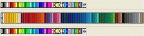
How can I get my screen to give me a closer color to what the Edge2 is going to output? Notice the screen was a lighter purple but the actual printed color was much darker.. How can I get the screen colors to mimic the prints? Muchas gracias!
 

Attachments

  • Picture 1458 (Medium).jpg
    Picture 1458 (Medium).jpg
    64.3 KB · Views: 123
  • Picture 1460 (Medium).jpg
    Picture 1460 (Medium).jpg
    56.2 KB · Views: 108
Ya I have many problems like too much time... many expensive hobbies, a 1959 morris minor i seldom drive.. 6 wheelers , quads, rc helicopters, harleys, man the list goes on.. But right now I want to tackle my Edge problem :)
 

Billct2

Active Member
Peewee...you are experiencing one of the many painful problems of the "magic" of digital.
Unfortunately calibarating monitors to match output is a rather complicated and expensive endeavor. The cheap solution is to print out samples of the spot color, spectratone color and process color pallettes that the edge makes. I believe there are utilities built into the Gerber program that will do this semi automatically. After a while you'll get used to what the machine will actually do vs what you see on the screen. Kinda like knowing what colors 1shot will make when mixed together. Even after almost 20 years of using an Edge sometimes I will still run a sample print if it will be a large and/or multicolor job. I just did that today with a new bike club colors decal.
 
Thank you Bill for the response.. I kinda figured it may end up being a learning curve issue.. I guess i should have also stated that I built the design in Flexi then exported the image into Omega . None the less this is such a neat tool to have in the garage. But boy has it been a learning curve! :thankyou:
 

mtroup

New Member
I am not a pro at color profiling but one way to get somewhat close is to print the image out and then hold it next to your monitor and play with the RGB values on your monitor controls until you get something close.. you can also download a program like QuickGamma and adjust the gamma as well.. now your monitor will display everything in pretty dull tones but it should be pretty close on most images/files if you do it this way.. at least it will get you by until you learn to truly color profile.
 

visual800

Active Member
print and see, print and see...this is to replace trial and error, trial and error. screen color vs what you get:covereyes: Once you print it wrong at least you cna fix it. I would suggest printing out a bunch of colors and then adjusting the program as to what you need
 

CropMarks

New Member
Have you tried printing out any cmyk charts and going by their color? That's an easier way to hit a color.

I think there is also a way to let composer suggest foil combinations that will get you as close as it thinks it can to different pantone colors (or at least I think it was pantone colors). I could be wrong, it's been about a year since I've used an Edge 2. When I used one, I did mainly spot colors/foils... (tomato red, cobalt blue, silver, teal, etc...).
 

luggnut

New Member
color is a complex subject.. but first thing make sure you are using the same input profile for all your software. (i think flexi's default is adobe rgb1998).... so all your software's settings should be that the same. for less thinking about it use sRGB on everything. or you do all designs in CMYK.. it might have a lower color gamut but would be more predictable.

next a cheap monitor calibrator like pantone's huey... if your display is way off you will be fighting an uphill battle all the time.
 
Okay here's what I did... it ain't rocket science but a little Redneck thinkin' .. i used Ultrasnap to capture the color charts on the screen... then I exported that as a Jpeg and imported it into Omega 4.0 .. I then printed it at both 300 & 600dpi Edge2 300dpi cmyk setting... Now I have a printed sample of what I see on the screen before and after it's sent to Omega as an image... and what they will look like after being printed.. Redneck? Yes... but it may work for me :thumb:
 

Attachments

  • SHARPS CHEVY VAN.jpg
    SHARPS CHEVY VAN.jpg
    33.8 KB · Views: 101
Tony that whole thing is an image created in Flexi .. then exported as a Jpeg into Omega 4.0 then printed. The cutlines were Vectors also exported . The screen in Flexi and the screen in Omega look spot on colorwise but the print was way off.
 
So after many prints and many setting changes in the Color Managment window I found that the settings Lugnut suggested ( Adobe 1998) and Fred's previous mentioning of Gerber Edge2 CMYK 30O dpi gave the best interpretations of the screen colors.. and it also eliminated most of the dreaded black specs in some colors.. Thanks again guys.. now back to making stickers! :)
 

Fireguy

New Member
another simple method is making sure the colors you design with are the foils that you have for the edge. If you are using spot foils vs process you will get different results. They key is doing the same thing everytime and you will maintain the same colors. Good Luck and happy printing!:wavingflag:
 
Top