• I want to thank all the members that have upgraded your accounts. I truly appreciate your support of the site monetarily. Supporting the site keeps this site up and running as a lot of work daily goes on behind the scenes. Click to Support Signs101 ...

Your business card sucks!

Has anyone else seen this video? The guy is a riot but he makes a great point.

[video=youtube;uoXaRORian4]https://www.youtube.com/watch?v=uoXaRORian4[/video]

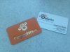
Anyway, I stumbled onto this video several weeks ago and it's had me thinking about business cards for our business. The ones we've had up until now are 16 pt. stock, gloss UV, 4 color front and back. Really nice cards that we've been getting printed using 4over for the last couple of years now. We run all of our customers cards this way with the option of matte or gloss and little more. So recently we set up an account with silkcards.com. I've known about these guys for a while and they make great quality printed materials andhave some extensive custom options. I decided the best thing to do would be to redesign our cards and add all the bells and whistles. This would also be a good sample to show people the many design options available to really set your business card apart from others. I'm not going to post the artwork because I left it at work, for one thing, and it won't do the cards any justice anyway. What we ordered are the 32 pt. (two 16pt. cards back to back) with the front side being a full color print with die cut, silver foil, embossing, and spot UV. The back of the card is full color with spot UV only. Also we got the 3mm rounded corners option and the PMS 032 Red colored edges option. Some thing like this...

479923_10151346381401911_384293033_n.jpg

Has anyone else tried going fancy with their cards, and if so, do you think it helped increase sales based on first impressions?

Oh, and by the way, yes I will be posting photos of the finished cards when they arrive.
 
Last edited by a moderator:

visual800

Active Member
Die cut, pop up, embossed and foiled? A little over the top for me. My cards are 3x3 and I dont even hand them out cause I dont care.

I gotta hand it him on one thing. OWNER, CEO. PRESIDENT, ESQUIRE, LLC, INC, and then we have the Drs with all their F'n BS titles after their name WHO FREAKING CARES? I dont and I am not impressed.
 

the graphics co

New Member
I have some fancy cards from silk cards. Pretty similar setup to what you ordered i imagine, double stack, die cut, foil & spot uv. They are great, and people always notice them when i hand it to them. they take an extra couple seconds to ask about them and give them a good look over, which never happened with my old cards.

The only issue with silk cards and my cards in particular is it took over a month for them to arrive, and they came from china??? It is a bit of a hard sell to tell people it is going to take a month for production of their cards, no matter how nice they are.

Also, they don't really state on their website or on the phone for that matter, that if you want an intricate die cut, or any of the spacing between your cut outs is less than 2mm you will have to pay for premium die cutting services. It took 3 phone calls for them to even mention that the premium service was available, they just kept telling me i had to modify my design so there weren't any areas that were under the 2mm threshold.
 

phototec

New Member
The best part about the video is the statement, "I don't make a criticism without a resolution", I think that is a good point, often on here people criticize without offering up a resolution. It would be good when you criticize someone or something, to offer a resolution to remedy the problem. Be constructive.


Anyway, back to the high-end fancy business card, not sure if I would spend $4 on a card like in the video, the OP didn't say want he spent on his fancy Silk Cards. I do notice cards that are different and stand out, and have been given a few that are larger than the normal size, never liked them because they don't fit the standard card folio I keep me cards in.


Just like some of the wrap designs posted on here for review, I have seen bc's that are so cluttered with die cut, silver foil, embossing, and spot UV, etc, the contact info is NOT clear, very distracting and not readable.


Whatever happened to Keep it Simple Stupid?
 

chafro

New Member
Man those cards really suck. A picture of yourself die cuted? Really????

might as well give away real size coro prints of himself wearing a tux.
 

the graphics co

New Member
The best part about the video is the statement, "I don't make a criticism without a resolution", I think that is a good point, often on here people criticize without offering up a resolution. It would be good when you criticize someone or something, to offer a resolution to remedy the problem. Be constructive.


Anyway, back to the high-end fancy business card, not sure if I would spend $4 on a card like in the video, the OP didn't say want he spent on his fancy Silk Cards. I do notice cards that are different and stand out, and have been given a few that are larger than the normal size, never liked them because they don't fit the standard card folio I keep me cards in.


Just like some of the wrap designs posted on here for review, I have seen bc's that are so cluttered with die cut, silver foil, embossing, and spot UV, etc, the contact info is NOT clear, very distracting and not readable.


Whatever happened to Keep it Simple Stupid?


While it does have lots of bells and whistles, my card is not cluttered and the contact info is very clear and readable.

It retains simplicity and adds a texture that engages additional senses when you hand it to someone.
 

Attachments

  • bus card.jpg
    bus card.jpg
    45.8 KB · Views: 148
While it does have lots of bells and whistles, my card is not cluttered and the contact info is very clear and readable.

It retains simplicity and adds a texture that engages additional senses when you hand it to someone.

Very nice! That's absolutely what we are going for, also. The cards I ordered sound over the top, but they really are simple.
 

Atomic DNA

New Member
We have been using 4Over for long time and decided to go with Silkcards a few weeks ago.

The pros:
Nice that they are die cut, heavier, and offer more options than 4Over. Color edges are pretty neat.

The cons:
The design templates offered? Fuhgetaboutit, there are none. Hell, don't need no stinking templates anyway!
The finish. I thought I was getting a jet black card for the base. There seems to be some "flecks" or discolorations of grey consistently through the entire order.
The lead time. Damn, 4over has ruined me. Took a little over a month.
The cost compared to 4Over. They ended up being about a a quarter per card (1,000 ordered) and there isn't really any room to mark these up to the customer.

For the record, I opted for the 28pt, full color, spot UV, die cut, colored edges, radius corners and white base
 

Attachments

  • 20140607_151256.jpg
    20140607_151256.jpg
    62.1 KB · Views: 124

bob

It's better to have two hands than one glove.
It's a business card kids. Something you hand to someone rather than writing your name and number on piece of paper. It's not a visual feast, a collection of tactile thrills, or a pithy commentary on the human condition. It's a simple business card listing, hopefully, your name and contact information. That's what a business card is for.
 

Craig Sjoquist

New Member
It is called a business card, but it is a 1st impression.

Now you can be redneck simple with clean readable copy in a great layout & attract a good crowd for most businesses.

But if your into graphic communications & have a redneck simple card, it had better be outstanding because your customer is expecting you to do better.

The biggest lesson to this your creative design, layout skills in creating your brand is highly important.

So reading & learning all ya can about branding & then putting it all to use& action,is way more important than the bells & whistles
 

Desert_Signs

New Member
It is called a business card, but it is a 1st impression.

Now you can be redneck simple with clean readable copy in a great layout & attract a good crowd for most businesses.

But if your into graphic communications & have a redneck simple card, it had better be outstanding because your customer is expecting you to do better.

The biggest lesson to this your creative design, layout skills in creating your brand is highly important.

So reading & learning all ya can about branding & then putting it all to use& action,is way more important than the bells & whistles


[video=youtube;qoIvd3zzu4Y]https://www.youtube.com/watch?v=qoIvd3zzu4Y[/video]
 

Color Spot North

New Member
Die cut, pop up, embossed and foiled? A little over the top for me. My cards are 3x3 and I dont even hand them out cause I dont care.

I gotta hand it him on one thing. OWNER, CEO. PRESIDENT, ESQUIRE, LLC, INC, and then we have the Drs with all their F'n BS titles after their name WHO FREAKING CARES? I dont and I am not impressed.
I was with you until you mentioned doctors :)
They do a ALOT of stuff for those credentials, and yeah I'd use them as well, and so would you. Good post though
 
Top