• I want to thank all the members that have upgraded your accounts. I truly appreciate your support of the site monetarily. Supporting the site keeps this site up and running as a lot of work daily goes on behind the scenes. Click to Support Signs101 ...

First Post

Gino

Premium Subscriber
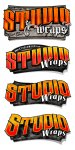
What tiki said about opening the middles up a little... but in addition, the thicks are so thick continuously.... that its a little hard to read at a glance. The top thin stroke [horizontals] don't even appear.... which from a distance tends to distort the letters. Our eyes here on a sign site will identify the word quickly, but the average person relying on legibility will be at a disadvantage. They won't have a word to associate with those letters and their eye might look elsewhere for something more understood.

Something that many people don't realize is that when the majority of people read... they aren't reading words all the time but doing a sort of eye/mind association and need complete help with words out of the ordinary. I believe this fits the area of needing help.

Don't get me wrong, I like what you have and just about any other sign maker or artist will like it too, but take it out of its comfort zone and you might have trouble.

When showing this to other people.... only let them look at it for two seconds and then take the paper away.... and see how many people could really read your name.
 

JoshLoring

New Member
Ah. Good stuff Gino. I guess it comes down to modifying the font then a little more then it comes.
Something like this then. More open ah?

attachment.php
 

Attachments

  • Wrap-Logo4.jpg
    Wrap-Logo4.jpg
    102 KB · Views: 143

Rick

Certified Enneadecagon Designer
I think I know what you are trying to do, it's got that shine to it, but it looks too "warpy" and "computery". "studiowraps is way too opened up on top.

I'm pretty sure you have been here but there are some great examples of the look you want here for inspiration.... http://www.letterheadfonts.com/gallery/
 

JoshLoring

New Member
Rick, you know what.. I don't even need the website on this image. It is going to be placed somewhere else anyhow.

Scratched it up a little bit and removed the unneeded website and phrasing.

New Image. haha

attachment.php
 

Attachments

  • Wrap-Logo3_nosite.jpg
    Wrap-Logo3_nosite.jpg
    92.9 KB · Views: 145

astro8

New Member
Hi Josh...the problem is in your spacing..it's reading 'S' 'T' 'UDIO'...you're gonna have to play around with it to get looking right...my eye doesn't flow along it, it jerks along.
 

Mosh

New Member
Try making the "S" bigger and overlapping th "T" on it a bit, with a black outling to seperate it. I think it looks cool.
 

JoshLoring

New Member
Consensus says.. I agree. { I'm pretty easy going for a graphics guy huh? }

You have to be open minded though otherwise you will never learn. I like this environment.

Ok guys. To all that have contributed. Here's an update. Whats next? haha

attachment.php
 

Attachments

  • Wrap-Logo4.jpg
    Wrap-Logo4.jpg
    106 KB · Views: 137

speedmedia

New Member
I like your work. Checked out your site, good solid creative and clean stuff.

I do like where you are going with this. I like the spacing better on that last one.

Thanks,
Kurt
 

JoshLoring

New Member
Thanks Kurt. You've got some nice stuff on your site as well. First time posting for suggestions and it seems to be working out well.
 
Last edited:

DOGraphics

New Member
I'm not qualified to really make suggestions but from an amature.

Look at post #17 from Tkik.

The Largers "S" looks alot better. IMO

just my $0.02
 

MachServTech

New Member
death by committee. good progression, but I really like the second version the best if the "d" was modified that would be my choice layout.
 
Top