• I want to thank all the members that have upgraded your accounts. I truly appreciate your support of the site monetarily. Supporting the site keeps this site up and running as a lot of work daily goes on behind the scenes. Click to Support Signs101 ...

First van job

Tim Aucoin

New Member
great job tim! did you enjoy it?
vehicle graphic are a favorite of mine.... from design & install to seeing them out on the road.

Thanks for all the positive comments everyone!
Yeah Gigi... I quite enjoyed it. Actually, I loved it! I find it relaxing. I think next time I'll be playing some P!nk in the background! :Big Laugh

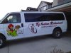
Even though I had the design printed out to look at, I was still in awe of how nice it looked in real life when it was all done up. I'll admit I was actually felt pride when it was done! :smile:

The greatest reward though was the smile that was on my customer's face when he saw me drive it up to his restaurant. He was out the door before I parked it with a HUGE grin on his face! He made us Chai Tea and didn't stop smiling, even after we left! He immediately had me send him the pics I had taken and FB'd them to his brother (co-owner) who was in Edmonton at the time. His brother switched his FB profile pic to the pic of his van and immediately started "marketing" his new truck! I'd say they were very happy with the job!!! :clapping:
 

bob

It's better to have two hands than one glove.
I hate to pop the big bubble of love and complements that seem to be gushing forth from all posters to date but the result as shown in the original poster's three pictures is an excellent example of full contact mediocrity.

On the sides there are four separate and somewhat less than integrated objects; some easily recognizable clip art, a rather aesthetically thin logo, some mediocre script with far too heavy caps, and an afterthought bullet list of three items. All four things sort of float there, disconnected. Nothing ties the four elements together in any way. Moreover, the phone number in what is no doubt the number set for the dubious script is especially annoying.

All in all, dubious typography and and mediocre overall layout.
 

Tim Aucoin

New Member
I hate to pop the big bubble of love and complements that seem to be gushing forth from all posters to date but the result as shown in the original poster's three pictures is an excellent example of full contact mediocrity.

On the sides there are four separate and somewhat less than integrated objects; some easily recognizable clip art, a rather aesthetically thin logo, some mediocre script with far too heavy caps, and an afterthought bullet list of three items. All four things sort of float there, disconnected. Nothing ties the four elements together in any way. Moreover, the phone number in what is no doubt the number set for the dubious script is especially annoying.

All in all, dubious typography and and mediocre overall layout.

:ROFLMAO::ROFLMAO::ROFLMAO: You crack me up! Maybe everyone is being "polite" because it's my first van job (although I'm sure most are sincere), but that's fine with me. I like it, it's easy to read and it will generate more business for me and my customer. It won't meet everyone's high standards, and I'm fine with that. Perhaps I'll get better as I do more... perhaps I'll always produce mediocre work. Either way I'll make money and business will go on! :thumb:

Mediocre script? I'll be sure to let A&S (signfonts.com) know what you think of his font!!
Thanks for your honesty Bob!
 

strypguy

New Member
Some of my work comes out similar to this. Nothing wrong with it at all. We can't all be "perfect" every time. Especially in the eyes of others in this biz. If I'm happy with it and my customer is happy that's all that matters to me. It's been working for over 16 years for me. I still learn everyday and strive to be better but many times good really is good enough.

Looks good!

John
 

Tim Aucoin

New Member
Some of my work comes out similar to this. Nothing wrong with it at all. We can't all be "perfect" every time. Especially in the eyes of others in this biz. If I'm happy with it and my customer is happy that's all that matters to me. It's been working for over 16 years for me. I still learn everyday and strive to be better but many times good really is good enough.

Looks good!

John

:thankyou:
 

phototec

New Member
one change i would make is to his thumb (i think thats what it is ) i would make it the same colour as his fingers the black makes it look funny
just my 2 cents
shane


The BLACK thumb looks like he is holding a NUT or something dark, I would have made a small change to the graphic, making the thumb the same flesh color as the other fingers, see example below.

Just because someone gives you the artwork, doesn't mean you can't prefect it so your finished work looks better!

Just my honest opinion.

:notworthy:
 

Attachments

  • Before & After copy.jpg
    Before & After copy.jpg
    262.8 KB · Views: 72
I agree with MikePro, in a perfect world I would have liked to have seen the Indian on the rear quarter panels and windows. Sounds like the budget may not have allowed that.

I think the driver's side is laid out better than the passenger side. On the passenger side, I'd have put the bullet points to the rear, then the name, then the logo.
 

CentralSigns

New Member
:ROFLMAO::ROFLMAO::ROFLMAO: You crack me up! Maybe everyone is being "polite" because it's my first van job (although I'm sure most are sincere), but that's fine with me. I like it, it's easy to read and it will generate more business for me and my customer. It won't meet everyone's high standards, and I'm fine with that. Perhaps I'll get better as I do more... perhaps I'll always produce mediocre work. Either way I'll make money and business will go on! :thumb:

Mediocre script? I'll be sure to let A&S (signfonts.com) know what you think of his font!!
Thanks for your honesty Bob!

Well I think it looked good T3, :Oops: Bob just missed his Lithium today as usual. Don't let him bother you. Can't wait to see the next one you get done!!
 

Steve C.

New Member
Tim, bob has, on several occasions, made me aware of his dislike for my fonts.
If bob were some great designer or if he ever gave a positive word to anyone
or anything it might matter. What little work he has exhibited on this board
gives new meaning to mediocrity. So ignore him as I do. There are a great
number of extremely talented designers who use Signfonts. And I think your
Van job is very well done and will serve your customer well.
While some of the points he makes may have some merit, isn't it funny
how he seems to relish the opportunity to make them, without ever saying
anything positive.
 
J

john1

Guest
Where did you get the artwork for the guy at Tim? Looking for a resource for some artwork when i need to get some.
 

2NinerNiner2

New Member
Looks good, Tim ... both the van and the business! :) Going to have to scoot up to Airdrie and give Taj a try :)

BTW, what happened to the "happy, smiley" Tim 'on the corner' (au coin) in your previous avatar ? :) ... 'bob' perhaps? LOL! :)
 

bob

It's better to have two hands than one glove.
Tim, bob has, on several occasions, made me aware of his dislike for my fonts...

Au contraire. I've never, ever, said I did not like your fonts. I own several of them and they see a lot of action.

What I have said is that the most of them tend more to an uber causal grocery store window banner style and, typically, that's not part of my scene. Perhaps it's that I did way too much of that flavor or work way back before the most of you were born and if I actually wanted that look, I'd grab a brush instead of a computer.
 

Steve C.

New Member
Au contraire. I've never, ever, said I did not like your fonts. I own several of them and they see a lot of action.

What I have said is that the most of them tend more to an uber causal grocery store window banner style and, typically, that's not part of my scene. Perhaps it's that I did way too much of that flavor or work way back before the most of you were born and if I actually wanted that look, I'd grab a brush instead of a computer.

:cool1:
Then I stand corrected. I have also spent some time doing grocery banner work,
mostly for liquor distributors and package stores. Which is why many of my
types reflect that style.

Sorry to pirate you thread Tim. :thread
 

Tim Aucoin

New Member
The BLACK thumb looks like he is holding a NUT or something dark, I would have made a small change to the graphic, making the thumb the same flesh color as the other fingers, see example below.

Just because someone gives you the artwork, doesn't mean you can't prefect it so your finished work looks better!

Just my honest opinion.

:notworthy:

I agree with you (and everyone else) on the black thumb point. I will fix that up once I get back from vacation and the weather clears up enough! It will be a simple fix! :smile:

Tim, bob has, on several occasions, made me aware of his dislike for my fonts.
If bob were some great designer or if he ever gave a positive word to anyone
or anything it might matter. What little work he has exhibited on this board
gives new meaning to mediocrity. So ignore him as I do. There are a great
number of extremely talented designers who use Signfonts. And I think your
Van job is very well done and will serve your customer well.
While some of the points he makes may have some merit, isn't it funny
how he seems to relish the opportunity to make them, without ever saying
anything positive.

Thanks Steve. I do see where Bob is coming from, as I (gulp) do read most of his posts. Sometimes they are good for a laugh and sometimes he does make good points. He does come across as being quite abrasive and he definitely calls a spade a spade. I don't agree with 99% of what he says and he could really use a lesson in tasteful responses, but other than that he seems like a decent guy! I can't make a personal judgement because I've never met him in person. Don't know if I'd ever want to either! :rolleyes:

Where did you get the artwork for the guy at Tim? Looking for a resource for some artwork when i need to get some.

Customer supplied the artwork. He uses Photobucket.

Looks good, Tim ... both the van and the business! :) Going to have to scoot up to Airdrie and give Taj a try :)

BTW, what happened to the "happy, smiley" Tim 'on the corner' (au coin) in your previous avatar ? :) ... 'bob' perhaps? LOL! :)

Definitely give it a try. Tell Sonny and/or Bhinder how you heard about it, they will be thrilled! PM me and let me know what you think. Where in Calgary is your shop? Drop in and see me anytime. I'm right downtown!

I decided to give people a look at the more "serious" side (yeah, right!!) of me in the new avatar! Those who have met me know better!! :Big Laugh
Sorry to pirate you thread Tim. :thread
Never a problem Steve. I like when a thread starts conversations and creative thinking, even if it is about Bob! :smile:
 

Suz

New Member
Tim, Congrats on your first Van! Looks good to me. Not just being kind either. Haha!
Really, it is very clean, very nice! I'm sure your Customer sincerely loves it!
 

Marlene

New Member
Nice looking job, clean, readable, great image.

+1
the font and the graphic work for the business as even from a distance, you know what this business is by the look of it. nice work (am I not just being polite) there will be the little things like the black thumb and flipping the image that could have brought it up a step but don't worry as most people who will look at this won't be people like us who see EVERY little thing:wink:
 

TyrantDesigner

Art! Hot and fresh.
Good stuff, I would have avoided the lettering over the seam ... you can get away with a tiny amount of issues in the future of that vinyl if you use an edge sealer where the split in the script is and just on the edges of the phone number where it is close to. But otherwise, kudos on a good looking van.
 

David Wright

New Member
Vans are just too tough to get layouts right, when dealing with wheel wells, windows, hinges etc.
Looks good but I played with it a little and tried to tighten it up, logo in with the name more, copy on door and "tried' to center phone more but that pesky wheel well. Could make it smaller I guess.

If I was to do it again, the logo a bit smaller to fit nice with copy.
 

Attachments

  • taj.jpg
    taj.jpg
    107.2 KB · Views: 88
Top