-
I want to thank all the members that have upgraded your accounts. I truly appreciate your support of the site monetarily. Supporting the site keeps this site up and running as a lot of work daily goes on behind the scenes. Click to Support Signs101 ...
You are using an out of date browser. It may not display this or other websites correctly.
You should upgrade or use an alternative browser.
You should upgrade or use an alternative browser.
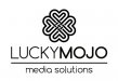
Logo for critique
- Thread starter GoodPeopleFlags
- Start date

mattcook8150
New Member
Good and Bad
As someone who has a degree in Marketing...i can tell you that you have something here. it's nicely laid out, but i would recommend that you decrease the size of the logo and make your stroke on the logo a little thinner. You don't want the logo to overpower the name. At this point, my eye is automatically drawn to the swirly logo and not the name. Brand awareness is key to being noticed...you don't want someone to see your logo at a fleeting glance and only see the swirly...you want them to be attracted by the logo and directed to the name...
Make your logo direct attention to the name...branding starts with the name...
I see hearts, so like a lot of people say, it has potential. I would say push some more iterations out.
There is an issue of clarity and readability in the logogram so adjusting the line weight and/or working on reducing the elements to make it read like a four leaf clover. Don't lose sight of your concept and make concessions in design to "make it look right".
There is an issue of clarity and readability in the logogram so adjusting the line weight and/or working on reducing the elements to make it read like a four leaf clover. Don't lose sight of your concept and make concessions in design to "make it look right".
bob
It's better to have two hands than one glove.
As someone who has a degree in Marketing...i can tell you that you have something here. it's nicely laid out, but i would recommend that you decrease the size of the logo and make your stroke on the logo a little thinner. You don't want the logo to overpower the name. At this point, my eye is automatically drawn to the swirly logo and not the name. Brand awareness is key to being noticed...you don't want someone to see your logo at a fleeting glance and only see the swirly...you want them to be attracted by the logo and directed to the name...
Make your logo direct attention to the name...branding starts with the name...
A degree in marketing? Is it too late to get your money back?
The raison d'etre of a logo is the logo, not the name. A symbol only requires seeing while a name requires reading and any attendant comprehension. The former is instantaneous while the latter takes some time. The object is to have an instantly recognizable symbol, not text. Witness the ever popular example; the Nike swoosh.
This is a natural progression from a time when few could read. Witness the line from Ivanhoe: " I'll meet you at the sign of the long bow."
That notwithstanding, this design appears as some sort of Celtic knot floating around with way too much text for a logo. Find some way to tie everything together.
J Hill Designs
New Member
some sort of Celtic knot ..... tie everything together.
I see what you did there! :ROFLMAO:
GoodPeopleFlags
New Member
Pixels Are Bad Mmmkay?
New Member
Thanks for the feedback! Does this address the issues? Or create new ones?
The new logo is way better, because it's simplified greatly and there is more negative space in this logo than the first.
I didn't notice this the first time I looked at this post, but now I see that the celtic knot forms 4 letter L's. Was this intentional?
Edit: And I now notice there are 4 stylized M's visible as well.
GoodPeopleFlags
New Member
No, it wasn't intentional but pretty cool! ")

Stormyj
Just another guy
Im kind of seeing what the others have already mentioned, hearts instead of clovers. I thought, what if you some how incorporated the "y" into the stem of the clover, however that would limit your manipulation of the use of the clover on top and in front. Just throwing that out there
Jillbeans
New Member
I prefer the revised icon, but in my opinion, the font is not very attractive.
Have you tried it in caps and lower case for better legibility?
I'd like to see it that way, with the subcopy in all caps.
I also think it would have a friendlier look in caps and lower case.
Love....Jill
Have you tried it in caps and lower case for better legibility?
I'd like to see it that way, with the subcopy in all caps.
I also think it would have a friendlier look in caps and lower case.
Love....Jill
GoodPeopleFlags
New Member
Here's a version in upper/lower case. The negative space under the logo and above the letters throws me off. I wouldn't be objected to using another font but I've searched all my fonts and dafont and can't find anything that jumps out at me. I think it should be a sans serif, and not a script, being that the graphic is so busy already. I'm definitely open to suggestions, though.
Attachments


GoodPeopleFlags
New Member
Very nice, Tiki! Thanks for the input. I'm a big fan of your work.