artbot
New Member
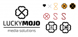
i like it as a draft and i hate it as a final. the font/s looks just straight stock. the relationship of the letters (spelling) is clunky with odd negative space. if the logo being the celtic thing is written in stone then you'll need to do lots of vector work to the company name to bring them together stylistically. this critique also depends on how much you are being paid. if it's a few hundred bucks, then maybe it's done. but if this is a $1000-$3000 job then the font has to go. it has to be customized.
as for the logo, why couldn't the celtic icon thing be intertwined vectored vine-work of an "L" and an "M"? that would be cool. otherwise the logo just looks like clip art.
as for the logo, why couldn't the celtic icon thing be intertwined vectored vine-work of an "L" and an "M"? that would be cool. otherwise the logo just looks like clip art.


")