-
I want to thank all the members that have upgraded your accounts. I truly appreciate your support of the site monetarily. Supporting the site keeps this site up and running as a lot of work daily goes on behind the scenes. Click to Support Signs101 ...
You are using an out of date browser. It may not display this or other websites correctly.
You should upgrade or use an alternative browser.
You should upgrade or use an alternative browser.
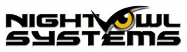
Night Owl Logo
- Thread starter Nourse1
- Start date
Carl Crabtree
New Member
Clean, easy to read. Look good.
Craig Sjoquist
New Member
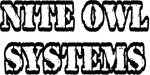
reads Night-Vowl..... sys-t-ems
V1
This is the first version. Since I knew it was Night Owl I never really read it as Night Vowl. Definitely don’t want someone to get that out of it. This one seems kind of plain though.
Don’t want to spend a lot of time on it because it’s just for the Wrap. But I don’t want a lame logo messing up the rest of my design.
reads Night-Vowl..... sys-t-ems
This is the first version. Since I knew it was Night Owl I never really read it as Night Vowl. Definitely don’t want someone to get that out of it. This one seems kind of plain though.
Don’t want to spend a lot of time on it because it’s just for the Wrap. But I don’t want a lame logo messing up the rest of my design.
Attachments
SignManiac
New Member
Lots of potential, keep tweaking.
Jillbeans
New Member
Glad you changed it.
I try not to arch an italic font.
I'd change the font.
Something like Tallington.
Love....Jill
I try not to arch an italic font.
I'd change the font.
Something like Tallington.
Love....Jill
SignManiac
New Member
Marlene
New Member
Systems needs some kerning adjustments. cool concept though!
+1

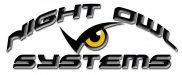
Tallington
Here it is with Tallington what yah think?
Glad you changed it.
I try not to arch an italic font.
I'd change the font.
Something like Tallington.
Love....Jill
Here it is with Tallington what yah think?
Attachments
qmr55
New Member
Here it is with Tallington what yah think?
I'm not a big fan of the bevel. Also, try to never distort italicized text. The layout is terrible as well!
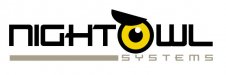
3 versions
Well here are 3 versions. I changed the Kerning in "systems" on V1
V2 is still the same. I'm not convinced it reads Night Vowl I mean really?
I like using the owl eye for the O and the eyebrow just makes it look ominous.
I like V3 better than V1. Would like some feedback on V3
Does everyone hate the font? IMO it looks tough and this is going on a race car.
Oh also posting what they used past 2 years anything is an improvement. Think the 5 dollar logos would have been 5 times better.
Thanks for all the Input!
Attachments

Border
New Member
What if you put the eye to the rear, might not look like a V then. On the eye I used a slightly lighter black as well.
Here's a rough design of what I mean.
This is nice!
taylormadesigns
New Member
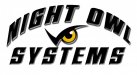
agree with S'N'S above.......maybe hard to read for a wrap...not a fan of the arch/bevel letters either...
italicized text
The font I used on this is "LHF Tallington BETA TRADITIONAL" regular no Italics. Not real fond of this layout either.
I'm not a big fan of the bevel. Also, try to never distort italicized text. The layout is terrible as well!
The font I used on this is "LHF Tallington BETA TRADITIONAL" regular no Italics. Not real fond of this layout either.