-
I want to thank all the members that have upgraded your accounts. I truly appreciate your support of the site monetarily. Supporting the site keeps this site up and running as a lot of work daily goes on behind the scenes. Click to Support Signs101 ...
You are using an out of date browser. It may not display this or other websites correctly.
You should upgrade or use an alternative browser.
You should upgrade or use an alternative browser.
Our New Logo
- Thread starter Locals Find!
- Start date
- Status
- Not open for further replies.


GAC05
Quit buggin' me
It is hard to tell.
Your attached image is about the same size as the thumbnail.
Seems too busy for a "logo".
The 2 symbols on the top I get
On the bottom it looks like you sell or service mail boxes and offer some kind of Rorschach testing.
I think you need to simplify all of it to leave a clear, clean impression of what you do without having to study the image.
wayne k
guam usa
Dave Drane
New Member
Lost me?? I can't see any association to making signs at all. The colors are more like pre school logo?? I just can't gel with it.
Jillbeans
New Member
Surely you jest.
I'm not trying to be mean, but what the hell is that?
Some sort of ancestral seal gone postal?
Yes we get the idea that you must have something to do with print.
But a mailbox?
A shoddy yard sign?
A bullseye looking thing?
Please for the love of God and mankind, and all designy things,
hire a professional or go home.
Love.....Jill
Locals Find!
New Member
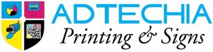
I have attempted to upload it bigger due to some saying it was too small to view.
The 4 pieces are to represent the 4 divisions of the company.
The upper left corner is a 4-color registration mark to represent print
The upper right corner is a Real Estate yard sign for our Real Estate Sign Division
The lower left corner is supposed to represent our bulk mail division better than the (unknowing illegal use of) USPS eagle I had before.
The lower right is a QR (Quick Response) Code that represents our QR Code Web Marketing Division.
The 4 colors are CMYK and I tried to tie it all into a Crest and if you look closely the 4 lines running through it and the circle are to be a subtle registration mark.
Unlike our previous logo no clipart whatsoever was used. Everything was vectored from scratch with the exception of the QR code that I have software to generate.
If you have input on how to improve it please tell me. I am open to suggestions. I posted it to get honest feedback.
Attachments

weaselboogie
New Member
Wow...
I thought you'd be starting over. This is not a logo.... its a collection of crappy symbols all rolled into one. As if Voltron was assembled in a landfill.
I really don't think you have a concept of what company imaging entails which is sad because that is what career you have choosen. A logo doesn't encompass every freakin product that you produce. A logo's meaning is to identify, not to explain.
This is terrible... hire a professional and release the reigns to let them do what they're good at.
SignManiac
New Member
I really like it, but think you need to include one more icon that shows you are a designer. Perhaps on top and centered. You could show a mouse with a pen and pencil crisscrossed through it to represent the artistic creativity that your company offers.
I think your new direction paints a very clear picture. Just remember, all those colors will cost more to reproduce. Let's see it in your black and white version too.
I think your new direction paints a very clear picture. Just remember, all those colors will cost more to reproduce. Let's see it in your black and white version too.
shakey0818
New Member
Wow...
I thought you'd be starting over. This is not a logo.... its a collection of crappy symbols all rolled into one. As if Voltron was assembled in a landfill.
I really don't think you have a concept of what company imaging entails which is sad because that is what career you have choosen. A logo doesn't encompass every freakin product that you produce. A logo's meaning is to identify, not to explain.
This is terrible... hire a professional and release the reigns to let them do what they're good at.

Jillbeans
New Member
Delete it from your computer and hire someone like Neato, Weasel, Stevo, etc etc.If you have input on how to improve it please tell me. I am open to suggestions. I posted it to get honest feedback.
These symbols mean something to you but nothing to a client.
It's just awful, and that's as honest as I can be.
There is nothing remotely good in it, and it won't do you any good.
You cannot polish a turd.
Locals Find!
New Member
I really like it, but think you need to include one more icon that shows you are a designer. Perhaps on top and centered. You could show a mouse with a pen and pencil crisscrossed through it to represent the artistic creativity that your company offers.
I think your new direction paints a very clear picture. Just remember, all those colors will cost more to reproduce. Let's see it in your black and white version too.
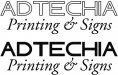
Thank you for the Feedback. I rarely do anything black and white when I do I don't incorporate the whole crest.
I keep it simple like the attached
Attachments
Jillbeans
New Member
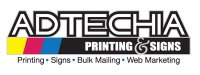
That is almost equally as bad.
Looks like something just typed out.
The fonts don't go together.
You have sort of a space age font, which suits the name, in your title but then you threw in some almost declaration of independence schoolbooky looking font underneath.
It's like wearing a Michael Jackson jacket with a catholic schoolgirl skirt.
Locals Find!
New Member
That is almost equally as bad.
Looks like something just typed out.
The fonts don't go together.
You have sort of a space age font, which suits the name, in your title but then you threw in some almost declaration of independence schoolbooky looking font underneath.
It's like wearing a Michael Jackson jacket with a catholic schoolgirl skirt.
Thank you Jill. Do you have a suggestion for a better font?
Pat Whatley
New Member
Did you really just throw a Voltron reference out there?As if Voltron was assembled in a landfill.
Ad....scrap it and start over. I understand what you're trying to do but it's just not working and I don't think this direction is gonna work out for you.
John Butto
New Member
how she really feels
I'm with ya...
I'm with ya...
Surely you jest.
I'm not trying to be mean, but what the hell is that?
Some sort of ancestral seal gone postal?
Yes we get the idea that you must have something to do with print.
But a mailbox?
A shoddy yard sign?
A bullseye looking thing?
Please for the love of God and mankind, and all designy things,
hire a professional or go home.
Love.....Jill
Locals Find!
New Member
Name:
LHF Quantum, Sugargirl, or Convecta (tho I feel 3D is on its way out)
Sign DNA Kaylon Heavy or Banner Heavy
Subcopy:
Art & Signfonts Sign Gothic
Sign DNA Froggy or Stix
LHF Stanford Script
Thanks Jill. I have to leave the Name the way it is. The font I used there is Abtecia which inspired our name.
I am looking into the subcopy fonts though.
Pro Image
New Member
Thanks Jill. I have to leave the Name the way it is. The font I used there is Abtecia which inspired our name.
WOW..............Creative thinking on your..................

Deaton Design
New Member
- Status
- Not open for further replies.