J Hill Designs
New Member
not one to always catch the sarcasm train, but..Horrible
...I caught that one.
not one to always catch the sarcasm train, but..Horrible
not one to always catch the sarcasm train, but..
...I caught that one.
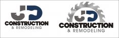
Just for what it's worth, I like the second one in your original post.
It's visually centered, and the blade over the type kind of invokes a sunrise. Also the hammer handle reminds me just vaguely of The Beatles "Drop T" logo.
I do think I might turn the hammer around, but other that that -- or even just as it is -- if I was JD Construction and you gave that to me, I'd be pretty pleased.
the ones without tools are nice. you were able to work in the JD a lot better and overall, it just looks more professional
I like signmaker's original design. The one with the saw blade and the complete hammer. It may not be perfect, but few designs are.
Graphic images can help a design
Graphic images are a big plus in a design, since they can convey a message instantly. True, a hammer graphic is used a lot for construction, but it's an appropriate icon. Of course, you would not want to use clipart in a logo design, but the hammer and saw blade together in this design is a clever variation, and it leaves no doubt about the nature of the business. I would not remove the descending handle of the hammer. It adds to the distinctive silhouette of the logo shape.
A word or logo that has a distinctive silhouette can be easier to recognize. That is one reason why mixed upper and lower case is easier to read, quicker to read, than all capitals. Words in upper and lower case have unique shapes, whereas the shape of a word in all capitals is a plain rectangle. The ascenders and descenders, especially the top halves of the letters with the ascenders, aid in quick recognition.
For the same reason, I like the idea of large and small capitals in JD Construction. It adds to the distinctive shape of the logo. In fact, I would make not only the 'J,' but the 'C' and 'D,' large as well. And letting the larger letters drop below the baseline a little is a nice touch.
True small caps versus fake ones
One point about small caps that is often overlooked: it is better to use real ones rather than fake ones. True small caps are actually designed to accompany regular capitals, serving as a kind of substitute for lower case. They are not just down-sized versions of regular capitals. If you compare true small caps to down-sized regular caps, you can see that the strokes of the true small caps are designed thicker, to match the strokes of the larger, regular sized capitals. Their width-to-height proportions are altered, too. They are wider and look more squatty than a normal capital. That is why the smaller letters in JD Construction look like they don't belong with the 'J.'
Of course, many font files do not include small caps. If you decide to fake small caps by just down-sizing large ones, you can improve the look by shrinking the stroke of the larger capitals, and possibly even adding slightly to the stroke of the smaller caps.
Another way to fake small caps is by using a slightly bolder version for the smaller letters, so the strokes are closer in weight to the larger caps. For example, try a bold for the small caps and a demi-bold for the large.
Here is a link that shows the difference between true small caps and fake ones. The fake ones in the example clearly look awkward and out of place.
http://theworldsgreatestbook.com/book-design-part-5/
Tight spaced letters
One other point: letters that kiss or touch can be very dramatic, but there is a trade-off in decreased legibility. When I design a logo that has tight spacing, I often design an additional version (or versions) for down-sized use. A word with tight-spaced letters can become difficult to read, and not even look the same, when shrunk to business card size, especially if the letters are chunky, having small counterspaces to begin with. Sometimes, when letter strokes are bold or black, the counters can actually disappear when the word is down-sized and printed on paper.
Brad in Kansas City
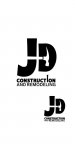
Try using a bolder typeface for JD & centering a hammer in the middle above Construction
Remove (and) and use a ampersand