-
I want to thank all the members that have upgraded your accounts. I truly appreciate your support of the site monetarily. Supporting the site keeps this site up and running as a lot of work daily goes on behind the scenes. Click to Support Signs101 ...
You are using an out of date browser. It may not display this or other websites correctly.
You should upgrade or use an alternative browser.
You should upgrade or use an alternative browser.
2nd try
- Thread starter evie
- Start date
Dan Antonelli
New Member
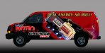
Watch your legibility on main copy. Your running red on red, and blue on red, and trying to use an outline and soft shadow to make it more legible. If you tried white or light grey, it would pop more. Same with the black lettering on the fender area. At night or dusk, it will all run together into the red background.
There doesn't seem to be much synergy with the can branding and your type you are using, so it feels a little disconnected.
If its a brand new product, I might try for bigger photography of can, and ditch the torn thing.
There doesn't seem to be much synergy with the can branding and your type you are using, so it feels a little disconnected.
If its a brand new product, I might try for bigger photography of can, and ditch the torn thing.
Rip could be at a forward angle making the can diagonal. This may allow you to make it bigger and will definitely allow more space on the back end for some copy. Play around with the sizes of the can without being afraid to let it hang off the van (even if only to see how it compares to other options). I'm no guru or even a good apprentice at designing but I can tell you that, to me, the copy just doesn't sit right with the colors and gradients used. It looks like an after thought.
Also, the copy on the fender will go into the curve and become hard to read once installed. Forget about the heavy shadows and white outlines on the copy. Use colors from the can for some of the copy to maintain consistency. Incorporate some of that gold into the background or a box at the bottom of the van. Maybe put the web addy there.
BTW...not sure if it's me, but the can looks upside down.
Oh....and read my sig...so you can see my credentials....
jc
sghobbies
New Member

needs more cowbell!
I have a fever.....and the only prescription is more Cowbell.
signcrafters london
New Member
No male enhancement, no care. (But the layout does look better this time.)
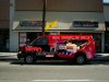
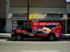
I like it mate. Just a thought though, considering the can has the name on it allready why not make it like a third bigger and delete the name on the front to tidy it up abit. You could still use energy drink on there so people know what it is. You have some talent mate to take it from the first design and recreate it into this. Look forward to seeing pics of the final job.
Cooky
Cooky
mikefine
New Member
I think you killed the original design and concept. It struck me right away, and I am surprised I am alone on this. The first design you did was far more interesting than the current. Go with your original inspiration. It is more alive.
I liked the distorted text -- and it worked with the hand popping out.
In design one, the can is in your face. Design two is just kind of there, like it is falling
out of the van -- not popping out of the van. My vote is go back to design one and tone down the other elements because they conflict with your main image.
iSign
New Member
I don't know how many times I've seen NO BULL on a competing energy drink...
makes me crave another Red Bull!
MikePro
Active Member
lightning bolts out of can!!!Can you make the product spray out the back of the can like a rocket blast?
regardless, i think it looks good!
phototec
New Member
If its a brand new product, I might try for bigger photography of can.
Here a comp with the can enlarged?