-
I want to thank all the members that have upgraded your accounts. I truly appreciate your support of the site monetarily. Supporting the site keeps this site up and running as a lot of work daily goes on behind the scenes. Click to Support Signs101 ...
You are using an out of date browser. It may not display this or other websites correctly.
You should upgrade or use an alternative browser.
You should upgrade or use an alternative browser.
4x4 mdo sign layout, whaddya think?
- Thread starter Flame
- Start date
Flame
New Member
Sign shape was chose by the customer.  Before I stepped into this project...
I politely disagree.
Apparently a "chalkboard" will be hanging underneath this sign as well. Not sure if we are tackling that yet or not, but that will be the 2nd sign, so too many panels might induce clutter.
My original sketch reminded me of "I love Lucy", more black, white and a bit of greys/browns, but the client loves fire engine red, so... this is where we ended up.
Yawn... when I finish waking up with my 16oz quad shot, I'm going to draw a new coffee bean that doesn't look like an exploding jelly bean, and make some tweakings...
Before I stepped into this project...You don't really need those stripes in the background.
I politely disagree.
If you are going with the jigsaw idea, try cutting out a big-ass coffee bean as a secondary panel on which to put the Java Jitters part, then layer that onto a background which has a rounded bottom, putting Cafe under that.
Apparently a "chalkboard" will be hanging underneath this sign as well. Not sure if we are tackling that yet or not, but that will be the 2nd sign, so too many panels might induce clutter.
I really don't like working with red and black.
My original sketch reminded me of "I love Lucy", more black, white and a bit of greys/browns, but the client loves fire engine red, so... this is where we ended up.
Yawn... when I finish waking up with my 16oz quad shot, I'm going to draw a new coffee bean that doesn't look like an exploding jelly bean, and make some tweakings...
Flame
New Member
Aren't customers' creative endeavors just the best?!
lol. The joys of being a designer...
Gino
Premium Subscriber
- I don’t understand the need for that big dip at the top of the sign. What does that achieve ??
- What is that little rule doing below the word ’Jitters’ ??
- The two bottom rules and gingerbread don’t seem to fit the theme either of the letter styles and why do they run off the sign like that ??
- Last, why does the upper ‘J’ look smaller than the other one ?? Is it an optical illusion or did you do that on purpose.
:Oops: one more thing…. the tops of your posts don’t match with anything on the sign or the shape of the sign.
Try looking in the alternate characters of that font, I think Arthur also includes a J that is more traditional.
The panel shape does not suit the lettering.
That letterstyle is from the 40s and your panel is far more traditional/formal.
You don't really need those stripes in the background.
If you are going with the jigsaw idea, try cutting out a big-ass coffee bean as a secondary panel on which to put the Java Jitters part, then layer that onto a background which has a rounded bottom, putting Cafe under that.
Too lazy to sketch something out today.
Love....Jill
OK went and shoveled some snow, Maybe try Flash Script.
I really don't like working with red and black.
Jill I like that Flash Script where did you purchase that? Thanks
Flame
New Member
one more thing…. the tops of your posts don’t match with anything on the sign or the shape of the sign.
That's just a generic thing, I haven't chosen post caps yet.
I don’t understand the need for that big dip at the top of the sign. What does that achieve ??
No clue, her past sign shop designed that.
The two bottom rules and gingerbread don’t seem to fit the theme either of the letter styles and why do they run off the sign like that ??
Doesn't fit?
Last, why does the upper ‘J’ look smaller than the other one ?? Is it an optical illusion or did you do that on purpose.
Excellent deduction. Jitters is slightly larger than Java.
laserman70
New Member
Love the layout. The J's dont look right.
Nice work, I would change the font due to the J's.
Nice work, I would change the font due to the J's.
Jillbeans
New Member
Jerhemi it is LHF Flash Script by my dear friend Arthur Vanson.
http://letterheadfonts.com/fonts/artists/arthurvanson.php
I got to hang out with him last Spring, it was one of the best days of my life.
http://letterheadfonts.com/fonts/artists/arthurvanson.php
I got to hang out with him last Spring, it was one of the best days of my life.
Deaton Design
New Member

Deaton Design
New Member
No problem Flame. I liked your layout, just that panel shape didnt look right with it is all.
Ive used the three post thing a few times with signs, and it looks really good, especially when you stagger them with the middle one being higher. Happy New Year man!
Ive used the three post thing a few times with signs, and it looks really good, especially when you stagger them with the middle one being higher. Happy New Year man!
grafixemporium
New Member
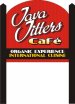
I agree with all of your customer's suggestions... getting rid of the scroll, the line and the coffee bean. That part of the layout looks great now. However, I don't like the new addition at the bottom at all. What purpose does it serve? What the heck does "organic experience" mean anyway? Does "Java Jitters Cafe" not say enough about what the place is? Does the design not say enough about its style?
Perhaps some window lettering could help further describe more specifically what they do and what type of food they serve. I don't think this sign is the right place for it.
Deaton, I love that 3 post suggestion! Very simple and inexpensive way to add some serious style to an otherwise typical sign.
Flame
New Member
However, I don't like the new addition at the bottom at all. What purpose does it serve? What the heck does "organic experience" mean anyway? Does "Java Jitters Cafe" not say enough about what the place is? Does the design not say enough about its style?
Unfortunately this is not a branding project, it is a sign project and my hands are always halfway tied on projects such as this. Customer is doing her own branding, we are merely taking care of her sign.
Personally, I disagree with the entire bottom of the sign and even the size of the sign itself, but it's a wee bit out of my control.
So, considering the request was for those two lines of text, any other ideas on putting them on there?
k.a.s.
New Member
I like your last effort A LOT better. The arch looks great.
As far as the additional copy, I would not make the black go all the way to the edge, let some of the red show so it does not look like two different signs. I don't like the lines of lettering in different colors, maybe do your yellow to white fade. I would add bullets or at least separate them a little for more space.
Kevin
signgal
New Member
one too many font styles. The bottom fonts need to tie into the top fonts more. I know that's their logo but that font is so stylized and different, maybe an uber simple block font.
And you might try "an organic experience" right up under the logo as a tagline and put the other line on it's own in a box like k.a.s. suggested or with a border or something. i don't think it'll be as important if you try the other things.
And you might try "an organic experience" right up under the logo as a tagline and put the other line on it's own in a box like k.a.s. suggested or with a border or something. i don't think it'll be as important if you try the other things.