-
I want to thank all the members that have upgraded your accounts. I truly appreciate your support of the site monetarily. Supporting the site keeps this site up and running as a lot of work daily goes on behind the scenes. Click to Support Signs101 ...
You are using an out of date browser. It may not display this or other websites correctly.
You should upgrade or use an alternative browser.
You should upgrade or use an alternative browser.
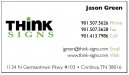
a business card or a hot mess??
- Thread starter thinksigns
- Start date
Brandon708
New Member
Thats better but I would add some more color. A blue back would be cool with your logo very small one the lower corner or some where.
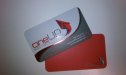
My card is red on the back with the logo really small on it.
My card is red on the back with the logo really small on it.
thinksigns
SnowFlake
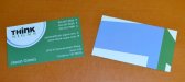
quick layout for what I was thinking about for your card.
I would suggest you tweek and add things
Stop the presses. I really like that. Now I've got more "thinking" to do.
Brandon708
New Member
Marlene
New Member
So I had the idea to put vinyl letters on a mirror and take a picture of the mirror as it was pointed at our storefront.
I forgot to add in my post that thinking up cool things to try is never a bad thing. it may not work out for this but don't stop. you could have done it all in Photoshop but I like that you went past that and gave it a shot with vinyl and a mirror.
thinksigns
SnowFlake

Brandon708
New Member
Much much better. I would give that the green light. good job
this site has some interesting business card ideas: http://naldzgraphics.net/inspirations/60-most-beautiful-and-creative-business-cards-design/
Last edited:
thinksigns
SnowFlake
omgsideburns
New Member
clean
John Butto
New Member
iSign
New Member
sorry the bubble color should match the thinking bubbles
damn dude.. where were you last week??
if that was just $50 worth of internet printing...
I would absolutely throw down another $50 to add John's bubbles... in a heart beat... gotta do it.. oh well, $50... don't let that stop you if you agree that the next 1000 cards you hand out could be that little bit better...shove them puppies to the back of the drawer for other promotional use!
while you're at it, check into the "Spot UV" Brandon was talking about & put even more emphasis on your logo & 'think bubbles"
thinksigns
SnowFlake
I've seen a lot of "think" logos with the thought bubbles. I've attached one from a google search. I wish I came up with it before I saw them but it feels a bit like stealing. Although, maybe the bubbles are too generic for it to be stealing.
Attachments

iSign
New Member
you would have had to come up with it a hundred years ago... it's as much part of visual communication as the light bulb idea... way to common place for any one person to lay claim to, and everyone else to be thieves... but with your name containing "think" AND already working for you in a bubble... John's ides both "justify" the bubble being there (not that you need to, but it does... to me... and that's not a bad thing) and adds visual reference to help remember the name "think" ...which is huge (in my opinion)
Brandon708
New Member
The new cards look great. When I did the layout for you I was messing around adding another bubble on the side to make it look like a thinking bubble but I thought it looked corny so I didn't suggest it. You did good!
-Brandon
-Brandon
4R Graphics
New Member
I like the new cards way to go sometimes simplicity is key ( I wish some of the wrap designs I see had more simplicity).
Brandon,
I would like to know where you get your cards as the foil is nice you can PM me the info.
Brandon,
I would like to know where you get your cards as the foil is nice you can PM me the info.