Ok i am stuck.... Need ideas or a new way to think.
Its an economic association that has several big houses and in each house there is like 10 to 15 apartments. I don´t know what its called in english but i guess tenant-ownership is the closest i can find, but you can buy an apartment or the right to the apartment....
Well anyway, the client hade an old logo with just text and they wanted to redesign the logo so it's easy to see that they have apartements and so on. And further more they wanted it to have a warm and velcoming feeling in the logo.
But....
I have pretty few options when it comes to being creative since the client have given me some directions and rules..
1. I cant change the font.
2. I cant change the color of the font
3. I cant change the kerning of the font
4. I can only use 2 colors in total in the logo...
As you see i am pretty locked........
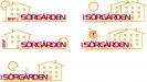
I tried to make a house with several windows to show that it is an apartmentbuilding, and a sun to get the feeling of beeign welcome and that it is a nice place in general....
Well, i think it is pretty boring logo but it sas what they want ( I think) But has anyone any idea to make it i donno know not so boring i guess....
Its an economic association that has several big houses and in each house there is like 10 to 15 apartments. I don´t know what its called in english but i guess tenant-ownership is the closest i can find, but you can buy an apartment or the right to the apartment....
Well anyway, the client hade an old logo with just text and they wanted to redesign the logo so it's easy to see that they have apartements and so on. And further more they wanted it to have a warm and velcoming feeling in the logo.
But....
I have pretty few options when it comes to being creative since the client have given me some directions and rules..
1. I cant change the font.
2. I cant change the color of the font
3. I cant change the kerning of the font
4. I can only use 2 colors in total in the logo...
As you see i am pretty locked........
I tried to make a house with several windows to show that it is an apartmentbuilding, and a sun to get the feeling of beeign welcome and that it is a nice place in general....
Well, i think it is pretty boring logo but it sas what they want ( I think) But has anyone any idea to make it i donno know not so boring i guess....


 , i kinda like it.