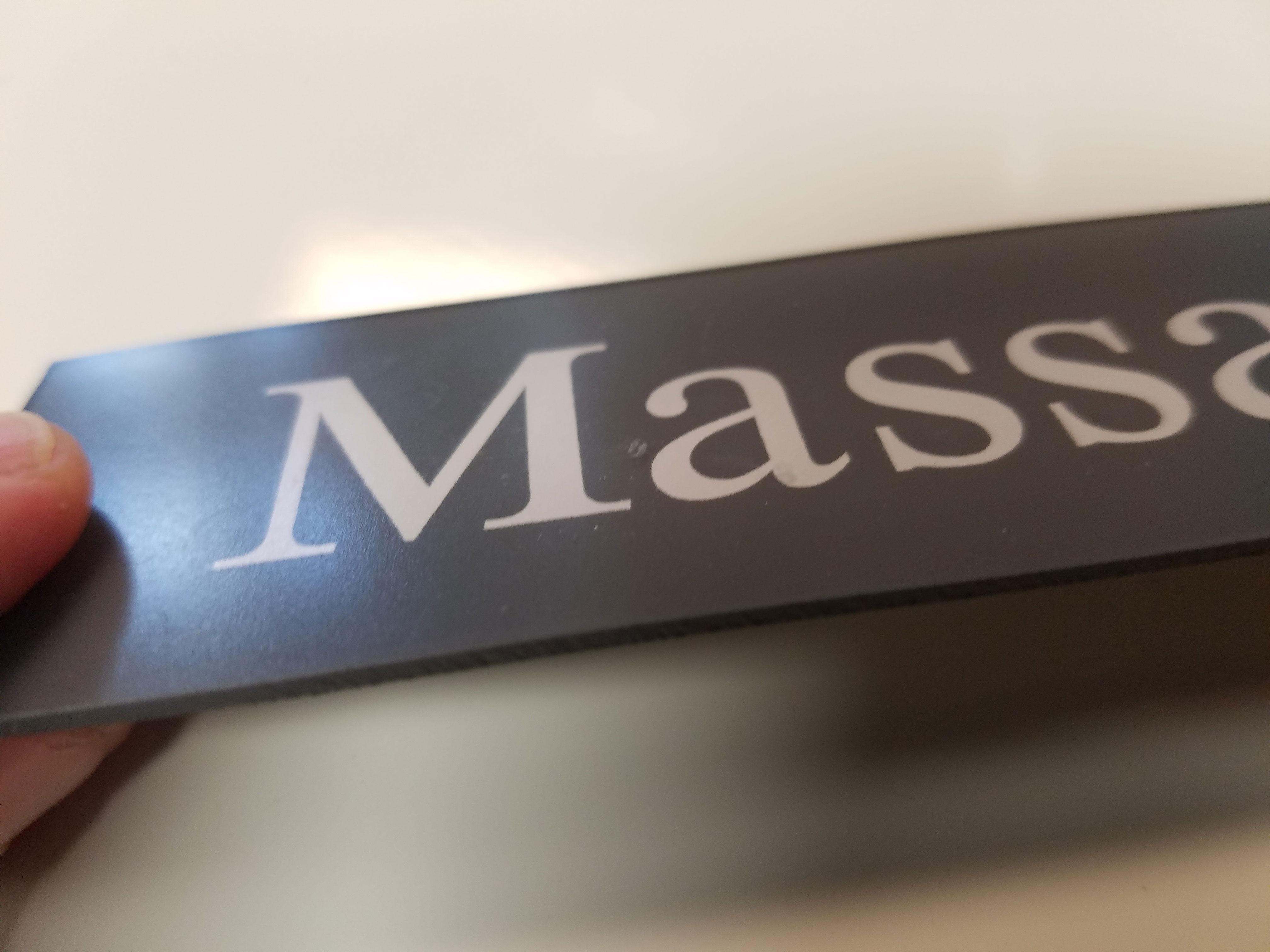
We are working with a doctor's office who has directory signs in their office. The sign shop they used in the past is no longer around. They are trying to get some matching pieces for what they have already. Attached are some pictures. The first one is just shy of 1 1/2" tall by just shy of 12" wide. Its a grey background with white lettering, but the lettering is inside the piece, not printed or stickered on the surface. The thickness is about 1/16" and is clear and flexible except the grey back. On the backside it has a metal thin strip and magnets onto the directory board.
 Anybody know of a distributor for these?

-
I want to thank all the members that have upgraded your accounts. I truly appreciate your support of the site monetarily. Supporting the site keeps this site up and running as a lot of work daily goes on behind the scenes. Click to Support Signs101 ...
You are using an out of date browser. It may not display this or other websites correctly.
You should upgrade or use an alternative browser.
You should upgrade or use an alternative browser.
Ada Looking Signage For Medical Office
- Thread starter signlords
- Start date
CanuckSigns
Active Member
Reverse engraved rowmark
Jester1167
Premium Subscriber
I used to work at a company that made similar signs. We mirrored the text, installed it on the back of plex then painted over it. If the Grey back has an orange peal texture, then that is probably how it was made.
Denton Visual
Visual Sponge
I can make what you need.
GaSouthpaw
Profane and profane accessories.
I'm guessing Rowmark or some other thin acrylic that's had vinyl applied second surface, then painted with magnetic tape applied to the back.
The corners look to exact for it to have been rotary engraved and I can't see any tell-tale signs of laser engraving (though my eyesight is admittedly bad).
The corners look to exact for it to have been rotary engraved and I can't see any tell-tale signs of laser engraving (though my eyesight is admittedly bad).
GaSouthpaw
Profane and profane accessories.
Yeah, but in the OP's defense- they called it "ADA Looking." It's neither of those things (ADA or ADA "Looking"). In addition to what you pointed out, it's also not a compliant font, and it's in UC/LC.You might've described it, but it hardly adheres to being ADA compliant. This letters should be raised off the surface and #2 braille under it.
Gino
Premium Subscriber
Yeah, but in the OP's defense- they called it "ADA Looking." It's neither of those things (ADA or ADA "Looking"). In addition to what you pointed out, it's also not a compliant font, and it's in UC/LC.
Let me re-re-phrase it, then. While he might've asked it wrong, they still are not ADA compliant and that kinda sign MUST BE...... ADA compliant. Rules of the land here is the old US of A.
Doesn't matter much what he's asking or even what is in the place, currently. A sign of that nature must meet all ADA conditions..... font, colors, braille, sizes, and where it is installed.
I'm going through this very same thing, right now. We're re-doing a baby care up to 5 year olds center. None of the signs in the place are ADA and I'm telling him, they hafta be changed out, or I will turn the job down. Fortunately, we're doing all of the outside electric signs, vehicles and this was an afterthought on his part. I already have the deposit for everything else.... and it's non-refundable, so either we do it corrextly, or not at all.
This OP will hafta notify his client that the existing signs are wrong, according to what already is needed, but the sample shown, must be ADA.
GaSouthpaw
Profane and profane accessories.
Actually, since it's a directory sign, it does not have to be compliant. Nor does all signage in a doctor's office or medical facility have to be ADA compliant (though I would say it's usually better to err on the side of caution).
2010 ADA Standards for Accessible Design (page 75):
216.1 General. Signs shall be provided in accordance with 216 and shall comply with 703.
EXCEPTIONS: 1. Building directories, menus, seat and row designations in assembly areas, occupant names, building addresses, and company names and logos shall not be required to comply with 216.
2. In parking facilities, signs shall not be required to comply with 216.2, 216.3, and 216.6 through 216.12.
3. Temporary, 7 days or less, signs shall not be required to comply with 216.
4. In detention and correctional facilities, signs not located in public use areas shall not be required to comply with 216.
Rick
Certified Enneadecagon Designer
Ahhh what the He1l, I can't help myself
The best way to figure out if this is a stock system sign is by looking at the frame and the panel.
This is not reverse engraved, as has already been said, either go through your Lexan, Romark or acrylic samples and match the finish or take it to your local sign supplier and see if they have the sheeting, reverse cut vinyl, slap it on the back and match the background paint, spray it, add your foil or magnetic backer and your done.
If you are going to continue servicing building interior signage, it's a good idea to start collecting sample rings of materials, it makes the search for substrates way easier.
-----------
As far as requiring ADA compliancy, nearly every building sign has a code attached to it. This sign does not require raised lettering or braille, nor does it require it to be san serif or upper case only.
GaSouthpaw is correct in that "directory" signs are not required to be compliant. But "informational" signs are required to comply. If this is really an informational sign (and it looks like it is), it's still compliant in Florida
Thanks for all the input! I know it is not truly ADA signage, and I will double check his other signs and make sure the stuff that HAS to be compliant is. I just meant that it was that stereotypical medical office clean lines, simple greys, blues, whites, etc. I appreciate the input on double checking ADA rules! It does have an orange peel texture to the back so agreed it is painted. I think I can get it 98% accurate with reverse cut vinyl. The lettering inside just does not appear to be vinyl or engraved, but I do not think anybody in the place is going to scrutinize that hard. From 2 feet away or more reverse cut vinyl and paint will look the same.
vincesigns
New Member
We can help. www.graphiccomponents.com
visual800
Active Member
Innerface - Architectural Signage, inc. ...........9 times out of 10 this company made that signage for that hospital. We have a couple hospital with old directories in the lobby and this is the company that did them
I will warn you of one thing, they are not cheap but they have what you need.
The docs at one facility were not impressed with time frame or prices to get their signage done. I offered them an option of doing it in-house but it would not match the older.
I will warn you of one thing, they are not cheap but they have what you need.
The docs at one facility were not impressed with time frame or prices to get their signage done. I offered them an option of doing it in-house but it would not match the older.
Johnny Best
Active Member
You should job this out as people suggested. Hopefully they will match the color and material and save you a lot of time since it looks like you do not do this all the time. Then if you need ADA for other signs you have a good source to get them accomplished.
Another question, on the backside of the name strip, are the letters raised? That would tell if they were reversed cut and then spray painted. Because from the pic you posted they do not look like vinyl reverse cut.
Unless you are changing out the entire directory you should not worry about ADA since you are just adding or replacing a couple names and if it has a glass case cover, no one with blind disabilities could read it anyway.
