• I want to thank all the members that have upgraded your accounts. I truly appreciate your support of the site monetarily. Supporting the site keeps this site up and running as a lot of work daily goes on behind the scenes. Click to Support Signs101 ...

Advice on "FOR SALE" sign?

Jillbeans

New Member
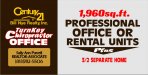
I am going to collect a deposit for a For Sale By Owner sign tomorrow.
(hooray! I need the $$!)
Customer wants it to look "Classy" but be effective.
Colors will be dark green 4'x8' Alumalite background and cream lettering to match a building on the property.
I will do a mock-up after I get the deposit.

Copy consists of:
FOR SALE BY OWNER
prime commercial property
X acreage
new (X# sq ft) building and rental house with utilities
price
phone #
Sign is double-sided. I think this seems like too much info but client was firm about it. The rental house is included in the sale, it's not for rent (confusing)
Client wants the price on the sign to avoid calls from tire-kickers.

What I am wondering is:
What do you like to highlight most on a sign of this type?
I like to tone down the "for sale" part because obviously if there is a sign on it it's for sale. It's on a state highway in a real visible spot and is presently a car lot.
I am thinking I will break it up with panels of some sort.

Any advice on arranging the copy?
:thankyou:
I am not looking for a free layout.
Love....Jill
 

GB2

Old Member
There's a wonderful book by Mike Stevens...have you read it...?


Sorry, couldn't resist!
 

k.a.s.

New Member
Would'nt just putting "house" instead of "rental house" be better? What if the buyer wants to live in it? Just b/c this guy used it for a rental does not mean someone else is going to.

Anyway, I always make "for sale" the focal point. Even the "by owner" can be much smaller, I understand what your saying but I think people need to get that it's for sale first, then if they are interested they will read the rest. But thats just me.

I love to use panels on these types of signs, and somtimes try to use circles (call Rick for a design, lol) or triangles. I have done several where I put the "for sale" in a circle on a seperate piece of material so it could stick up above the sign. It's a simple way to give some dimention.

Good Luck, sounds like fun.

kevin
 

letterman7

New Member
The couple that I've done around here, I've always highlighted the 'prime commercial property' with the square footage, since people looking for that type of property are interested in the size. Then, in decreasing order, acreage, phone, price and description. If someone's interested, they're gonna call about it anyway.

Can I send some snow your way, Jill? We're being smacked here!
 
You could omit the "For Sale By Owner" part and make "Prime Commercial Property" be the header. That automatically says it's for sale. Do the price on a separate small panel and cock it at an angle on the main sign, cuz he's gonna call you back and want the price changed.
 

Lunatic Taskbar

New Member
Hi Jill How you feeling?

I would say the main parts are the size SqFt, Commercial, Price & Phone.

I have also found that if its commercial it may be also worth adding what its zoned for?

Ian
 

Tim Aucoin

New Member
One thought I had Jill...
Consider talking to the client about leaving the price off of the sign. This will help de-clutter it a little, but the main benefit is that it will create more "call to action" on the property. People will actually have to call to find out the price, and that creates a more captive potential buyer. I don't necessarily agree with the "tire kicker" philosophy... but that's just my opinion!
Just my two cents worth... :rolleyes::smile:

Hope you're feeling better...
Tim
 

GP

New Member
One thought I had Jill...
Consider talking to the client about leaving the price off of the sign. This will help de-clutter it a little, but the main benefit is that it will create more "call to action" on the property. People will actually have to call to find out the price, and that creates a more captive potential buyer. I don't necessarily agree with the "tire kicker" philosophy... but that's just my opinion!
Just my two cents worth...

This was my initial thought exactly. We never put the price on our signs (back when we were "selling dirt").

You might also mention that when the price drops, this will prevent him for paying those expensive sign makers to change the price.

Leaving off the "For sale by owner part" will also minimize the number of calls from brokers trying to get the listing.

I like the idea of Prime Commercial Property maybe with a sub header that reads SALE or LEASE.

Good luck,

GP
 

Graphics2u

New Member
I would highlight the "Prime Commercial Property" also. Then the "For Sale" and Phone #. The details are really not needed but if they insist make them much smaller. The main thing you want people to get as they drive by is what it is and how to contact them. If they are real interested they will stop to get a closer look at the details.
 

Jillbeans

New Member
I tried to talk him out of the price on the sign but he said his Realtor® friend suggested it.
:)
I will try to get him talked out of the rental thing, it's confusing.
Anybody have any pix of FOR SALE signs they've done for some visual inspiration?
If you Google image search ya just get a bunch of those 29¢ black/orange lettering ones.
I am feeling MUCH better, still get worn out from doing little things, and am not idea-filled creatively at the moment. Thanks!
 

Graphics2u

New Member
Here one I did recently. Blurred Numbers and emails for privacy. Pretty basic. This was for a realtor but you get the idea.
 

Attachments

  • For sale2.jpg
    For sale2.jpg
    157.4 KB · Views: 100

SignManiac

New Member
Jill,

Here's a wide variety of signs I've done over the years for inspiration. Hope they help ignite the fires within!
 

Attachments

  • ForSale-01.jpg
    ForSale-01.jpg
    123.7 KB · Views: 120
  • ForSale-02.jpg
    ForSale-02.jpg
    92.6 KB · Views: 118
  • ForSale-03.jpg
    ForSale-03.jpg
    139.4 KB · Views: 104
  • ForSale-04.jpg
    ForSale-04.jpg
    178.7 KB · Views: 110
  • ForSale-05.jpg
    ForSale-05.jpg
    37.9 KB · Views: 92
  • ForSale-06.jpg
    ForSale-06.jpg
    177.5 KB · Views: 107
  • ForSale-07.jpg
    ForSale-07.jpg
    131.8 KB · Views: 113
  • burnadet.jpg
    burnadet.jpg
    135.2 KB · Views: 102

Graphics2u

New Member
If the price is reasonable I don't mind putting it on there. I never call about a used car advertised without a pricebecause I figure they're embarassed to show it. I know real estate is a little different but I think no price shown can work against you sometimes.
 

G-Artist

New Member
What I have found effective and something we do for brokers who deal in commercial property is to break the sign into 3 sections.

1. a scale plat drawing.
2. what is being offered (usually bulleted in some way)
3. contact info including broker's logo.

As to #2 - zoning info is a MUST!!! As well as acreage to the decimal.

As to the rental house. Call it "plus residential income property" or "income building included" something along those lines. That's a seller.

Putting a price may or may not be wise. But tagging it "priced to SELL!!" may be the way to go.

Be sure to tell him that FSBO will garner more broker calls than buyer calls at the outset. A tag line of "no brokers please" may cut that down except for the jerks in the biz who will call regardless of what is on the sign.
 

Craig Sjoquist

New Member
when by owner and if.. for sale... not going to be prime... then its size or type it is ...like what are people looking for on this property that makes it more sell able..just making that part easy to read 1st
 

Jillbeans

New Member
Thanks for the ideas.
I will go see him in the morning then post what I come up with.
I like the idea of stacking the FOR SALE part.
Like being able to see some other options, too.
Zoning? There's no zoning in that area if you can believe it.
I was shocked to hear it too.
 

SignManiac

New Member
I had forgotten about these. Another way of saying 4sale that I like and you might be able to use this format.
 

Attachments

  • Don Lombardi-02.jpg
    Don Lombardi-02.jpg
    68.3 KB · Views: 115
  • Don Lombardi-03.jpg
    Don Lombardi-03.jpg
    32.5 KB · Views: 109
  • Don Lombardi-04.jpg
    Don Lombardi-04.jpg
    36.2 KB · Views: 101
  • Don Lombardi.jpg
    Don Lombardi.jpg
    41.4 KB · Views: 108
  • dirtforsale.jpg
    dirtforsale.jpg
    86.4 KB · Views: 116
Top