• I want to thank all the members that have upgraded your accounts. I truly appreciate your support of the site monetarily. Supporting the site keeps this site up and running as a lot of work daily goes on behind the scenes. Click to Support Signs101 ...

Been chasing gray for years, finally realized the problem is in Flexi?! Please help me figure this out!

jtiii

I paid good money for you to read this!
I've got a 315 print/cut. For years I've had grays be WAY too warm on some (most) materials. In this particular case I'm using the correct profile for the Arlon product. I've been running the calibration on the printer to no avail.

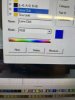
I just realized that if I pull up the janky "variations" screen under color adjustment, it actually shows me what's going to happen! To clarify, the little images with the purple borders are what ends up coming off my printer. The gray frame on the right edge is what Flexi shows normally (and is the color I'm actually sending to Flexi). It doesn't matter if I send from CorelDraw or Photoshop. It doesn't matter if I'm sending RGB, CMYK, or Pantone.
the very thing.png

The other amazing thing I discovered is the preview button in the top left of the color adjustment tab. Why isn't it on by default?
Oh hey theres a preview button.png


So the main questions I have are why does Flexi want to turn my gray purple, and how can I stop it from doing so?
Thank you everybody,
John
P.S. I have tried using the in-program help and it is insultingly poor and incomplete. Several times I have searched by name for buttons or checkboxes only to find no entries at all for them.
 

gabagoo

New Member
I have never seen that screen before...is this version 22? Do you print up a colour chart to reference the colours you want to use for any particular job?
 

jtiii

I paid good money for you to read this!
Version 19 - it's the perpetual license version that came with the package.
Under the "Color Adjustment" tab
1698087209780.png

is this button
1698087301292.png

that takes you to the horrific "Variations" window.
1698088069471.png


To clarify though,
I am not trying to use that window, the only reason I included it was to show that Flexi does indeed know it's going to print purple when asked to print gray.
 

Attachments

  • 1698087804811.png
    1698087804811.png
    191.8 KB · Views: 63

JBurton

Signtologist
I am not trying to use that window, the only reason I included it was to show that Flexi does indeed know it's going to print purple when asked to print gray.
Why not use the window? Looks like you want to click on the opposite side of the color, or just turn the 'amount of adjustment' slider all the way down and see if it doesn't print what you're seeing.
I'm not a flexi user, so forgive my ignorance here.
 

jtiii

I paid good money for you to read this!
I'm not a flexi user, so forgive my ignorance here.
No worries, it does look like this might be a useful window! However it is a disaster. First of all, the "amount of adjustment" slider has FORTY levels - the six bars mean nothing. Why they couldn't give us a numbered slider for consistency (there is also no way to save the settings). Also, say you chose a setting of More Green that resulted in an addition of 3%C and 3Y to your colors. Well white would still be 0 0 0 0 but even the very beginning of a gradient, say 0 1 0 1 would suddenly be 3 1 3 1, totally destroying the gradient.
 

jtiii

I paid good money for you to read this!
Any color profile that isn't made specifically for your printer and environment is going to have results like these.
Unfortunately, the 315 doesn't have a spectrometer for making profiles.
If you make a custom one on your machine, it's much easier to hit grays,

I could understand that if Flexi was sending it gray and the printer wasn't hitting it because the profile wasn't quite right.
The issue I'm trying to wrap my head around is why does Flexi, using the stock company made profile, intentionally send this crazy color info to the printer?

This is what it's doing - check out the Cyan. It's cutting it 21points which is almost a 40% drop!

1698164704384.png


Also, using the stock profile, printing the test print directly from the printer controls gives me neutral grays.
For these two reasons I don't see how it could be the profile.
 

Attachments

  • 1698164380991.png
    1698164380991.png
    3 KB · Views: 61

jtiii

I paid good money for you to read this!
What happens if you click the original?
Nothing - clicking on the Original will revert the "current setting" one to the original, but it only does something after you've selected a variation. Also, say you make it more green, then more yellow, then print it. You don't like it and decide to go in a different direction. When you go back in that box, the greenish yellow one will be the Current Setting AND the Original Setting! The only way to get back to your actual original is to delete your job and reload it. Again, the screen is worthless :-/
 

ColorCrest

All around shop helper.
Again, the screen is worthless
Your Signs 101 profile mentions that you have Photoshop. If you load the ICC printer output profile that Flexi is currently using into Photoshop, you could preview the effects you're experiencing and likely understand what is happening during the critical path. The exercise could save a tremendous amount of time and materials and provide some clarification.

Adobe removed their color variations tool from Photoshop some time ago when they transitioned from 32 bit to 64 bit software. Otherwise, it's a nearly ideal tool to teach users the basics of color correction. (The tool would have been super-ideal if the engineers would have known not to reverse the clockwise display direction of RGB to counterclockwise.) However, if your PS version does not have the variations tool, you can still preview effects and color number values.

The changing number values you're seeing may likely be normal due to color management performing tasks that it should be performing. The accuracy of the transform might be a separate conversation, however. In any case when trying to find such issues, one should be using somewhat standard files to print which show gray scales and familiar colors such as skin tones, bright blue skies, etc. One should also know what values in the file are supposed to reproduce as neutral gray.

So to start, what values for gray are currently used in the source file? How do you know they are to print gray?
 

Stacey K

I like making signs
I've had the same issue but I created my own profiles which is just CMYK 10%, 20% etc and I printed them out on glossy stock. I match my customer grays to one of these and print. I also printed out a pantone color book and use that. I'm lazy I guess (I like to call it efficient). I don't like guess work and I typically use many of the same color over and over again if I know they print well. I have them saved and labeled like "Pigeon River Blue" and "Brians Green" and "Lions Yellow" etc. Then I keep all my little sample logos that I print for color checking and I always have lots of samples to look at.
 

Attachments

  • 394493475_7106212912745304_8502628814364044846_n.jpg
    394493475_7106212912745304_8502628814364044846_n.jpg
    396.1 KB · Views: 50
  • 394020785_3534771206736909_5884354247267551195_n.jpg
    394020785_3534771206736909_5884354247267551195_n.jpg
    162.1 KB · Views: 55

jtiii

I paid good money for you to read this!
So to start, what values for gray are currently used in the source file? How do you know they are to print gray?
I have tried RGB 128 128 128, one of the Pantone Cool Grays, and CMYK 52% 43% 43% 7% (this is what both Photoshop and Corel give when converting RGB 128128128 OR Lab 53,0,0 to CMYK SWOP v2). When creating the pdf for HP production manager I have sent the colors as native and embedded the color profiles.
 

ColorCrest

All around shop helper.
I have tried RGB 128 128 128, one of the Pantone Cool Grays, and CMYK 52% 43% 43% 7% (this is what both Photoshop and Corel give when converting RGB 128128128 OR Lab 53,0,0 to CMYK SWOP v2). When creating the pdf for HP production manager I have sent the colors as native and embedded the color profiles.
If you haven't already done so, print a control image file with and without color management set in the RIP. If the results show a color balance bias in the grays, especially in the print using no color management, run the re-calibrate exercise of the printer and see if any color bias shifts.

What are you judging printed grays against? Ideally a standard gray card or, at least, something you've found in the shop that you might trust is neutral gray.

EDITED TO ADD: Obviously, be sure no other color settings are influencing test results, especially that variations tool in your case.
 
Last edited:

jtiii

I paid good money for you to read this!
What are you judging printed grays against? Ideally a standard gray card or, at least, something you've found in the shop that you might trust is neutral gray.
To be fair, I'm not talking about a slight color variation here :-D
never mind an off shade of gray, we're all the way into purples on this one!
1698343380327.png

The strip along the bottom is black ink only - I cut it out of the calibration chart the printer runs.
I tried your advice about bringing the icc profile into photoshop but I may have done it wrong - it only changed the colors very slightly on screen.
I will try your suggestion about printing a control image when I get a minute. Thank you SO MUCH for helping me with this.
 

ColorCrest

All around shop helper.
I tried your advice about bringing the icc profile into photoshop but I may have done it wrong - it only changed the colors very slightly on screen.
If that's a fact, it's very indicative of a valid and properly produced output profile. I think in this case, it's a "canned" profile from the factory or media source? You're using Photoshop's soft proof feature, right? If so, fault lies with the printer calibration or possibly somewhere else in the path of the process. The machine however, should most definitely calibrate properly unless heads and / or media advance are too far away from spec.
 
Top