• I want to thank all the members that have upgraded your accounts. I truly appreciate your support of the site monetarily. Supporting the site keeps this site up and running as a lot of work daily goes on behind the scenes. Click to Support Signs101 ...

Before/After planning stages

Craig Sjoquist

New Member
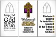
gees wonders what happen to the first one with scrolls & Celtic caps and readable font.
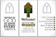
I do like GB2 arrow and word placement seem organized.
Also like how #16 post seems to center the eye well. using lines and bolder Sunday worship
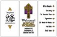
Toss up on panels not red tho in #19 post seemed too strong.

But it sure is going to be a great before after when done for portfolio shows great improvement
Keep at it Jill you really can push through well and it will be the best.
 

signgal

New Member
I like those arrow heads better (more gothic-y) and I got goosebumps over the new set-up on the mission statement... I'm not feeling the red. I got a little nervous in the beginning when you mentioned the red. maybe the grey? Superb suggestion on implementing the architecture, Adrian! I've always wanted to do that but rarely get the kind of job where it works :)
 

Jillbeans

New Member
OK this is from today after two cups of coffee.
The actual windows have a lot of purples, and purple is a somewhat regal color so I tried that, and only on one "window" shape.
There is also a lot of green in the church windows too but haven't tried that yet.
I tried the arrows on the other side, that's actually the side of the triangle closest to the main door.
Am I there yet?
:thankyou:
 

Attachments

  • GRC5.jpg
    GRC5.jpg
    251.8 KB · Views: 70

signgal

New Member
I like this better... I would put make the time in the middle official (11:00) for consistency and you might want to try some justifying on the times. It's not very easy to understand, you know the adage about treating the customers like they're dumb :) I like the purple but when you mentioned green I hit my head with the heel of my hand and went "Duh!" celtic...
 

signmeup

New Member
Love the purple! Why did you leave it off the other two? I also like the arrows but on the other side, although it does make sense to say what the thing is and then give the direction. (you're on your own) They do go with font on the first panel really well.
Agree with signage... drop the sbc if you're allowed.
 

Jillbeans

New Member
They may not like the SBC removal, but I can add it if they ask.
I have to put it on everything I do for them.
Here it is with green
(I like green or purple equally, both ar far less Satanic!)
I made the colored panel just in the middle to de-emphasise the other panels.
The mission statement one is actually at the back.
I changed the font, it may be too light now though.
And I changed it to Sunday Morning
(Good old VU song for one, but also I know they will want AM in there)
and changed the 11 to 11:00.
Better? Worse?
:thankyou:
Whatever you say, I will email one to the minister and maybe save one as a back up.
 

Attachments

  • GRC6.jpg
    GRC6.jpg
    247.4 KB · Views: 75

signmeup

New Member
I vote purple but I haven't seen the churchs windows. The heavier font too. Maybe split the difference? (Of course, you'll tweak it during production so it looks right anyway.)
 

Bannerday

New Member
Jill

You know I'm no great designer but I'll note a few thoughts.

The current font seems to light to me.

I like the purple best I think , but the green looks good too.

The window behind the cross looks good but on the other two
panels it looks more like a miter too me. Could you put a
lighter version of the center panel color there? Maybe with a gradient.
That would make it more like a window. Maybe the center purple and the other 2 green with gradient?

Also, "EVERY" being capitalized bothers me. I understand why your doing it form a design point but it might strike people wrong.

My first though was you (the church) were either yelling at me or boosting(you got EVERY answer on the test right). Might just be me but to this internet generation that "EVERY" might be a little jarring.
 

Craig Sjoquist

New Member
the panel behind the Celtic cross destroys the cross

the copy seems to light likes the 1st ones font

and I still like GB2 organized directionals this one is nice but confusing which way
the fade looks good , the outline or frame panels are nice but liked the scrolls better to me, but you do such a nice job designing and layout
 

GB2

Old Member
The only other thing about the directional portion is that, if it was me, I would put those in alphabetical order. I don't know if you have a reason for the order you used or not.
 

iSign

New Member
16 was very good IMO, but flush right direction makes sense, especially since most arrows point right, needs the bolder font for sure...

I think color in other 2 windows, but not behind cross (maybe gray outline window, maybe no window... hey... could the entire panels be window shaped?
 

GypsyGraphics

New Member
i wanna play too! have a question though... will these signs be displayed as a trio or in close proximity to each other?

EDIT: just looked at the original image... looks like the answer is "no" not a trio
 

Jillbeans

New Member
Gypsy the three panels make a triangle shape
(birds eye view)
Just back from a fall festival where they were actually selling wine.
Durrrrr
All points taken may drive down to the church (tomorrow) for an in-depth look at the windows.
Providing the roof doesn't fall in of course.
:)
 

GypsyGraphics

New Member
Jill, i'm thinking the celtic aspect should be carried into the two side panels. Sticking with your layout I just incorporated a simple celtic knot elements on the left and with a mini version of the same knot, created small arrows for the left panel.
 

Attachments

  • church.jpg
    church.jpg
    55.7 KB · Views: 78
Last edited:

signmeup

New Member
Good one GG. The little knots are a nice touch........ a little yellow carried over to each panel just seems right to me. I like Jills original font on the first panel too. (the text and graphics could take up a little more space on the first panel)

Just noticed.... celtic knot arrows! Brilliant!
 

Tiki

Font Sage
Maybe try to incorporate the cross in all the panels :wink:
 

Attachments

  • Picture 3.png
    Picture 3.png
    68.3 KB · Views: 74
Top