• I want to thank all the members that have upgraded your accounts. I truly appreciate your support of the site monetarily. Supporting the site keeps this site up and running as a lot of work daily goes on behind the scenes. Click to Support Signs101 ...

Boat Lettering - Critique

Jesse_gvi

New Member
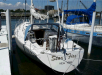
So my in-laws bought a sailboat last summer and they want me to hand paint the name. It's a white boat with a burg/silver/black scheme. So far the only direction I've been given is "piratey", so you may see some ride-turned-movie influence in the lettering.

I don't know, I've been staring at it too long, so now it's looking like "Relentles", which sounds like some candy that tastes like defeat. How does it look? Lose the spurs on the flourish?


I guess it looks like I have to learn to hand letter by spring. I'll be looking over those threads from a few months back.
 

Attachments

  • relentless_lettering.png
    relentless_lettering.png
    60.9 KB · Views: 115

shakey0818

New Member
Looks great!Should go good with the color scheme.MY first boat i tried to hand letter years ago,i had no clue and it came out like crap.I named it Sunken Treasure,and ironically it sank when i was drunk and took it off a ski jump.Hay i was 13 i didnt know any better and if i did i still woulda done it.
 

SignosaurusRex

Active Member
I think it will work great. You chose a relatively "loose" font that fits the bill and at the same time will only increase in character being hand lettered...especially for your first shot at hand lettering. In your situation, the only change that I might suggest is to change the port of hail font to a straight-ahead loose gothic rather than Copperplate which I think you will find to be a challenge you may not be ready for if you hand letter it. I say...."Go for it" if they like what you have put together.
 

Dave Drane

New Member
Could look better I think. A&S fonts have a good script, similar to Choc, and i don't have it on this puter but I could see it working for you.
 

Jillbeans

New Member
It's really not that bad.
Has a piratical look.
I do not care for your font choice on the city.
And neither will you when you have to paint it.
Choose a thick and thin sans serif like Stevens Percepta.
A thick and thin alphabet can help you cheat a wee bit if your hand lettering is not adept.
You may even want to try a script on that, it's even easier.
Just not too fancy or it will compete with the name.
Love.....Jill
 

RiXaX

New Member
Jill, after so many years kicking around harbor towns doing boats, I am still convinced that doing anything without studying the vessel first is not a correct beginning. Sailboats have a very different grace than power craft and require a lettering and placement and size that reflect that. Plastic boats are different from wooden boats. Can you show us the vessel please?
 

Craig Sjoquist

New Member
This looks nice,likes the font for the name, good flow also,normally the harbor name would be a sans serif font for contrast from the fancy serif name font but Copperplate is plain looking enough and contrasts somewhat , but you will find it a tough one to master if you have not hand lettered before.
Which brings another point, you could cut a vinyl stencil and hand letter OR you best get busy and practice, practice, practice. and if no one to teach you stuff yikes a high dollar boat
 

Jesse_gvi

New Member
Here's a pic of the boat. They were looking into removing that bracket right about where the name would go.

Is Copperplate really that difficult? Even as a built-up? I thought it at least added to it's salty-doggedness. I tried others and all but sans-serif gothics looked weird paired up with the name.

Of course, after I start practicing, the font that I can actually paint might conveniently end up being the "best" choice.
 

Attachments

  • relentless_pic.png
    relentless_pic.png
    223.4 KB · Views: 90

Marlene

New Member
are there regs on the font to be used for the city/state? seems like everyone I have ever seen (I live near Lake Champlain) has been a sans serif. like the font for the boat name, looks nice
 

Jillbeans

New Member
Thank God you're getting rid of the brush script.
My view on the sans serif is that the name stands out most.
The city should be more understated.
If you're not adept at handlettering (unless using a mask and I hate that) something that's real even like Copperplate can be tricky, getting all the thicknesses uniform.
It's also a "long" letterstyle meaning it's extended and a long city name is going to take up space.
I don't think it's bad luck to change a boat name when the owner changes, I do it all the time.
 

Jesse_gvi

New Member
are there regs on the font to be used for the city/state? seems like everyone I have ever seen (I live near Lake Champlain) has been a sans serif. like the font for the boat name, looks nice

http://www.uscg.mil/hq/cg5/nvdc/nvdcfaq.asp#15

It says 4" high & "legible" for recreational boats.

There are strict guidelines and ceremonies that must be adhered to in order to avoid the wrath of the Sea! Only after performing such activities can anything with the new name be allowed on board.
 

Billct2

Active Member
Design is nice, I agree with changing the Hail Port font though, it's just traditional to use a sans serif.
Unless the boat is documented there is no requirement that I know of for the name.
And yes there is a superstition about changing the name, but I don't think anyone buying boats now is even aware of it.
I will say that you have picked a fairly difficult project for your first hand lettering job.
That font requires a deft hand. Especially if you cut in those highlights. May be easier to add them afterwards, maybe in a second color. Though fiberglass can be a great surface to work on, if it is old and open (weathered) it is not forgiving. Errors will leave stain that can be tough to get out.
I miss spring in the boatyards.
 

Gino

Premium Subscriber
Looks good and I believe you've captured the feeling.

I also agree that you might want to use an easier font than Copperplate.

Anyway, whether you're doing this dry or in the water..... you could always make a paint stencil and give it a first light coat and then give it a second light coat with penetrol added for better flow and you should have ample coverage. Just don't thin your paint down with turps using either method. If you brush it on... the tendency for newbies is to thin it down to get more control. All that does is wear/fade out three times as fast and creates a lot of runs. Try to do it in the shade or put a tarp over you. You don't want the paint to set up too fast.. that's why the penetrol on the second coat. You'll get a better gloss, too.


Good luck..............
 

JR's

New Member
I think it will work great. the only change that I might suggest is to change the port of hail font to a straight-ahead loose gothic rather than Copperplate which I think you will find to be a challenge you may not be ready for if you hand letter it. I say...."Go for it" if they like what you have put together.

:goodpost:

looks good

JR
 

OldPaint

New Member
some states if your going to register the boat, the hail port name most place has a specific size and letter style. ive run into this when doing boats in sarasota ,fl and here in pcola.
 

Cross Signs

We Make Them Hot and Fresh Everyday
Jesse;
You've gotten lots of good advice here from people. My question is. Are you going to letter this boat in the water? If so that adds another level of difficulty. Good luck
 
Top