• I want to thank all the members that have upgraded your accounts. I truly appreciate your support of the site monetarily. Supporting the site keeps this site up and running as a lot of work daily goes on behind the scenes. Click to Support Signs101 ...

Boat Registration Numbers Complaint...for real???

Chriswagner92

New Member
Only remade registrations a couple times. Not because anything was wrong but because the clients were causing "issues" on the water. Ooops.

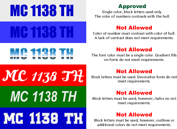
Truth to tell most of the registrations I make are technically illegal by DNR standards. S'posed to be 3" tall, block letters and black in color. IIRC minimum stroke width is 0.250"

20 years ago I used to airbrush the vinyl for trick effects. Today it's digital prints.

The color stipulation is that it has to be contrasting; black numbers on a dark boat will be kind of hard to read.
 

rjssigns

Active Member
The color stipulation is that it has to be contrasting; black numbers on a dark boat will be kind of hard to read.

Yup. Been so long since I've done a plain registration I forgot. Last one I did was for a cigarette boat. Client wanted flames so that's what he got.
 

Patentagosse

New Member
Here's my input: my shop is just in front of a big boat/atv/motorcyle dealer. I'm asked to do their numbers like 2-3 hours before the final delivery to their customers. We simplified the process by always doing the numbers in the same font and only white or black depending on background color. Sure I can do WAY better job but as it's always needed for yesterday, I told 'em it's that's the way it's gonna be or you go wherever you want, it's not my core business (I'm in vehicle graphics, wide format, mostly on big rigs).

As for the 3" requirement, for boats it's not a problem but on SeaDoo, 3" might be too much due to physical usable space on body. I'd say that most of the watersport toys get 2½" x 18" numbers and NEVER got a single complain... BUT... it's a matter of readability. Some fonts at half the expected size read better than script ones at +3" so work wisely with this in mind. Myriad Bold is simply easier for the eyes than Murray Hill... No need to get a degree in marketing to figure this out...
 

Andy D

Active Member
Whenever I have to make size compliant letters/numbers I always make them around a 1/8" taller than
spec'd & have never had an issue.
A little off topic; One weird thing about boat ID here in Mississippi is they start with MI, not the MS abbreviation.
 

myront

CorelDRAW is best
We do these quite often. I use a corel macro that will "average" the height to a desired input.
We've had many request smaller size, crazy fonts and Such We make them sign a waiver knowing damn well they're not compliant. Boat people = "I have money and don't care"
 
Last edited:
I always set up registration and DOT numbers based on the cap height of the letters, not the height of letters with ascenders and descenders. That way you always meet the minimum required height.

This also sounds to me like an excuse for a free replacement.
 

2B

Active Member
I always set up registration and DOT numbers based on the cap height of the letters, not the height of letters with ascenders and descenders. That way you always meet the minimum required height.

This also sounds to me like an excuse for a free replacement.

We also do the same.
Typically a capitalized "I" works great, make the desired height, and everything else will be golden
 

Stacey K

I like making signs
Whenever I have to make size compliant letters/numbers I always make them around a 1/8" taller than
spec'd & have never had an issue.
A little off topic; One weird thing about boat ID here in Mississippi is they start with MI, not the MS abbreviation.
That's weird! What do they start with in Michigan I wonder...
 

Andy D

Active Member
MC
approved-michigan-mc-numbers1.gif
 
Top