• I want to thank all the members that have upgraded your accounts. I truly appreciate your support of the site monetarily. Supporting the site keeps this site up and running as a lot of work daily goes on behind the scenes. Click to Support Signs101 ...

Body Shop logo

klemgraphics

New Member
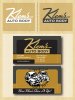
Starting on a logo for my dad's body shop, this makeover is well overdue and I want to do it right instead of rushing into something like we did about 10 years ago. I'm definitely not the best designer and I have learned a lot here. So I guess it's time I throw myself to the wolves. I was almost thinking a sort of retro design but don't know where to start. This is what I came up with so far.... If I need to scrap it totally and start over that is what I will do...just looking for some tips from the pros.
 

Attachments

  • kar.jpg
    kar.jpg
    32.6 KB · Views: 140

SignManiac

New Member
Or "mobile fix it" in the shape of a laptop lawnmower?

First off, I don't like your choice of font for Klems. it does not connect well or read easily. What color car does your father drive?
 

klemgraphics

New Member
He started off as a mechanic(25 years ago) but now is only doing body repair for at least the last 10-15 years. I never really thought about the auto repair part, didn't know it meant only mechanical, something else to think about.

I will hire someone if there is no other way but I was hoping to do it myself and maybe learn something.

Maybe we can change it to Auto Body, don't know how much he will like it but if I tell him it needs to be he will probably listen.
 

klemgraphics

New Member
Or "mobile fix it" in the shape of a laptop lawnmower?

First off, I don't like your choice of font for Klems. it does not connect well or read easily. What color car does your father drive?
I had hoped I was not as bad as the laptop lawnmower...

He drives a blue car....why does this matter might I ask? Is it so I can make a cartoon of it and put on a sad face?
 

SignManiac

New Member
Not a common name. Avoid the script on that, use elsewhere. Always try to go for legible first. This is a simple five minute example. I could think of a hundred other directions if I had more info on your dads operation. Don't get locked down on one idea only. Go google body shop logo's for inspiration.

Mix up your two fonts, something rigid with something loose. makes for good contrast.
Edited to add: Move your elements around also. There's no one right or wrong location for an image or icon.
 

Attachments

  • Klems.jpg
    Klems.jpg
    86.3 KB · Views: 113
  • klems2.jpg
    klems2.jpg
    90.1 KB · Views: 94

ericmitchell29

New Member
Sign Maniac Is that Valentino? I'm going to pick up a few more fonts I dont have from Sign fonts... just wanted to make sure. thanks
 

Flame

New Member
This is probably one of those instances where I should not have posted up what was in my head...but this popped right in. Just, take it with a grain of salt and look for better fonts. lol.

But basically, my $0.02, listen to what others are saying. Auto repair says.... mechanic. Auto Body says, paint and body repair.

Now when I think paint, I think airbrush, candys, rod style.... and I've seen some very successful auto body shops that went with this theme. JMO, but an auto body shop should NOT go with a boring, corporate look. Make it fun. Ya know, I had fun with mine and I think you should with his. I like the direction you started in, some casual grungy font, maybe just expand on it and keep tweaking away. :)


edit....snap, messed up my lightsources too :/
 

Attachments

  • klems.jpg
    klems.jpg
    45.7 KB · Views: 89

klemgraphics

New Member
I'll break it to him tonight that it will now be auto body instead of auto repair. I know what your saying flame, but at the same time almost 100% of his work is insurance repairs(and he intends to keep it that way) so I think maybe keep the logo clean but not too corporate and do more of the rod style in the actual construction of the sign. I like the direction you went maniac, and maybe if I do something along those lines with some sort of auto body graphic...maybe a gun. I'll post up a few more later on tonight. Thanks to all for the help!
 

Flame

New Member
I'll break it to him tonight that it will now be auto body instead of auto repair. I know what your saying flame, but at the same time almost 100% of his work is insurance repairs(and he intends to keep it that way) so I think maybe keep the logo clean but not too corporate and do more of the rod style in the actual construction of the sign. I like the direction you went maniac, and maybe if I do something along those lines with some sort of auto body graphic...maybe a gun. I'll post up a few more later on tonight. Thanks to all for the help!

Well I'm not talking flaming background and every effect known to man. Even if it's professional, use some color, put a little flavor in. I LOVE doing work for auto repair shops, they're one of my favorite customers, make this one of your favorite.
 

klemgraphics

New Member
I really wasn't thinking loaded with effects, but more like using some nice candy colors on a dimensional sign. But I'll focus on the logo first.
 

Rick

Certified Enneadecagon Designer
I kinda liked your first gut instinct, compared to the Klem's type, the Auto Repair looked to late 70's early 80's...
 

Attachments

  • KLEMS.jpg
    KLEMS.jpg
    345.8 KB · Views: 99
Top