-
I want to thank all the members that have upgraded your accounts. I truly appreciate your support of the site monetarily. Supporting the site keeps this site up and running as a lot of work daily goes on behind the scenes. Click to Support Signs101 ...
You are using an out of date browser. It may not display this or other websites correctly.
You should upgrade or use an alternative browser.
You should upgrade or use an alternative browser.
Body Shop logo
- Thread starter klemgraphics
- Start date
klemgraphics
New Member
Worked on these before I even looked at what Rick posted up. These are not really what I was originally thinking but I am liking a few of them. After seeing what you did Rick I am now torn as to which direction I want to go.
Just out of curiosity how long did it take you to come up with that?
Am I getting any better??
Just out of curiosity how long did it take you to come up with that?
Am I getting any better??
Attachments

Rick
Certified Enneadecagon Designer
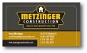
The logo is your logo, but I did not have your script typeface... I used a 50's script, the auto body typeface is from the 40's... I try to use typeface from the era when doing retro. The card came from a rejected layout from a client, then I used it in an old post that I never posted... I do that a lot, if I am bored I will design something but never show it because most people asking for help never stick around long enough or I lose interest in the person I am trying to help.
If you notice, the Quality logo is actually a knock off of an old post for Metzinger Construction (I never showed that either) and then shared it with Tint Guy.... but it originated from a rejected design from a few years back.
Added up, it took a couple of hours, but on your take, I liked your logo so much it took 5 minutes.
Attachments


Rick
Certified Enneadecagon Designer
The other thing I saw in your original idea is how it would work as a sign....
I can see you having many options if it's simple...
This is just a quick 10 minute idea, but you can do all types of dimensional treatments and materials....
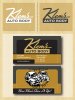
Shown below is halo-lit KLEM'S and a AUTO BODY cabinet with push thru lettering on a stone base with aluminum cabinet.
I can see you having many options if it's simple...
This is just a quick 10 minute idea, but you can do all types of dimensional treatments and materials....
Shown below is halo-lit KLEM'S and a AUTO BODY cabinet with push thru lettering on a stone base with aluminum cabinet.
Attachments

VizualVoice
I just learned how to change my title status
Rick - you're awesome. I just wanted to make sure you know that. :-D
klemgraphics
New Member
My thoughts exactly!!Rick - you're awesome. I just wanted to make sure you know that. :-D

klemgraphics
New Member
Where might I find a typefaces like used on the Klem's? I don't have anything that looks nearly that good.
laserman70
New Member
Rick, great work.... Very clean
Jillbeans
New Member
Rick took this in the direction I would have if I was half as talented.
When I use the script you used in your #1 I always beef up the lower case letters.
I am of the thinking that AUTO BODY needs to stand out (not in a script)
Rick did it to perfection.
I like a dependable, older feel for an auto body sign.
Love.....Jill
When I use the script you used in your #1 I always beef up the lower case letters.
I am of the thinking that AUTO BODY needs to stand out (not in a script)
Rick did it to perfection.
I like a dependable, older feel for an auto body sign.
Love.....Jill
Jim Doggett
New Member
I like the first one, with the kerning and apostrophe placement fixed. Maybe eliminate the connector between the m and s on Klem's.
My $0.02,
Jim
My $0.02,
Jim
Jim Doggett
New Member
Postscript, of course, Rick's fixing of the logo is top rate, as always. Just pay the man -- and be happy everytime you drive by the business, see their trucks or come across a business card. Years and years of pride. (and others might buy from you)