mark galoob
New Member
i like the second one best...maybe the large text could have a black outline instead of a blue one...
mark galoob
mark galoob
(although I'd have to call that dropping on the right, not rising... but whatever)
Add copy
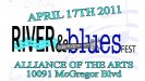
Something along these lines??
Thought I'd deviate from the original concept for another possible direction. Make it more of a logo style than a sign on a panel.


The little hook-ups look a bit too trite or something... especially having 2 of them... in my opinion...