-
I want to thank all the members that have upgraded your accounts. I truly appreciate your support of the site monetarily. Supporting the site keeps this site up and running as a lot of work daily goes on behind the scenes. Click to Support Signs101 ...
You are using an out of date browser. It may not display this or other websites correctly.
You should upgrade or use an alternative browser.
You should upgrade or use an alternative browser.
Changing our logo
- Thread starter SpiritMagnets
- Start date


SpiritMagnets
New Member
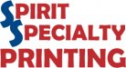
I appreciate the comments, I was not a fan of the design. I told the artist that that we were going to put it on Signs101 and if the users liked it, only then would I consider it. I will be sharing the comments you all have made with the artist and have them start over. Attached is our current logo.
Attachments
visual800
Active Member
I appreciate the comments, I was not a fan of the design. I told the artist that that we were going to put it on Signs101 and if the users liked it, only then would I consider it. I will be sharing the comments you all have made with the artist and have them start over. Attached is our current logo.
snap
Jillbeans
New Member
At least you finally spelled my name right. Let's see your ideas.Not your best work by far Jill.
(obviously you've never seen Beetlejuice? It was a joke)
I like Bucks' third one over.
What you are using now is possibly even worse than what the "designer" did.
Marlene
New Member
We just hired a graphic designer to redo our logo
well, you did do what we mostly say and hired a designer. you just hired the wrong one. I wouldn't go back to this person as if this is what they suggested, it won't get any better. really horrid choice of a font and stupid looking tailing into the bottom text. I hope you haven't paid them yet for this.
Gino
Premium Subscriber
Technically, your old one is much easier to read, so in that sense, it's better than the new one. The new one looks too Christmas-y to me. University is something you use for a small effect in the minds eye.... not for name recognition.
I'd give your artist friend another crack at it and see what he/she comes up with this time.
I'd give your artist friend another crack at it and see what he/she comes up with this time.
mopar691
New Member
Technically, your old one is much easier to read, so in that sense, it's better than the new one. The new one looks too Christmas-y to me. University is something you use for a small effect in the minds eye.... not for name recognition.
I'd give your artist friend another crack at it and see what he/she comes up with this time.
Kind of off topic but,
I was a graphic designer for a cosmetic company for many years and the owner insisted to the point of throwing hissy fits that everything had to be in University.
He was always spouting off about bogus studies he said he had done that showed this font was the most elegant typeface in history. Always made me laugh and this was one of the many ironic reasons I left that company.
Marlene
New Member
Kind of off topic but,
I was a graphic designer for a cosmetic company for many years and the owner insisted to the point of throwing hissy fits that everything had to be in University.
He was always spouting off about bogus studies he said he had done that showed this font was the most elegant typeface in history. Always made me laugh and this was one of the many ironic reasons I left that company.
you poor thing having to use that nasty font! I bet the owner now wants all Copperplate or comic Sans:Big Laugh
Fatboy
New Member
:Big Laugh
you poor thing having to use that nasty font! I bet the owner now wants all Copperplate or comic Sans:Big Laugh
mopar691
New Member
They still use it, Even now they are rolling out a redesign for the packaging I did when I was with them 5 plus years ago and its full of that typeface.
Toward the end of the artwork stage I all but gave up cause anything with any merit to it was turned down by the owner. 20 plus in the marketing department could not convince him otherwise. No wonder the PR firm dropped him like a bad habit.
Toward the end of the artwork stage I all but gave up cause anything with any merit to it was turned down by the owner. 20 plus in the marketing department could not convince him otherwise. No wonder the PR firm dropped him like a bad habit.