• I want to thank all the members that have upgraded your accounts. I truly appreciate your support of the site monetarily. Supporting the site keeps this site up and running as a lot of work daily goes on behind the scenes. Click to Support Signs101 ...

City of South Beloit

OlsonSigns601

New Member
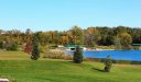
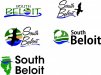
Working on a new logo for the South Beloit City Park

Its 100% Charity work as I'm a member of the Parks & Rec Committee.

Got inspiration from Pine City, MN
http://en.wikipedia.org/wiki/Pine_City,_Minnesota

Park has a lake, bike path, lots of geese, a dock, a bridge and playground.

I feel I was able to incorporate the lake, geese, dock & park appearance with the logo, but just can't help feel something is missing.

Looking for help.
 

Attachments

  • South Beloit Logo - PROOF.jpg
    South Beloit Logo - PROOF.jpg
    20 KB · Views: 113

qmr55

New Member
Do you really think you need to incorporate all of those elements into the "icon"? I feel it loses clarity with that many elements. Your eye travels throughout the entire icon and doesn't exactly decipher what it is suppose to represent. I think overall you are going in the right direction but it needs some fine tuning. Text could definitely use some work as well. A little too "blah" for me! If I get the urge, i'll throw together some ideas to try and boost start you! Good luck!
 

Rick

Certified Enneadecagon Designer
ummm, first, I would say that's more than inspiration, but not a total pinch.
What's missing is simplicity... it looks like a poor pinch of the Pine City logo

Too many elements. I would do some research on it. Cut out the stuff thats complicating the logo.
 

visual800

Active Member
looks like it was ripped off Obamas logo.

Hard to describe, too much going on, but not enough going on. It does nothing for me. Rick was dead on trying to find something significant to tie logo together
 

Jillbeans

New Member
It does look like a total rip-off of the Pine City logo with a smidgen of Obama.
There's way too much going on.
I'd do the name in a pretty script with a blue underline in a soft wave, and maybe a yellow circle for the i dot with a flying goose silhouette off to the side.

Or get really basic with a simple compass pointing south beside the word Beloit.
Love....Jill
 

OlsonSigns601

New Member
Any Better?

The compass just didn't work... looked to much like a boating community.

But I've created a couple variations as I'm really stuck on this one.
 

Attachments

  • South Beloit Logo - PROOF.jpg
    South Beloit Logo - PROOF.jpg
    52.3 KB · Views: 87

Jillbeans

New Member
The latest batch are all pretty awful.
I see you breaking three "rules" I try to live by:
Never distort a script
Never use all-caps in a display face (top left)
If something has eyes they should be looking into the layout (middle left)
Jhill's is nicer than anything you've attempted.
 

OlsonSigns601

New Member
Thanks Jill, JHills is kinda like my bottom right...

Its going on a longer sign, so the text will have to be to the right of the "logo" if you can call it that.

Thinking I'm going to go with my Bottom Right, change the logo to the way JHill has it and be done with it. However.... I'm Going Hunting tomorrow so I'll have plenty of time to think about this while in a park like atmosphere.
 

OlsonSigns601

New Member
Last Try of the Night...

My thoughts... its to much like the Pine Town one now, but then again its been an 18 hour day already.
 

Attachments

  • South Beloit Logo - PROOF.jpg
    South Beloit Logo - PROOF.jpg
    28.9 KB · Views: 88

Jillbeans

New Member
Adding the gradient did not help.
Try losing that, flipping the goose, and blending the B into the circle.
I'd draw something up but I'm too lazy and you probably wouldn't listen to my advice anyway.
:)
 

Jillbeans

New Member
Here's a quick suggestion.
Is the South as important as Beloit?
 

Attachments

  • Untitled-1.jpg
    Untitled-1.jpg
    81.2 KB · Views: 102

OlsonSigns601

New Member
Yes South is important as we South Beloiters are Definetly not Beloiters.

With that said.... I like the lettering style for Beloit you picked. Not digging the logo. Park is not open at night and I'm trying to say something about the lake. Its about all South Beloit has going for it.

I took a new original approach. I like the bird in the B, but I'm not wild about the blue. I just can't figure out how to incorporate this lake into the logo without it looking dumb.

I've attached a picture of the lake... I get nothing. I'm going to head to the park tomorrow and get some pictures myself and hopefully figure out a way to get something I'm happy with and hopefully the city government will be happy with. Maybe it will be Olson park after this. LOL
 

Attachments

  • South Beloit Logo - PROOF.jpg
    South Beloit Logo - PROOF.jpg
    23.4 KB · Views: 88
  • SouthBeloitPark.jpg
    SouthBeloitPark.jpg
    54 KB · Views: 98

OlsonSigns601

New Member
Thanks, I did pick a different letter style with better Kerning. out of the several examples I gave they picked this one.

I just wanted to say thanks to everyone who replied, I may have not gotten 100% perfect but at least I didn't go with the Obama rip off logo.

I'm glad people are here to steer me away from what seemed like a good idea at the time.

I really appreciate it.

Thank you for everyone's input, I may not have used every piece of advise but I learned something and I think I have a better design because of this.
 
Top