• I want to thank all the members that have upgraded your accounts. I truly appreciate your support of the site monetarily. Supporting the site keeps this site up and running as a lot of work daily goes on behind the scenes. Click to Support Signs101 ...

Critique requested

jimbug72

New Member
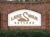
I like JSMortiz's swan idea. I get where you are coming from trying to keep the "S" more intact but it just looks a bit odd that way IMHO. Definitely need to work on the curves more if you are going to keep it an S.

I personally think the word "OUTLOOK" could use a little size reduction and spread the tracking out a bit so there is more space between the letters. If my schedule weren't so heavy right now I'd do a sample of what I'm talking about but I really shouldn't even be looking at S101.com right now with the stack of jobs on my desk, but I gotta get my daily fix...

EDIT: A swan like the one YOR just put up might work quite well.
 

Stacey K

I like making signs
The U caught my eye right away lol -- I like Gino's swan...play with the fonts - I also agree with using blues
 

rjpjr

New Member
Been a long while since I chimed in here.
Here's how I would have revised the swan concept...
 

Attachments

  • LakeSwanSample.jpg
    LakeSwanSample.jpg
    177.7 KB · Views: 459

Gino

Premium Subscriber
Been a long while since I chimed in here.
Here's how I would have revised the swan concept...

Nope, that looks like 'Lake Wan'. Doing that loses the natural flow of inserting an abstraction of a letter form. Anyway, my opinion. :confused:
 

TimToad

Active Member
What about doing the swan as a graphical element in the background just a few shades lighter or darker than the background color with the lettering set in front of it?

All the font choices I've seen so far seem very dated and overused. Nothing screams 80's vinyl shop more than Tiffany. Well, maybe except for Antique Olive and Eurostile.
 

Johnny Best

Active Member
I tried the S and swan idea but did not like way it looked. I never use clip art so I realized these are old people in this community that will never "get" the swan S thing and it will be Lake Usan.
lakee.jpg
 

JTBoh

I sell signage and signage accessories.
I liked some of these... good to see the community come out for once without ripping someone a new one.
SheBeau's was my favorite, for keeping with the source material the best - I think it's a good, unique idea, and kept more with what the community is... a bunch of old, rich, white people in million dollar homes lol.
RP's - too rustic
Johnny's - too difficult to reproduce, but damn pretty
JSMoritz - concerns over curved wall, weighting, ability to read neck as "s"
BillCT - dinosaur swan is terrifying, just like real swans
DDArlak - Rustic, again. I want to go picnicking there.
Gino - That would be awesome if we knew how to paint and vignette a stucco wall

Thanks for the input... once the HOA rejects this design after we quote, I'll be sure to incorporate some of the ideas before we quote it again, and again, and again...
 

kcollinsdesign

Old member
I would be negotiating licensing terms with Mr. Neato. In addition to being a beautiful sign design, that logo will have uses for internal communications and real estate professionals.
 

neato

New Member
I would be negotiating licensing terms with Mr. Neato. In addition to being a beautiful sign design, that logo will have uses for internal communications and real estate professionals.

Thanks. Yes, that's the hard part sometimes with designs like this. When does it become a logo and not just a sign layout?
 

SNeas

New Member
I used a dumb font at the bottom on purpose, but you get the idea. Instead of a flat kinda sign, if the customer can't afford a relief sign, than make it appear to be a 'poor man's sandblasted' sign with such a nice setting. View attachment 139246
I like this rendering the best. I would probably change the lower copy to an easier to read font. It looks great on paper but I think in reality you might have a little trouble reading it.
 

BALLPARK

New Member
Lake Susan 2.png

That reflects well to the before mentioned wealth as in community. The design creates a new brand compared to having an entrance sign used by the commoner's (joking as if from a millionaire club voice over.).

Perhaps you should work something out with neato to finalize the logo with you and then propose an enhancement package to your client within the grounds of the development. Typically you could find yourself with a much larger order as they may want the new look to be throughout the areas on the grounds.
 

Gino

Premium Subscriber
Lake Susan 2.png

That reflects well to the before mentioned wealth as in community. The design creates a new brand compared to having an entrance sign used by the commoner's (joking as if from a millionaire club voice over.).

Perhaps you should work something out with neato to finalize the logo with you and then propose an enhancement package to your client within the grounds of the development. Typically you could find yourself with a much larger order as they may want the new look to be throughout the areas on the grounds.


Wait, why would you do this ?? That wasn't neato's design. He duplicated the design from yor in post # 19. While neato presented a nice touch, it was hardly his thought or even clipart. Besides, the clipart being used is copyrighted.
 

BALLPARK

New Member
Wait, why would you do this ?? That wasn't neato's design. He duplicated the design from yor in post # 19. While neato presented a nice touch, it was hardly his thought or even clipart. Besides, the clipart being used is copyrighted.

Perhaps I'm just getting old...lol.

I see the Lake Susan 2 png easily a large enough variation that falls outside of the yor #19 post. The logo may have a similar head, but that is where it ends for me. The overall layout, style, colors are complete within the Lake Susan 2 png. I would think if one wanted to waste one's time to search google for swan silhouette heads that we could have hundreds that are close enough to say they are the same head on different scales. The serif ending to the "S" completes it and I don't think #19 swan has chance to win in court on that battle in most any State. But I'm not lawyer... but I do have a good eye for quality work and Lake Susan 2 is a few adjustments away from locking up a potential new logo if the original poster would follow through with it.

Work with whoever... I just thought one is close enough to a complete package that could land an enhancement project.

To me you could have four people start with a square as the only provided asset to build around. True designer will have a way to make the square a part of the design in a way that flows as if it's the natural progression of the square. Others just have a square with some words around it. That's the way I view designers... Not saying it's 100% correct, but that's the bottom line to me. There are those that can make it look great and then there are those that can reflect a true power brand in appearance with very little effort.

Good to luck to whoever is working on the project.
 
Top