-
I want to thank all the members that have upgraded your accounts. I truly appreciate your support of the site monetarily. Supporting the site keeps this site up and running as a lot of work daily goes on behind the scenes. Click to Support Signs101 ...
You are using an out of date browser. It may not display this or other websites correctly.
You should upgrade or use an alternative browser.
You should upgrade or use an alternative browser.
Critique time....
- Thread starter Pat Whatley
- Start date
Pat Whatley
New Member
Wouldn't surprise me. The sketch she brought me looks traced, not drawn.

Jon Aston
New Member
Dude! You are totally missing out on an opportunity to make her a pinup girl (in pink overalls, on her ladder). If you don't have the chops. Hire somebody! Maybe somebody here (at signs101.com), bit - if not - maybe here.
GypsyGraphics
New Member
Look at every pin-up... if they're not in heels, their on their tip-toes or if sitting, their toes are pointed. it's just cuterWhy is she on her tip toes? Is it because she's a dumb blond and doesn't know enough to step up?
if you have to leave the ladder, thin it out or make it less obvious. maybe have a portion of it falling behind the letters. it just stand out too much. i rather see her on her tip-toes on the ground reaching to paint the top of a letter.Less is more.....I don't see the need for a ladder....
YES, YES, YES!...look at the images in Jon's link! Crazy not to take it that direction. Show your client those images. If she's the kind of person who wants her likeness in her logo, and she's hot like you said... she's already playing the "cute card".... she'll love the idea of looking like a pin-up girl!!!Dude! You are totally missing out on an opportunity to make her a pinup girl (in pink overalls, on her ladder). If you don't have the chops. Hire somebody! Maybe somebody here (at signs101.com), bit - if not - maybe here.
She may have given you a sketch, but she's no artist, use her sketch as a starting point.

Jillbeans
New Member
The woman looks like an overly made up contortionist with a dowager's hump, dwarfed upper arms, granny boobs, a long torso, and the legs of a kindergartener. Looks like she probably does more than renovations if you know what I mean (wink wink) maybe sidelines over at Bubba's Truck Stop on Friday nights because she is just sooo flexible.
Use her if you must but redraw her from scratch. Put her at the end of the name so she is leaning into the words if using your original sketch. Don't use the computery looking drop shadow if you can avoid it. Typography is fine.
The pose GG suggested has so much more potential.
Love....Jill
Use her if you must but redraw her from scratch. Put her at the end of the name so she is leaning into the words if using your original sketch. Don't use the computery looking drop shadow if you can avoid it. Typography is fine.
The pose GG suggested has so much more potential.
Love....Jill
Pat Whatley
New Member
If you don't have the chops. Hire somebody! Maybe somebody here (at signs101.com), bit - if not - maybe here.
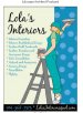
Jon, nice stuff at that second link.....and look what I found in the "Interior Decorating" tab:
Time to rethink this whole idea, methinks.
Attachments
JR's
New Member
Hi Pat,
how about having the latter behind renovations and propped up against the bottom of the M. in room. Have her leaning over trying to paint above the letter R. and O. and have her kickback one of her feet. Of course pointing out her toe like she is kissing a sailor.
Fun project.
JR
how about having the latter behind renovations and propped up against the bottom of the M. in room. Have her leaning over trying to paint above the letter R. and O. and have her kickback one of her feet. Of course pointing out her toe like she is kissing a sailor.
Fun project.
JR
signmeup
New Member
That's the one! (also saw a variation where she has a pony tail.)Jon, nice stuff at that second link.....and look what I found in the "Interior Decorating" tab:
Time to rethink this whole idea, methinks.
Jon, nice stuff at that second link.....and look what I found in the "Interior Decorating" tab:
Time to rethink this whole idea, methinks.
Let us know how it turns out.