-
I want to thank all the members that have upgraded your accounts. I truly appreciate your support of the site monetarily. Supporting the site keeps this site up and running as a lot of work daily goes on behind the scenes. Click to Support Signs101 ...
You are using an out of date browser. It may not display this or other websites correctly.
You should upgrade or use an alternative browser.
You should upgrade or use an alternative browser.
Customer wants it very simple.....
- Thread starter Shovelhead
- Start date
Shovelhead
New Member
")
Shovelhead
New Member
Interested in what....
is the going rate in everyone's neighborhood....
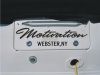
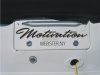
8" x 31" (2 color cast)
I'm hitting him for a Hunge installed!!!
Have to walk across the street to bang it out.
is the going rate in everyone's neighborhood....
8" x 31" (2 color cast)
I'm hitting him for a Hunge installed!!!
Have to walk across the street to bang it out.
Shovelhead
New Member
Thought the original CLEARFACE GOTHIC.....
was over-powering.
Although the two styles go well together, I think it's a little too 'Wimpy' now.
Needs a little strength on the bottom. With or without those dots, it's a little top heavy.
was over-powering.
Shovelhead
New Member
Sign_Boy
New Member
just an observation.... here's another... try inserting a little more room after the comma. I know its a style, but it looks a little too close.
I agree about the comma. (on the second one)
Shovelhead
New Member
Makes sense.....
I didn't notice it.
Change made.
Thanks all!
I agree about the comma. (on the second one)
I didn't notice it.
Change made.
Thanks all!
Shovelhead
New Member
S
SignTech
Guest
"yous" lol ....... it's rubbing off on you ....... being up there .......... Hey SH ... just wanted to say thanks .... you said 2k on a past post regarding a 16' truck .... sold at 2300 with tax AND checked out all your boat stuff and got R first boat job this week. Came up with a design and will post when done ... used some of your concepts for inspiration ......... don't get all soft on me ........... just saying thanks!
Shovelhead
New Member
Never thought of that....

but the boat will be rocking up and down so I don't think it will matter.
I will keep that in mind on a stationary object in the future.

Hey Shovel,
One thing I would suggest is to rotate the Motivation script a tic or two up on the right side. Most Script tends to look like it running down hill even though the text baseline is level.
but the boat will be rocking up and down so I don't think it will matter.
I will keep that in mind on a stationary object in the future.
Shovelhead
New Member
Yes.....
a "hunge" is a "hunge" less than two "hunge"....
and two "hunge" less than tree "hunge".
Not to be confused with a "hun"...like in a-"hun" fourty ninth street.
Mike, that is a good tip.
I usually do the same thing.
Shovel, is a "hunge" $100? I'd say that's about right if you only have to walk across the street.
(I only speak Pittsburghese)
Love....Jill
a "hunge" is a "hunge" less than two "hunge"....
and two "hunge" less than tree "hunge".
Not to be confused with a "hun"...like in a-"hun" fourty ninth street.