-
I want to thank all the members that have upgraded your accounts. I truly appreciate your support of the site monetarily. Supporting the site keeps this site up and running as a lot of work daily goes on behind the scenes. Click to Support Signs101 ...
You are using an out of date browser. It may not display this or other websites correctly.
You should upgrade or use an alternative browser.
You should upgrade or use an alternative browser.
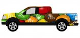
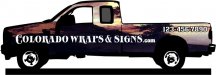
Design for our new Truck
- Thread starter HulkSmash
- Start date
SignManiac
New Member

HulkSmash
New Member
Try these and put your company initials in place of the M's?
You asked for it :ROFLMAO:
Attachments
HulkSmash
New Member
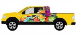
Post up the truck with just the "candy" and no text.
here ya go
Attachments
SignManiac
New Member
shakey0818
New Member
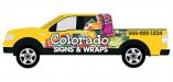
Looks like the jelly like looking candy in the shape of fruits i used to see at my old aunts house.I would scrap the whole thing,start from scratch and include some of the things that you offer .
Jillbeans
New Member
Both of the suggestions are far more legible.
Adrian's is especially fun looking but I might be biased about his font.
I'm sure it's been done to death (like the Coors label)
But at least when I think of Colorado I think of mountains.
Are you playing on the "colors" of colorado?
(now I'm thinking of Beneton or whatever that was)
What about some sort of black mountain silhouette with a colorful sunrise coming up out of it?
Kind of Maxfield Parrish-like.
Then the name etc on top.
Maybe too "happy"?
I just think if it's candy it needs to look like candy.
edited to add really trailer trash rendering
Attachments
Last edited:
Both of the suggestions are far more legible.
Adrian's is especially fun looking but I might be biased about his font.
I'm sure it's been done to death (like the Coors label)
But at least when I think of Colorado I think of mountains.
Are you playing on the "colors" of colorado?
(now I'm thinking of Beneton or whatever that was)
What about some sort of black mountain silhouette with a colorful sunrise coming up out of it?
Kind of Maxfield Parrish-like.
Then the name etc on top.
Maybe too "happy"?
I just think if it's candy it needs to look like candy.
edited to add really trailer trash rendering
ackkkk
fmg
New Member
You work for Fellers?Both of the suggestions are far more legible.
Adrian's is especially fun looking but I might be biased about his font.
I'm sure it's been done to death (like the Coors label)
But at least when I think of Colorado I think of mountains.
Are you playing on the "colors" of colorado?
(now I'm thinking of Beneton or whatever that was)
What about some sort of black mountain silhouette with a colorful sunrise coming up out of it?
Kind of Maxfield Parrish-like.
Then the name etc on top.
Maybe too "happy"?
I just think if it's candy it needs to look like candy.
edited to add really trailer trash rendering
Craig Sjoquist
New Member
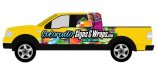
Yellow is a very strong color.
The candy colors take it away ... so put them on the bottom as a partial wrap.
Use a like idea like what Signmaniac & Jill put in copy straight across above candy part touching.then you will have flow and balance.
notice when strong graphics are closer to bottom of trucks the flow is better.
The candy colors take it away ... so put them on the bottom as a partial wrap.
Use a like idea like what Signmaniac & Jill put in copy straight across above candy part touching.then you will have flow and balance.
notice when strong graphics are closer to bottom of trucks the flow is better.
Malkin
New Member
You work for Fellers?
Have you ever seen her in a cowboy hat?
HulkSmash
New Member
ackkkk
this
signmeup
New Member
That's some mighty big talk for someone who has yet to toss out their idea. Go on then.... dazzle us with your brilliance.I reckon ya gonna get bored and fed up of looking at that after about a week of being wrapped.I bet ya can do better than that.Also the text is very lame in all of the layouts that have been posted.