-
I want to thank all the members that have upgraded your accounts. I truly appreciate your support of the site monetarily. Supporting the site keeps this site up and running as a lot of work daily goes on behind the scenes. Click to Support Signs101 ...
You are using an out of date browser. It may not display this or other websites correctly.
You should upgrade or use an alternative browser.
You should upgrade or use an alternative browser.
design thoughts?
- Thread starter laserman70
- Start date
weaselboogie
New Member
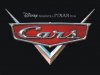
Looks like you're trying too hard to copy a certain movie logo.
rushworks graphics
New Member
Looks like you're trying too hard to copy a certain movie logo.
exactly what i thought straight away to!
J
john1
Guest
Yep! i thought of the movie Cars the first time i seen it lol
