• I want to thank all the members that have upgraded your accounts. I truly appreciate your support of the site monetarily. Supporting the site keeps this site up and running as a lot of work daily goes on behind the scenes. Click to Support Signs101 ...

Designing for signs

Rick

Certified Enneadecagon Designer
I've been designing for 20+ years. Took zero art classes, no formal design training whatsoever. I know what looks good & what jumps out & what is important or what should be emphasized in a layout. I get told all the time, "you're artistic." No, I'm a great commercial artist and had a lot of great trial & error life experiences along the way. Have tried to hire out of school "designers" that would spend 7 hours on a 10 minute design. I know in the past you were looking for an "A" on your school project, but I need to make money. Hard to find that production minded employee to begin with, let alone the mentality of great design work on top of it.

After selling my business I've transitioned to a printing business that is trying to be more involved with the large format & sign industry. They have designers that have been designing print designs for years, business cards & brochures and such, but don't have the 1st clue about laying out a sign. Biggest thing, you're viewing time on a sign opposed to a print piece. Usually you're driving when viewing sign, needs to be simple and to the point. Idk, I hold myself to a higher standard & wonder why others in this business are willing to do the same. You're only as good as your last project, granted they're not all show pieces, hard to church up a parking lot sign too much. Just my 15 1/2 cents...

I've been in the sign industry for about five years - my first career after a number of years in sales/customer service at a retail level. I had a background in design that I had taught myself (how to use Illustrator, Photoshop, InDesign, and some basic gen ed courses taken during a career as a History Major in uni). It didn't help much for signage.

"Designing" Signage for production is different than print, and requires far more practical and production knowledge. Many posters have noted that talented designers have created proofs that are, for all intents and purposes, impossible to produce. In my time working at various sign shops I've seen designers promise clients we can make 1/2" wide channel letters (no), roof signs (without checking bylaws, which distinctly said No, you cannot), and that "Variances are sure things" (which they are not).

Sign designers also require a knowledge of math, some background (or willingness to learn) in structure, production, wiring, and permits. It's a lot more than "designing."

This is why having a knowledgeable boss to first tell you what the job is about, and after getting hired, shows you the limitations signs have when being reproduced.

I would tell a designer new to the business, this should take 10 minutes to layout, this will take an hour. I don't get buggy when it takes twice as long, because in time, they will get it. Channel letters? grab them by the hand, take them to the shop and show them how they are made, why they are this deep, or can only go so thin. Watch them see their "creations" (or layouts) being made in the shop so they understand construction or the process. Walking out to the shop and asking the guy welding the metal or installing the sign was the best part of my education. But will it be the kind of work they want to do? Most graphic designers out of college have loftier goals. Working at a sign shop may seem like a step down unless they something to contribute. Of course, if they come to me with 4 lackluster pylon designs in 30 minutes that have no relationship with the building architecture, color or elements that add no value to the client, they get a gentle critique and some guidance to come up with a better solution in a couple of hours while they knock out some vehicle graphic, banner or private parking sign...

You need to find a graphic designer with the soul of a sign designer. You can't do that if you have no background in signs.

There is a trend in the sign business with some franchise companies where you get training, but the idea is to hire a sign designer to get started and the new owner would learn from them. The company would find an adequate designer for you... if the OP is not well versed in signage, he might want to look into that path. Again, in a pinch, there are plenty of freelance designers that can take up the slack or even train your employee...

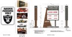
It really does matter what type of sign designer the OP is looking for... for all we know, he wants to make Raider fan parking signs and peeing Calvins...
 

Attachments

  • WHAT TYPE.jpeg
    WHAT TYPE.jpeg
    211.6 KB · Views: 330
Last edited:

Terry01

New Member
A sign needs to be a sign, not a postage stamp...Its a what am I, who am I and where am I.. Signs need to be simple and clear...
 
Obviously designing for a sign is a lot different than designing for print. If I hire a designer that has never designed signs before is there a recommended guide out there somewhere. I have found a lot of stuff online but if there is one place to go to get the best information on sign designing please let me know, I appreciate it.
If you want the signmaker services, known more about the sign design go through the Xplore sign & digital website. In this website, you get the various sign and manufacture process and maintenances services
 
I couldn't disagree more. Design is when careful thought and planning is put into the construction of an object so that it can serve its purpose effectively. If signs weren't designed, we wouldn't have STOP signs that are consistently red and octagonal. There's a reason they're red, a reason they're octagonal, a reason they're larger than other signs – when those decisions were made, that is the process we call design.

Even a sign that has the client logo centered in it – nothing else – can be "designed". The design process for such a sign is absurdly obvious, like deciding the right size, position and negative space around the logo, but that's still design. It can be done well and it can be done poorly.

And to your example about brush lettering, when you roughly sketched the copy with a Stabillo, taking your understanding of typography into account, the sum of that process is DESIGN. When you repeat a similar design process for so long that it becomes second nature, I don't think that makes it any less design – it only means you're an experienced designer.
I agree with shoresigns clearly mention what sign is and how the sign represents a story. Every sign has its own presentation, graphics and the meaning for that they use.
 

Rick

Certified Enneadecagon Designer
These are all within 2 miles from my house...
The speed limit on this road is 55...

-- Tell me now that graphic designers can't design signs when we sign designers are doing this?
-- This is why so many try to get into this trade. The majority of sign shops they get in contact with probably suck... why not give it a try, how bad could they be?
-- If this industry doesn't take kindly to those that suck - why do so many SUCK!
-- How is this design? I mean really, even layout seems like we're being generous.
-- Are some of you saying that after a week or 2 of training - mostly on equipment, a graphic designer won't be able to pull all of this off?

This stuff is everywhere, it's no wonder a few here rattle off about how great they are if this kind of crap is littering the roads... it's not that hard to be better than this.

Now granted, maybe... just maybe, the client loved it. Or most likely they don't know any better because the sign shop doesn't... I get it, not every sign needs to be a work of art... and a few layouts are not all that bad. But c'mon, some of this stuff they didn't even try... PHOOEY! It's no wonder we sign designers are the red-headed step-child of the design industry!
 

Attachments

  • Sign Designers - 16.jpeg
    Sign Designers - 16.jpeg
    71.3 KB · Views: 304
  • Sign Designers - 15.jpeg
    Sign Designers - 15.jpeg
    131.6 KB · Views: 277
  • Sign Designers - 14.jpeg
    Sign Designers - 14.jpeg
    153.6 KB · Views: 280
  • Sign Designers - 13.jpeg
    Sign Designers - 13.jpeg
    115 KB · Views: 276
  • Sign Designers - 12.jpeg
    Sign Designers - 12.jpeg
    187.7 KB · Views: 281
  • Sign Designers - 11.jpeg
    Sign Designers - 11.jpeg
    127.5 KB · Views: 284
  • Sign Designers - 10.jpeg
    Sign Designers - 10.jpeg
    133.7 KB · Views: 287
  • Sign Designers - 9.jpeg
    Sign Designers - 9.jpeg
    155 KB · Views: 276
  • Sign Designers - 8.jpeg
    Sign Designers - 8.jpeg
    98.4 KB · Views: 282
  • Sign Designers - 7.jpeg
    Sign Designers - 7.jpeg
    92.6 KB · Views: 279
Last edited:

Rick

Certified Enneadecagon Designer
Ooops, more...
 

Attachments

  • Sign Designers - 6.jpeg
    Sign Designers - 6.jpeg
    140.6 KB · Views: 278
  • Sign Designers - 5.jpeg
    Sign Designers - 5.jpeg
    128.2 KB · Views: 258
  • Sign Designers - 4.jpeg
    Sign Designers - 4.jpeg
    166.7 KB · Views: 271
  • Sign Designers - 3.jpeg
    Sign Designers - 3.jpeg
    171 KB · Views: 260
  • Sign Designers - 2.jpeg
    Sign Designers - 2.jpeg
    93 KB · Views: 258
  • Sign Designers - 1.jpeg
    Sign Designers - 1.jpeg
    203.7 KB · Views: 295

myront

CorelDRAW is best
...
Now granted, maybe... just maybe, the client loved it...

Clients won't spend $$ for art time and employers don't take kindly to time spent on them.
Clients want you to use their crappy logo.
Clients want something the same day they walk in.

For signs in high speed traffic i.e. 55mph the message needs to be much more simple.

How about some pics of "good" signs?
 

neato

New Member
LOVE the giant phone number on the Servicemaster sign.

That has to be one of my biggest pet peeves when working with service businesses. The "make my phone number as big as possible" mentality. Seriously, who writes down a phone number off a sign driving at 55 MPH.
 

unclebun

Active Member
Most of those look like the customer whose only question, when they had their secretary call all the sign shops in the phone book (or google search page), was, "How much for a banner....?" and they chose the lowest price. The only one that really amazes me was the channel letters. No matter how lowball the sign shop was, the price of channel letters should make the customer care at least a little about how they look. (You would think)
 

Rick

Certified Enneadecagon Designer
How about some pics of "good" signs?

I have to drive 2 1/2 miles to see the first decent sign...
We have two main sign shops in the area of 120k - at least 25 quickie sticky garage shops.
Pics of the 2 storefront shops...

The point I'm trying to make is... if the OP is opening a shop... please, I BEG YOU... layout(or design) some decent work. Hire someone or learn the basic principles of graphic AND sign design. Give the client with bad taste options.
 

Attachments

  • first decent sign.jpeg
    first decent sign.jpeg
    88.3 KB · Views: 250
  • sign shop-2.jpeg
    sign shop-2.jpeg
    178.9 KB · Views: 274
  • sign shop-1.jpeg
    sign shop-1.jpeg
    218.1 KB · Views: 277

myront

CorelDRAW is best
This client was equipped to spend the $$ and patience.

upload_2018-10-18_12-22-45.png
most client's budget will only allow this
upload_2018-10-18_12-27-10.png
 

Rick

Certified Enneadecagon Designer
This client was equipped to spend the $$ and patience.

View attachment 137173 most client's budget will only allow this View attachment 137174

That has nothing to do with money... it has something to do with taste...

I'd like to point out that it's the complete structure I was pointing out, not just the channel letters - but you might have missed something... some sign shop clown used the wrong typeface for "CLEANERS" and a bolder version on "Stanford Liquor"
 

equippaint

Active Member
That has nothing to do with money... it has something to do with taste...

I'd like to point out that the complete structure, not just the channel letters - but you might have missed something... some sign shop clown used the wrong typeface for "CLEANERS"
It also doesn't match in color or size. Don't forget the Subway logo which is also out of place and gives it a little bit of the trashy shopping center look.
 

Rick

Certified Enneadecagon Designer
It also doesn't match in color or size. Don't forget the Subway logo which is also out of place and gives it a little bit of the trashy shopping center look.

It is - was... er - is a trashy shopping center that was recently remodeled. The old sign was some tall wood structure built in the late 60's... appropriate for the time but was probably very dated within 10 years.

Most shopping centers around here have Comprehensive Sign Programs - or a sign code within the sign code. A new owner is given the sign manual on signing a lease, they give it to the sign vendor who follows the standard so there is usually no guessing on whats required on the wall, or that pylon.

Almost every CSP I have written or seen allows for logos on national trademarked companies... thats why the Subway logo is there... looks totally out of place. There is a Del Taco at the same Center but they have their own sign with their logo on it.

This sign is about 3 years old... with all the business turn-over around here, in another 5, it will probably looked hacked up and unrecognizable
 

rossmosh

New Member
I do a lot of smalls. Small job comes in to match to an existing item. Okay. To figure out the typeset and condensing, takes time. At least 20 minutes and I'll burn through some scrap doing a test or three depending how anal I am and how far from standard the font is. $25 for the setup. Or....I can eyeball it and run it and it is what it is. Guess what they chose.

I agree with the idea that some signs are just flat out bad and it's the sign shop's fault. I also think the customer plays a big roll. No budget, no time, and no taste is a big issue. They also might not have their stuff together and once again, don't have the cash to pay you to help them get their stuff together. I also think it's fair to say a lot of those signs are old. Sometimes things just don't age well when in 1983 they looked fashionable.
 

equippaint

Active Member
It is - was... er - is a trashy shopping center that was recently remodeled. The old sign was some tall wood structure built in the late 60's... appropriate for the time but was probably very dated within 10 years.

Most shopping centers around here have Comprehensive Sign Programs - or a sign code within the sign code. A new owner is given the sign manual on signing a lease, they give it to the sign vendor who follows the standard so there is usually no guessing on whats required on the wall, or that pylon.

Almost every CSP I have written or seen allows for logos on national trademarked companies... thats why the Subway logo is there... looks totally out of place. There is a Del Taco at the same Center but they have their own sign with their logo on it.

This sign is about 3 years old... with all the business turn-over around here, in another 5, it will probably looked hacked up and unrecognizable
IMO, there is no good reason that the Subway logo couldn't at least match the rest in size and color. If I were the supreme ruler of the shopping center sign, there would be no exceptions. Well maybe for an anchor but it would cost them a monthly variance fee that would go to my beer fund.
 

Rick

Certified Enneadecagon Designer
I do a lot of smalls. Small job comes in to match to an existing item. Okay. To figure out the typeset and condensing, takes time. At least 20 minutes and I'll burn through some scrap doing a test or three depending how anal I am and how far from standard the font is. $25 for the setup. Or....I can eyeball it and run it and it is what it is. Guess what they chose.

I agree with the idea that some signs are just flat out bad and it's the sign shop's fault. I also think the customer plays a big roll. No budget, no time, and no taste is a big issue. They also might not have their stuff together and once again, don't have the cash to pay you to help them get their stuff together. I also think it's fair to say a lot of those signs are old. Sometimes things just don't age well when in 1983 they looked fashionable.

I'm trying to stay within the OP's topic, for the most part, I agree. Which is why I contend that even a marginally skilled graphic designer can easily be taught sign design, most of what we do requires no magic dusting...

As far as the shops fault... if they have the chops, and the time presenting an option, then at the very least the blame lands squarely on the clients shoulder... on some of the signs I show, we simply have no choice but to follow the existing signage. But yeah, for some reason a client will spend thousands, sometimes even millions on construction that took months or years to develop, and give us days or sometimes hours to make them a sign....
 

neato

New Member
Commence crockety old man speech:

You just can't blame the cheap client for putting out shoddy work. The client didn't put the vinyl in the cutter and hit 'plot'.

It really just boils down to caring enough about your profession and your community to charge what you need to in order to do the job right.
 
Top