• I want to thank all the members that have upgraded your accounts. I truly appreciate your support of the site monetarily. Supporting the site keeps this site up and running as a lot of work daily goes on behind the scenes. Click to Support Signs101 ...

Favorite "professional" graphic design idiot stories?

jtiii

I paid good money for you to read this!
We sent out an order for some stainless water bottles. I sent a completely vectored file. The imprint method is full color digital.
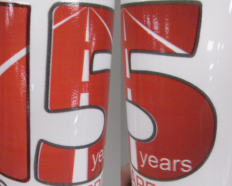
They sent pictures of a production proof advising us that our art had issues.
Screenshot 2023-11-14 085429.png

Y'all, look at this registration.
Screenshot 2023-11-14 085753.png

And then for the Coupe De Gratchie they explained to me what they needed (spoiler: it's a literal impossibility)
Please see the attached images. In the “5” the red is not extending to the black outline and some of the red is extending past the red outline as seen in the “1”.
Art is advising this is also below our minimum of 300 DPI. The submitted artwork is more like 150 DPI. To correct these issues, they have advised we really need vector artwork at 300 DPI.

To clarify, I am fully aware that you can embed a bitmap in a vectored file, but my file was 100% vectors.

The other one I get often that grinds my gears is when I only have a bitmap and it's like a 1" square print, and they send back "artwork looks jagged, need cleaner art". And yes, it does, blown up on screen, but at print size it's like 600dpi and will be fine..
 

jtiii

I paid good money for you to read this!
JtiiI, did you send them a .pdf file to Print?
I started with a .pdf and then sent them a 400dpi tif hoping to placate them. They ignored the tif and further "explained" the issues -
There are low DPI images that reach behind the gray outline. This is causing the ink to mix together in places; please have it so that the images do not reach behind the outlines or send in vector art where it does not go behind the outlines please. The white lines of the road and the text seems to be made out of a clipping mask instead of vector points. We believe that may be causing part of the outline as well, we think the machine may be reading part of the clipping mask since it extends so far and the images are a lower DPI.
This renders fine in Acrobat and Photoshop and I just opened it in Flexi print & cut without a problem. Flexi did ask what resolution to emulate the gradient; it kept everything as a vector aside from the red fill in the numbers. The grey outline is NOT set to overprint.

Of course these are for an event and the client dragged their feet :banghead:
 

Forty One

Make signs they said... It'll be fun they said...
Anyone calling themselves a designer and submitting Canva files.

Canva is like the MS Publisher of the 21st century.
This....


Or "But I purchased the image off Shutterstock. Why can't I use it for my office wall???"
 

ProSignTN

New Member
It's not a design problem as those might be too numerous to list, but instead a fab problem. I don't have a photo handy since it was in the early 90's but, I witnessed this production-fabrication screw up of a neon lit channel letter set that was mounted on a modern day country store until the awful tornado that came through middle Tennessee in 2020 took the whole store down. Why Loyd, why?
 

Attachments

  • Echo Valley Market.jpg
    Echo Valley Market.jpg
    196.3 KB · Views: 162

mbasch

New Member
We had someone working for us. Great guy, but he went out to measure a car for a vehicle wrap and came back and did the art, print etc. The installer called and said one side was wider than the other side by about a foot so one side didn't fit. Our designer defended his work saying he measured both sides and did the design based on his measurements. He got different measurements from both sides of the same vehicle.
 

cwinmadison

I'm doing nothing, and it's not working!
I previously worked for a graphics company whose clients included a lot of high-end fashion names, but also retail chain stores. One time we were running a seasonal rotation for a shoe store, and one of the files had a bunch of little kids in a grassy field littered with very obvious cigarette butts - like, close-ups of the shoes with a ciggy butt RIGHT next to it.

Realistic, yes - but probably not the message they wanted to convey. This made it through the shoe companies design department, their corporate approval process, and MY company's design department, all the way to print. We did end up reprinting that batch with new art, but not before numerous internal "client art, produce as is" arguments and the client then asking how bad could it really be.

Stupidity went both ways that time...

:rolleyes:
 

gnubler

Active Member
Also, when a client sends you a png and you ask for an illustrator or EPS version because you need vector. They then place the PNG file in an illustrator doc and save it as an EPS. Problem solved :)
They're brilliant, aren't they? Probably smirking while doing their little trick to "help" us. LOL
I worked in commercial printing for 15 years before getting into signage and it's all the same. Crap in, crap out.
However, signage is pretty permanent and can potentially be viewed by hundreds or thousands of people every day. Most printed items are looked at once and thrown away.
 

CanuckSigns

Active Member
Also, when a client sends you a png and you ask for an illustrator or EPS version because you need vector. They then place the PNG file in an illustrator doc and save it as an EPS. Problem solved :)
Lol, yup all the time, I imagine them sitting there doing it and thinking I'm an asshole for wanting to charge them $75 to do this for them.
 

brdesign

New Member
Many yars ago i got a file from a "designer".
(Don't have the file anymore so i made a quick sketch)
He placed all the text in the creases, so i told him "Thats not the best place to put it"

So he just erased the creases!
Like he expected me to rebuild the car...
View attachment 168327
It's always funny when a "designer" moves/deletes the door handle or resizes a window on the template to make more room for the logo.
 
Top