-
I want to thank all the members that have upgraded your accounts. I truly appreciate your support of the site monetarily. Supporting the site keeps this site up and running as a lot of work daily goes on behind the scenes. Click to Support Signs101 ...
You are using an out of date browser. It may not display this or other websites correctly.
You should upgrade or use an alternative browser.
You should upgrade or use an alternative browser.
Feed back please
- Thread starter Signmaker1234
- Start date
Signmaker1234
New Member
toucan_graphics
New Member
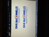
none of them are really speaking to me.... but of the three, the first one without the script font is best IMO
Signmaker1234
New Member

Signmaker1234
New Member
J Hill Designs
New Member
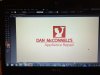
for one, he doesn't know how to export images. cell phone pic of the screen? really?
graphicwarning
New Member
for one, he doesn't know how to export images. cell phone pic of the screen? really?
hahaha I was just about to ask why someone having the wherewithal to use illustrator, is posting pictures of the screen? :ROFLMAO:
Signmaker1234
New Member
U can see it!!!
You can see it can't you! What does it matter how it got here! I always take pics on my phone so I can look at it wherever I'm at! Cant make changes, but I can see it!
for one, he doesn't know how to export images. cell phone pic of the screen? really?
You can see it can't you! What does it matter how it got here! I always take pics on my phone so I can look at it wherever I'm at! Cant make changes, but I can see it!
J Hill Designs
New Member
You can see it can't you! What does it matter how it got here!
theres a big difference between professional and perfeshunal, but you can read them both
Gino
Premium Subscriber
Do you have any other directions you might wanna explore ?? These aren't quite doing it for me.
Try stacking, jumbling around or making some kinda geometric shape out of letters vs. appliances.
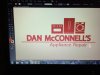
- The pictures are far too old fashioned.
- The clever play of a dryer for an 'O' is kinda childish..... or at least this attempt of it.
- The overall concept is too long.
Try stacking, jumbling around or making some kinda geometric shape out of letters vs. appliances.
Signmaker1234
New Member
Thanks
The customer likes the little guy with the wrench, which he supplied. More than likely he is gonna pick something with him in it! It is ok, but not my choice! I do appreciate the feedback, I'll probably play around with the designs just to see what else I can come up with though.
Do you have any other directions you might wanna explore ?? These aren't quite doing it for me.
- The pictures are far too old fashioned.
- The clever play of a dryer for an 'O' is kinda childish..... or at least this attempt of it.
- The overall concept is too long.
Try stacking, jumbling around or making some kinda geometric shape out of letters vs. appliances.
The customer likes the little guy with the wrench, which he supplied. More than likely he is gonna pick something with him in it! It is ok, but not my choice! I do appreciate the feedback, I'll probably play around with the designs just to see what else I can come up with though.
Signmaker1234
New Member

thinksigns
SnowFlake

Coming here looking for constructive feedback is like going to a S&M Club and asking 3/4 of the other members to tie you up and whip you. Many here are incapable of articulating constructive feedback or analysis of other people's work without getting in a dig or resisting being mean about it.
I actually liked the washer in the place of the O concept if the store was selling appliances, but for the repair scenario, I'm not sure it portrays that well enough. The caricature looks too much like Homer Simpson and its overall poor quality really detracts from everything else. Having it all be one color links the weak graphic with the text, further dragging it all down together.
Let me go look at the options again and see if I have anything else to offer.
Stormyj
Just another guy
some tweaks
Thats exactly what I was thinking. Was way too long, needed to be condensed.
DravidDavid
New Member
With the version of the guy with the spanner lower down, you can see the white feather shadowing the top of the text. Perhaps move the character to the background so the text is up front and not being feathered by the image.
Unlike everyone else, I quite like the first example but with the script text. The "Appliance Repair" text on the others looks boring and unimaginative. If you're still not set in concrete with the design, you could try inversing the Appliance Repair and name text making Appliance Repair the fancy large font and the name of the repairer the text underneath.
Of course, I wouldn't recommend doing so if this person is a well known repairer in a small to medium community whos name is important. If not...Appliance repair is definitely the more important attribute.
Looking forward to seeing more revisions.")
Unlike everyone else, I quite like the first example but with the script text. The "Appliance Repair" text on the others looks boring and unimaginative. If you're still not set in concrete with the design, you could try inversing the Appliance Repair and name text making Appliance Repair the fancy large font and the name of the repairer the text underneath.
Of course, I wouldn't recommend doing so if this person is a well known repairer in a small to medium community whos name is important. If not...Appliance repair is definitely the more important attribute.
Looking forward to seeing more revisions.