-
I want to thank all the members that have upgraded your accounts. I truly appreciate your support of the site monetarily. Supporting the site keeps this site up and running as a lot of work daily goes on behind the scenes. Click to Support Signs101 ...
You are using an out of date browser. It may not display this or other websites correctly.
You should upgrade or use an alternative browser.
You should upgrade or use an alternative browser.
Fire Away
- Thread starter Adam Bennett
- Start date
omgsideburns
New Member
make her boobs bigger.
Adam Bennett
New Member
haha thanks for that
Monsterkidz
New Member
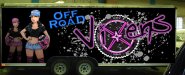
The font used for "OFF ROAD" doesn't really scream off road or racing to me.
Might want to try a few different fonts.
Just my opnion though.
Might want to try a few different fonts.
Just my opnion though.
Deaton Design
New Member
I think it looks cool. For the words off road, lookup a font called feast of flesh. I think it would be perfect for that.
Or better yet, heres the link:http://www.dafont.com/feast-of-flesh-bb.font
Or better yet, heres the link:http://www.dafont.com/feast-of-flesh-bb.font
speedmedia
New Member
It is lacking something to tie it all together. Just sort of looks like items placed here and there. I think if you tie it all together it will look much better.
I agree with John that the font he suggested might look good for this application. Maybe just move some things around and don't be afraid to overlap to give it a sense of depth. Even some sort of subtle background would create that as long as it isn't overpowering.
Thanks,
Kurt
I agree with John that the font he suggested might look good for this application. Maybe just move some things around and don't be afraid to overlap to give it a sense of depth. Even some sort of subtle background would create that as long as it isn't overpowering.
Thanks,
Kurt
grafxxx
New Member
what people have been saying change the off road font. take those splats an spread it out for the background and lower the opacity on it to blend it in the back ground and make them brown for the blue girl move closer to the logo and have the off road tag shadow over her shoulder.
Adam Bennett
New Member

GoodPeopleFlags
New Member
Off Road is better but too big. Maybe smaller and behind the "V"? At a glance, all I see is "Off Road".
Circleville Signs
New Member
What about fading out the brown splatter in the background, and having "Off Road" look like the splattered mud?
As BlueFish said, right now because of the electric blue, Off Road REALLY jumps out in front of everything else.
Gary
As BlueFish said, right now because of the electric blue, Off Road REALLY jumps out in front of everything else.
Gary
grafxxx
New Member
i think the font is good but it looks like a "eat at joes" neon sign look .. get rid of the blue inside or see if you can add a texture and the color overlay to make it look more solid to give it that "Xtreme" look and what blue fish said behind the v and smaller made somting like this http://www.linksguruji.com/images/dirt_2_logo_final.jpg goto run good luck
Circleville Signs
New Member
Adam Bennett
New Member
Unfortunately, I think they're pretty set on copperplate as their accent font. They are a clothing company and that is what is printed on all of their merchandise.
dman0427
New Member
I know "Vixens" is plural, but does there really need to be two girls on there? IMO the second girl in the background throws it off a little, especially because its a mirror image with only a different color hat and shorts.
If you have multiple girls it might look better if they were in different poses and there should be 3 of them... unless the racing team is made up of only two girls and they are twins")
I forgot to mention that it looks pretty awesome so far. I like the splatter effect in the second one.
If you have multiple girls it might look better if they were in different poses and there should be 3 of them... unless the racing team is made up of only two girls and they are twins
I forgot to mention that it looks pretty awesome so far. I like the splatter effect in the second one.
Last edited:
Copperplate..ugh..it's the font that you think is good for everything but isn't good for anything, you'll make it work though, a little bigger and bolder than your first one and make sure the angle is correct. I agree that there should be 3 girls if possible and different girls. Now, about that first girl, her face is the most prominent thing in the whole design to my eye. I don't know what it is, maybe it's just because I can't see too well on you picture or the fact that her hair can't be seen in the background but her face looks disproportionatly large, round and scary to me. Also, I think there's a little too much splatter in your last version but other than that it's a design with good impact.
astro8
New Member
...yeah, bigger boobs.It is lacking something to tie it all together.
Liquid GraphX
New Member
The Vixens gets a little lost with the other graphics and the font. Could you maybe try a yellow glo? Dunno it looks pretty dang good tho.