• I want to thank all the members that have upgraded your accounts. I truly appreciate your support of the site monetarily. Supporting the site keeps this site up and running as a lot of work daily goes on behind the scenes. Click to Support Signs101 ...

First shot at business card layout

rm25x

New Member
This is my first shot at a 2 sided business card layout.
I looked through several old posts for ideas.
It will be 3.5x2 with rounded corners, the black outline is just to show the edge of the card.
I was going with trying to keep it simple. Good idea, or would a full color card be better off?
Thanks in advance for your opinions.
 

Attachments

  • GreatLakesCard2SidedSmall.jpg
    GreatLakesCard2SidedSmall.jpg
    67.6 KB · Views: 88

Fitch

New Member
In todays world, one does not have to highlight "Hamburgers with egg, hamburgers with bacon, hamburgers with pineapple" etc etc etc.

"Hamburgers" is sufficient, the rest is a given.

When advertsing, we put " Signs, shopfronts, banners, vehicles" THAT'S IT !!!!

The rest is assumed or in the very least questioned.

It amazes me that many signshops want to "write down" every thing they do.

Less is more.
 

TheSellOut

New Member
The rest is assumed or in the very least questioned.

I completely disagree with this statement. I can not count the amount of times someone has said something along the lines of "Oh you make banners too?!"

People, myself included, are stupid and if you don't tell us...then we won't assume and likely won't even question.

Less is more.

This statement I do agree with, rm25x some of my old cards are set up very similar to this with a ton of information, and while I don't think it's necessarily a bad thing, in my experience very few ever read all of that stuff. The nice thing is you could stick a magnet to the front side of the card and still have all your contact info., and things you do, displayed from the backside.

In my last card, instead of listing what I do, I filled the entire backside with about 13 pictures of my best work, and while they were small, people looked at them and asked questions.

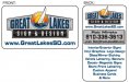
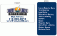
In my new card I wanted to keep it simple with contact info and just try and drive people to my website so that, when it is finished, people can see in greater detail everything I do and possibly fill out a quote request form.

In my BC Thread you asked

Do you offer those or did someone else print them for you?

Yes to both...I am sure there are Merchant Members here who sell wholesale to the trade, and my favorite is 4 Color USA. They have an East coast, Mid-West, and West coast facility, and all their products are made here in the US!
 

Jillbeans

New Member
I'd lose the logo on the back as it is redundant.
I'd also lose the metallic looking box and simply place your contact info at the bottom.
Do you need an email addy if your site has a contact form?
And definitely lose the "& More" because in my opinion it's tacky and implies that maybe you would do anything.
You do need to list what services you offer because I have found that if you don't spell it out, people won't realize what you do offer.
How many of us have heard "Oh I didn't know you made banners!"
Love....Jill
 

Craig Sjoquist

New Member
Well I liked your present logo better the avatar ..but the color change is good
Likes the simple front but the back has way to much or lighten up fonts like the menu way to heavy
Good start
 

rm25x

New Member
Thanks for the feedback guys (and ladies)

I will work on a few more designs taking your suggestions into account.

I do like listing what I offer on the cards, because as said, people are ignorant and if you don't spell it out to them they won't ask about it for the most part I have found.

:thankyou:
 

Sticker Dude

New Member
to me you dont need 2 logos on the card.
Take off the logo on the back it will loosin up that clutter
looks clean tho
 

rm25x

New Member
It still feels like it needs more...

And I like having my e-mail address on the card, because if someone want to send me a picture or a file, etc then they don't have to deal with the contact us form on the website, I can just hand them a card and tell them to send it there.
 

Attachments

  • gl business card logo change simple 2 sided.jpg
    gl business card logo change simple 2 sided.jpg
    61.3 KB · Views: 78

GypsyGraphics

New Member
I normally don't like laundry list but even if you assume, as suggested above, that people are ignorant, are you also assuming they're vision is impaired? Why is the logo and web address so huge on the front?

Don't fill the card edge to edge, front and back!

Maybe the back could have a little more interest, with a image that plays off the logo, but keep it subtle, maybe screen it back. Again, a little breathing room around the edges.

And I totally agree with Jill.... NO "and more."
GreatLakes_card.jpg
 

Jillbeans

New Member
And no nasty script!
And isn't having a website what you want customers to look at, seeing examples of your work before they click on your contact link?
Isn't it easier to click a link than to type something in?
GG has a nice idea.
Also note how she gave everything breathing room and made it look classy.
 

rm25x

New Member
OK good suggestions. And thank you GG for taking the time to put together a visual, it was a big help.
I will leave off the e-mail address, and play with some other changes as suggested. I do like the picture you added to the back to tie in with the business name.
 

Marlene

New Member
I completely disagree with this statement. I can not count the amount of times someone has said something along the lines of "Oh you make banners too?!"

People, myself included, are stupid and if you don't tell us...then we won't assume and likely won't even question.

ditto
once you start a laundry list, people will look at it and if something isn't listed, they assume that you don't do it. I can't count the number of times I have also heard the "I didn't know you did banners too". I would keep the back just a list and make it easy to read. there's nothing worse to get thru than an all centered list with bullets between the words.
make it a nice left justified list that can be scanned thru top to bottom.
 

rm25x

New Member
How about something like this? Or with some color on the front?
 

Attachments

  • glbc sunset.pdf
    800.9 KB · Views: 104
  • glbc sunset 2.pdf
    801.9 KB · Views: 117
Last edited:

TheSellOut

New Member
I'm not diggin the yellowy background on the front, the white looks cleaner. And on the back I don't mind the sunset picture but I would try an all blue (the blue of your "Great Lakes" lettering) background with white letters, and not bold.

P.S. I dont think too many people open pdf's since they have to be downloaded!
 

rm25x

New Member
Ok thanks for the tips.

I tried PDF to see if the quality would be better for people.

I am just looking for a simple card that looks good.
 

rm25x

New Member
something like this?
 

Attachments

  • glbc blue 2 sided.gif
    glbc blue 2 sided.gif
    15.7 KB · Views: 73
Last edited:

signgal

New Member
I like this one best of all the ones posted so far. I'd still go with a cleaner simpler font for the list and info though. To me, that was the best part about GG's. they are holding it in their hand. While they do need to get the phone number off of it quickly, the rest can be simple, understated with plenty of negative space. remember it's not a sign :) my 2cents
 
Top