-
I want to thank all the members that have upgraded your accounts. I truly appreciate your support of the site monetarily. Supporting the site keeps this site up and running as a lot of work daily goes on behind the scenes. Click to Support Signs101 ...
You are using an out of date browser. It may not display this or other websites correctly.
You should upgrade or use an alternative browser.
You should upgrade or use an alternative browser.
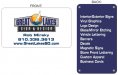
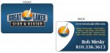
First shot at business card layout
- Thread starter rm25x
- Start date
TheSellOut
New Member
I like this one best of all the ones posted so far. I'd still go with a cleaner simpler font for the list and info though. To me, that was the best part about GG's. they are holding it in their hand. While they do need to get the phone number off of it quickly, the rest can be simple, understated with plenty of negative space. remember it's not a signmy 2cents
Completely Agree!
Another suggestion for the back would be to...take just the boat icon (like SignMe did in post 15) and have it in the background at like a 20% opacity!
Plus, may be it just looks different in the image, but make your contact info on the front the same blue as the Great Lakes lettering

signcrafters london
New Member
I think you are going backwards now. The latest one is too crowded.
I prefer what Gypsy did in post #10 and signmeup did in post #15.
I prefer what Gypsy did in post #10 and signmeup did in post #15.

TheSellOut
New Member
Bottom Right! on the front I like what you did by making your name and website Roman and the number Bold, but you need to shrink the font sizes down a bit! Nice work!
signcrafters london
New Member
I like the back with the addition of the boat, I just think the type is too big on the front. Not enough white space makes me not even want to read it, like when I see a 1,000-word paragraph in someone's post.
TheSellOut
New Member
I think they are ready for Print!! Great improvements rm25...this is one of my favorite things about S101!
Rick
Certified Enneadecagon Designer
I think it's no better than you started, and homogenized by committee...
I would research good and unique business cards...
http://www.flickr.com/photos/dailypoetics/sets/72057594104389710/
http://www.underconsideration.com/fpo/archives/business-cards/
I would research good and unique business cards...
http://www.flickr.com/photos/dailypoetics/sets/72057594104389710/
http://www.underconsideration.com/fpo/archives/business-cards/
rm25x
New Member
They may not be the best thing out there, but I think they are an improvement from where I started. Do you have a suggestion as to what you would do to design them? I am all earsI think it's no better than you started, and homogenized by committee...
I would research good and unique business cards...
http://www.flickr.com/photos/dailypoetics/sets/72057594104389710/

Rick
Certified Enneadecagon Designer
They may not be the best thing out there, but I think they are an improvement from where I started. Do you have a suggestion as to what you would do to design them? I am all ears
I figure it will never going to be the best one out there... lame comment and not part of the criticism process.
Um, and I did give you a suggestion... research business cards.
--Here is another one... do not listen to everyone. Worst thing you can do is design by committee, I can design a killer card and show it to you, but you will be better off learning how to fish than me handing you one.
--Here is another one, start looking at typefaces that are not typical of a newbie sign maker (not calling you a newbie sign maker, but after years of looking at signmaker layouts, they lean toward a few select fonts, you are/were using them in the layouts) but more of a graphic designer.
--Here is another one, adding rivets to the design on a card may in your own mind carry over the concept, but how will it carry over to other things? Is anyone going to catch your "concept"
The card looks like a bad knock off of Heaths card.. Heaths is very nicely done. Yours seems off proportionally and cluttered and now the serif type gives it a disconnect.
rm25x
New Member
Points well taken. I will do some more research. I need to have these ready to go to print tomorrow though.
I was playing with a slightly different direction.
Second one has a font change, I think it looks better.
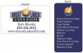
3rd is another different look based off something else I found while searching bing images.
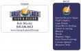
4th is with the front page logo changed
I was playing with a slightly different direction.
Second one has a font change, I think it looks better.
3rd is another different look based off something else I found while searching bing images.
4th is with the front page logo changed
Attachments


Last edited: